


U.S. Mortality Trends, Long-Term and 2020, and a Video Explainer
On the bigger picture

Yesterday, I had a Twitter conversation with Dale Hall, Managing Director of Research at the Society of Actuaries, and Magali Barbieri, Associate Director of the Human Mortality Database, under the hashtag #SOATalksMortality.
There was a total of 12 questions that we addressed. The list of questions are below, with a link to each Twitter thread:
In the early 1980s, the U.S. reached 2 million deaths. Tell us about the shifts & changes that have emerged from this number to approach 3 million deaths in 2020.
How did the U.S. mortality rate change between the 1980s through 2000s?
People are living longer, so why an increase in mortality over the past few decades?
Why have we seen mitigated improvement in mortality, such as in 2014?
How does the U.S. compare to other high-income, developed countries with mortality?
@HMDatabase can you tell us about your recent findings on mortality & mortality improvement?
In terms of socioeconomics, what type of differences are you seeing with mortality?
Looking to next year & beyond, what considerations do you have for mortality & mortality improvement?
Highlights from the Conversation: Long-Term Trends
Some items from the SOA & HMD conversation which you might find interesting:


Lots more than that, of course — check out the 12 questions above and follow!
Feel free to tweet me @meepbobeep or email me: marypat.campbell@gmail.com if you have any follow-up questions.
Recent Mortality Research
The Society of Actuaries has a long tradition of mortality and longevity research (as well as other areas relating to actuarial work).
Here is the page on the most recent U.S. mortality experience: US Population Mortality Observations - Updated with 2018 Experience
You might find this opioid death trend interesting:
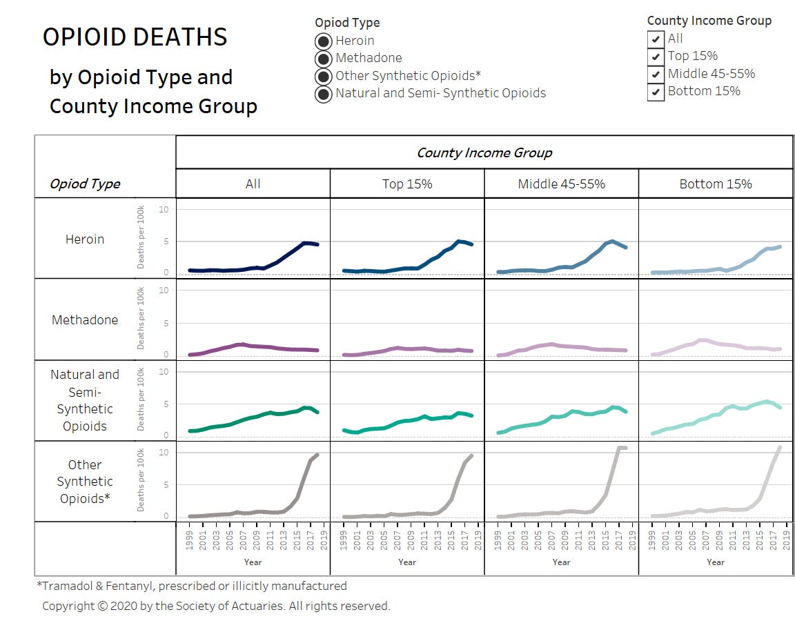
Interesting that it doesn’t seem to differ much by county income group. That has been my own experience in the fairly high-income/high-wealth Westchester County, in which people from fairly wealthy families have been dying from drug overdoses.
Magali Barbieri, who was a participant in the #SOATalksMortality twitter chat, authored a report with the SOA: Mortality by Socioeconomic Category in the United States - it comes with a spreadsheet you can manipulate yourself to see mortality patterns. Hmmm, I think that will be a future video.
COVID Tile Grid Map Explainer
In my last post, I made an animated gif:
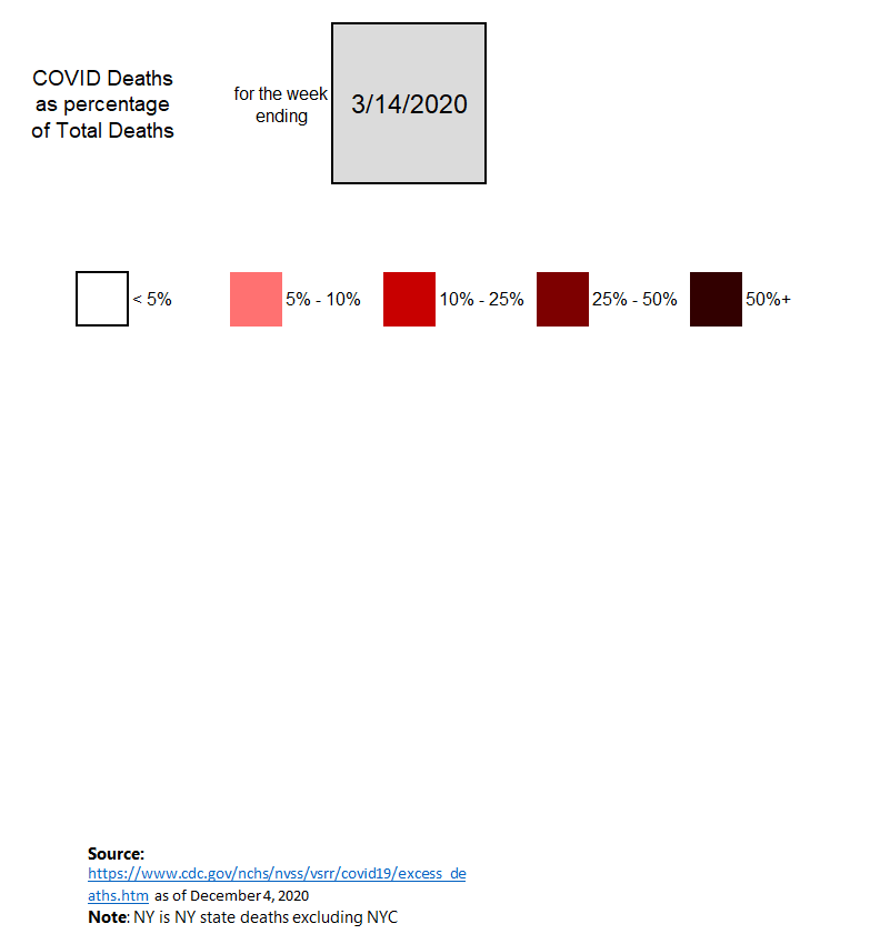
Here is an explainer on how to use the underlying spreadsheet:
Things to Come?
Mortality issues are going to be persisting, even after vaccines are widespread.
As a result of the conversation yesterday, I learned about the Human Mortality Database’s Short-term mortality fluctuations shiny app. I’ve been trying it out, and it’s got multiple countries in it. I may be looking at that, as well as the U.S. demographic mortality differences files, in future blog posts and video explainers.
As for now: yes, we’re in the third wave of COVID cases and deaths, and it’s not just the U.S. I think this is really very weather-driven at this point: basically, when people are inside a lot (whether it’s too hot or too cold outside), in dry, climate-controlled rooms… that seems to be where COVID is spread.
Also, the flu season so far has been very quiet. That one should be interesting to watch as well. (No, I don’t think it’s because flu cases are being classified as COVID.)
Lots more material to be coming over the next several months!
Related posts:
Dec 1: COVID Mortality with Meep: Update of Graph -- Plus Age and Sex Breakout by Week
Nov 23: Mortality with Meep: The Sex Gap in COVID and Total Mortality
Nov 7: Mortality with Meep: Comparing COVID-19 and 2020 Total Death Rates Against U.S. Historical Rates
Dec 7: COVID Mortality with Meep: Making Comparisons, by Age, Week, and State
Oct 23: Mortality with Meep: Comparing COVID-19 with Historical Mortality and Prior Pandemics