Mortality with Meep: Comparing COVID-19 and 2020 Total Death Rates Against U.S. Historical Rates
Both relative and absolute rates matter
In my prior post on COVID death impacts, Mortality with Meep: Comparing COVID-19 with Historical Mortality and Prior Pandemics , I looked solely at the total number of deaths and the percentage change in those deaths year-over-year.
The result: total deaths for 2020 is likely about 10% higher than 2018/2019 in the U.S., and the two prior large pandemics, the Hong Kong flu (1968) and the Asian flu (1957), saw death count increases of only about 4% each. Yes, it is a major mortality event.
I also saw a worrying increase in death counts for those age 25 – 44, which I want you to remember for the following… it will only get more worrisome.
Data sources and methods for the following will be at the end of the post, as well as a link to the spreadsheets if you want to download and check out the stats for yourself.
U.S. Historical death rate trends and 2020 projection
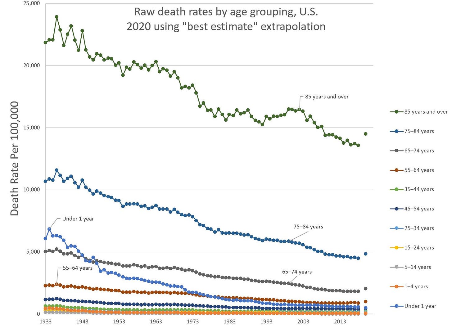
Here is the big view:
Items to note:
The dot all the way to the right is my estimate for the 2020 total death rate for that age grouping. This is based on death data through October 31, 2020.
Rates are based out of 100,000, which means the 10,000 = 10% death rate; 1,000 = 1% death rate; 100 = 0.1% death rate. This is a standard scale for death rates and I will be using this on all death rate graphs.
No, I will not use logarithmic scales, because it confuses people.
Infant mortality (for those <1 year old) really came down in the 20th century, didn't it?
I will not be talking about the historical death rate trends too much, which I’ve done before, and I plan on doing again. The focus is looking at the likely mortality experience for 2020 and how significant those results are.
I’ve taken the data and graphed it a different way, which we will use for analysis below:
I talked about death counts before, because those are easy for people to understand, but I really want to talk about rates because that makes it easier to compare against prior years. Obviously, one of the reasons we have a lot more deaths is that the population in 2020 is more numerous than the population in 1960. We don’t really care about that driver of death counts.
We do care about specific groupings of people having much higher probabilities of dying in 2020 compared to recent years.
I am excluding those under age 15 for all the following analyses, because I’ve seen so far that the death rate for children is projected to be lower than in prior years. This is probably because there will be far fewer accidental deaths for children — car accidents are a major killer for the under-15 crowd. Also, pediatric flu deaths may be down due to COVID precautions… we’ll see.
Historical comparison of rates: most similar years to 2020 experience
Here’s one way of thinking about the mortality impact of 2020.
For each age grouping, let’s take the projected 2020 death rate (all causes of death) and see how far back into history we need to go where the mortality rate was that high.
For instance, for the age group 74-85, you have to go back to 2009 before you get about the same death rate as I’m projecting for 2020.
So here are my current results:
Equivalent mortality years to 2020-projected
Age 85+: 2010
Age 75-84: 2009
Age 65-74: 2006
Age 55-64: 2001
Age 45-54: 1996
Age 35-44: 1995
Age 25-34: 1973
Age 15-24: 2006
I am really unhappy about what I’m seeing for the age 25-34 grouping, but I also want you to understand this is not necessarily as damning as you think it is, in terms of “who is hit the hardest”.
In the past 50 years, mortality improvement has primarily come from the oldest ages, mainly because most of the improvement has been in survival rates of heart disease and cancer, the biggest killer of all people. This has also improved death rates for the middle-aged, but the oldest, with death rates exceeding 10% per year, have a lot more room for improvement.
The primary killers of young people — accidents, overdoses, homicide, and suicide — have had variable trends. And, more to the point, the death rate for the age 25-34 group is less than 0.2%, and has been for over 60 years. It doesn’t take much of a margin on excess deaths to really move the needle for this group.
Focus on young adults: what is going on?
Let me focus just on those age 15 – 34 for this section.
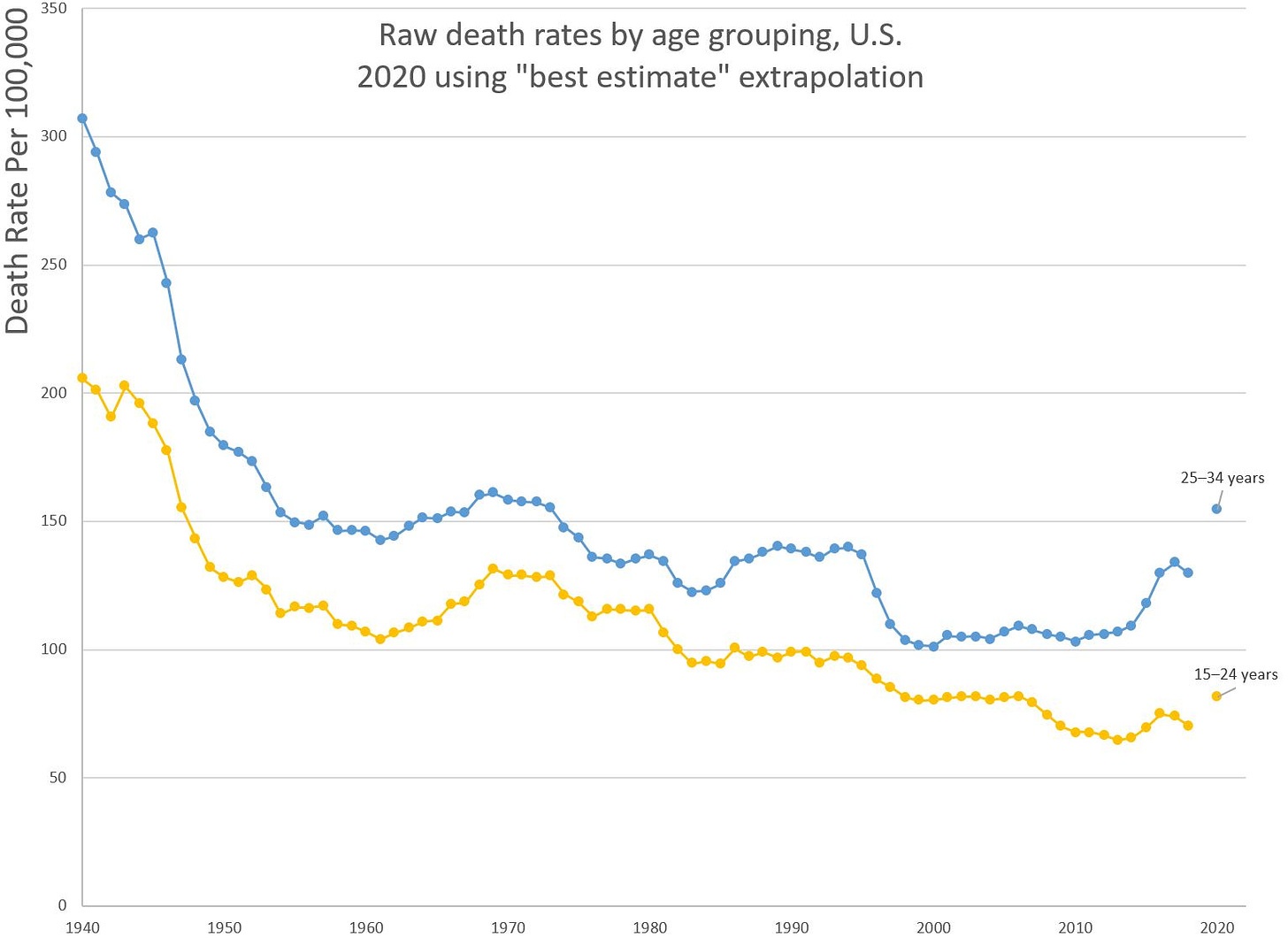
Here is the historical graph, 1940-2020 projected:
Features to point out:
Most of the mortality improvement came from 1940-1960; I bet almost all that improvement is due to improved vehicle safety over those years.
Mortality trends for these groups, since 2000, have been mostly flat
The 25-34 age group has seen a run-up in mortality rates since 2014 — blame that one primarily on the opioid epidemic in the U.S.
We are going to look at the projected 2020 mortality “jump” for these groups in a moment. I want to claim the jump may be due to COVID… but not because the disease killed them.
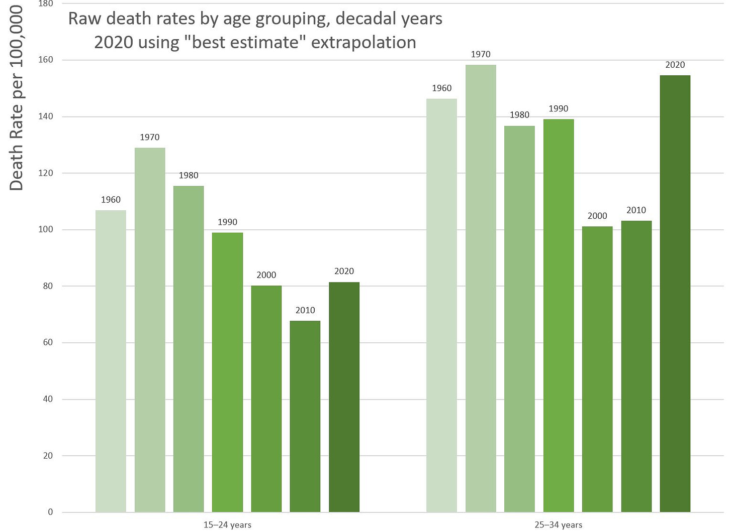
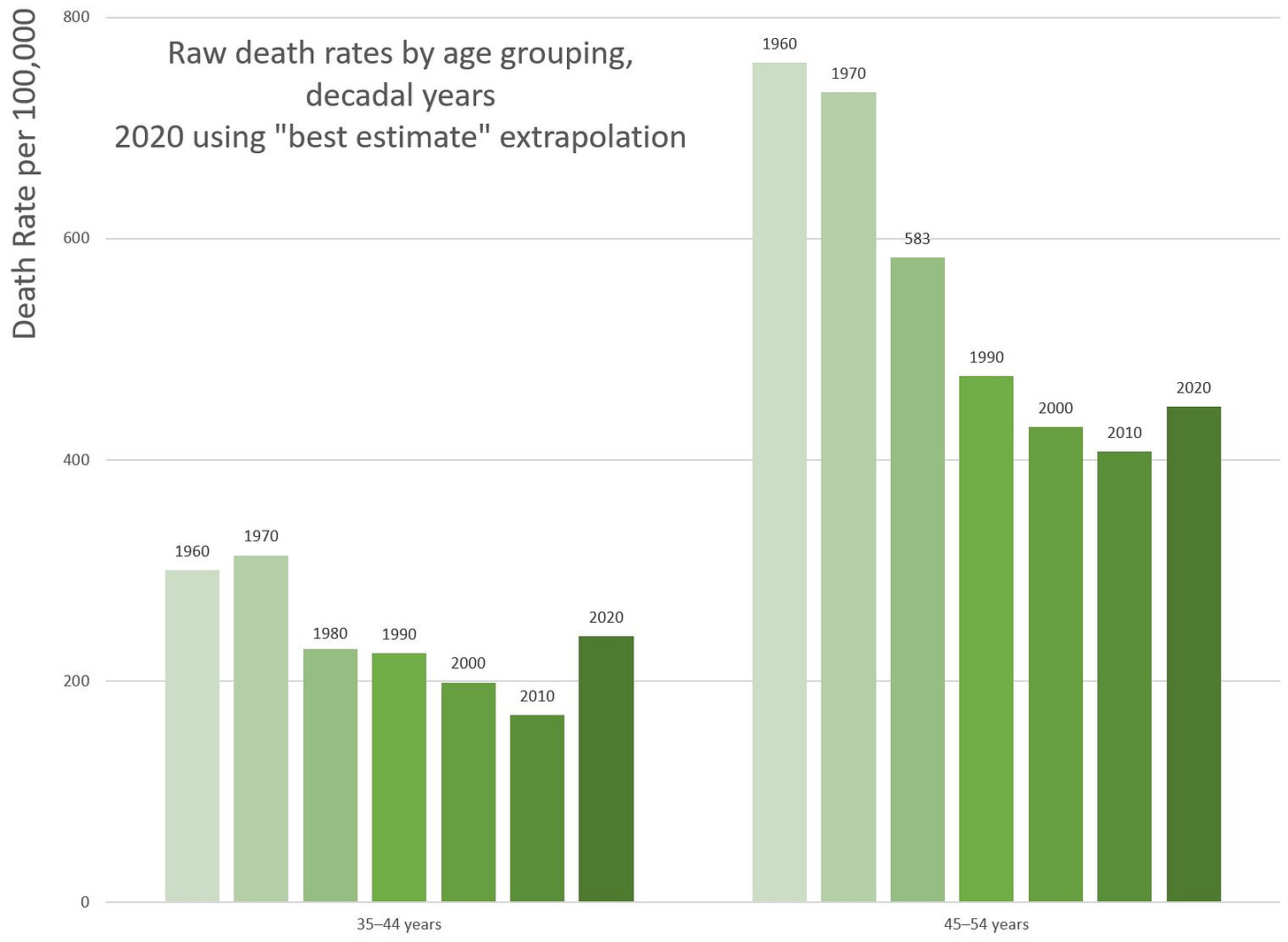
Here are the decadal years, just doing 1960-2020:
The pattern really pops out when I compress it like that, doesn’t it?
Again, I will note that the death rates being shown here are less than 0.2% per year. But this is a matter of relative risk, as well as absolute risk.
These are groups of people who naturally have extremely low death rates. Most of the mortality for these groups, in normal years, come from human-driven causes: accidents (mainly car accidents, not something purely accidental like getting struck by lightning), drug overdoses, homicides, and suicides.
So when I see an increase like that — it’s really bad.
How much of those “excess deaths” come from COVID?
I’m going to do the math for the 25-34 age group, and then provide stats for all the age groups I have.
First, I averaged death rates 2015-2018, to smooth things out; rates above that average will be considered the excess death rate. For ages 25-34, the base mortality rate calculated this way is 128 (per 100,000 people).
My projected death rate for 2020 for this age group is 155 (per 100,000 people) — so that’s an excess mortality of 27 (per 100k).
Then I take the annualized death rate of official COVID deaths (all deaths “with” COVID) from this age group — so far, that’s 5 (per 100K)….
So the estimated excess mortality is only 18% = 5/27 coming directly from deaths with COVID.
Now, for caveats: it can be that COVID deaths for this group have been grossly undercounted compared to other age groups. Maybe they’re disproportionately in that first wave, before there was sufficient testing. The data are likely to change over time (no, this is not nefarious — it just takes a lot of investigative work to get this done properly. Cause of death is a lot trickier than just plain counting deaths.)
That said, I don’t think that’s what’s happening. I think we are seeing an uptick in suicides, homicides, and drug overdoses for this age group in 2020. It’s most blatantly seen for those age 25-34, but it also bleeds into surrounding age groups.
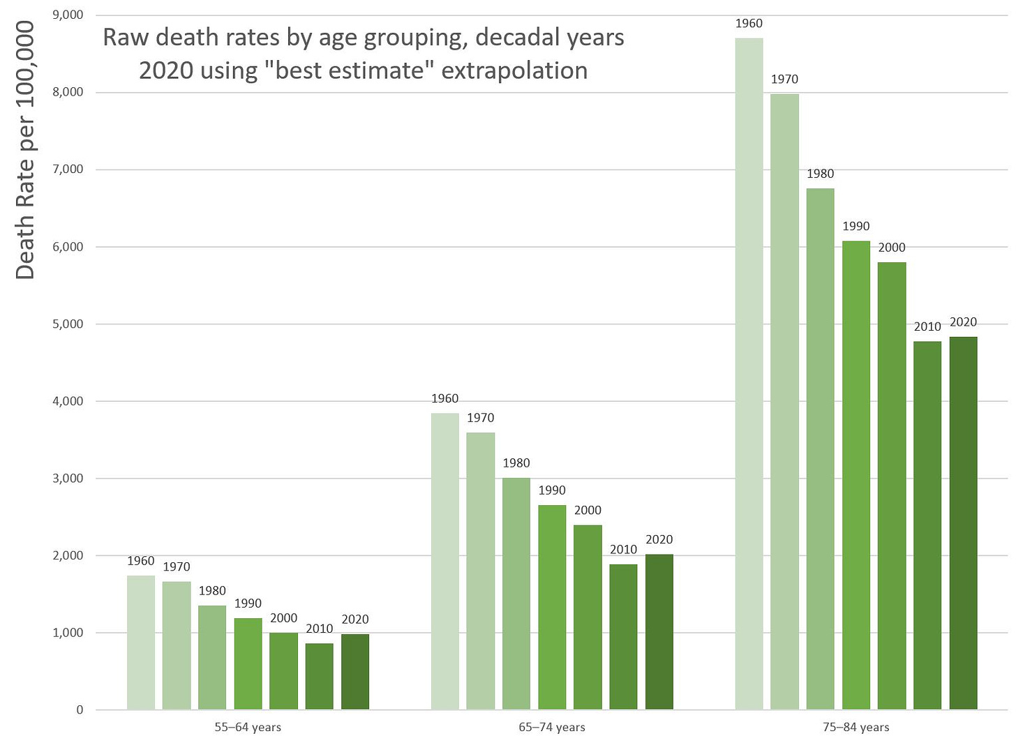
Decadal graphs for older adults
For completeness sake:
Please note the very different vertical scales for each of these graphs.
Excess mortality explained by COVID-19-related deaths
These are based on the official CDC count. From the compilation dated November 4, 2020, these are deaths with confirmed or presumed COVID-19, coded to ICD–10 code U07.1. (Taking a look, the WHO has two codes, one which indicates lab-confirmed COVID, and the other meaning presumed COVID. The U.S. is not distinguishing right now… but it would have been nice if they did.)
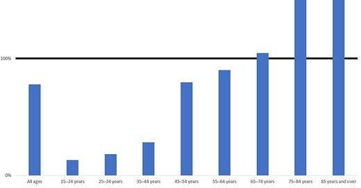
I did the calculation for age 25-34 above, but let me show it to you for all the adults:
You notice that I made a 100% line … and that for the oldest-age adults, we’re seeing more than 100% of their excess mortality explained by COVID.
I can think of three major explanations for the results greater than 100%:
Overcounting of COVID deaths for the elderly (they actually died of pneumonia due to something else, or something like that)
COVID killed them before the thing that would’ve killed them in 2020 (works best for those over age 85)
My extrapolation for the whole year, for both excess mortality and COVID mortality, is biased in different ways for the two numbers.
For that last one, the way I extrapolated may have overestimated total COVID deaths for 2020 for the oldest groups, where we see the greatest number of official COVID deaths.
But seriously, we see for those age 15 through 44, they have excess mortality, and it looks like most of it is coming from non-COVID reasons. This is highly concerning to me.
Now what?
I have no particular policy proposal to put in front of anyone. My whole point in the above is to really dig into the projected mortality patterns for 2020, and point out direct COVID-19 impacts, versus other mortality effects which are likely results of the economic environment as well as policy differences.
No, I didn’t break it out by state, or large geographic region, because the data are barely good enough for me to do an analysis at a national level for the third-most-populous nation in the world. Unfortunately, I probably won’t have good data to look at for a year (no, not due to anything nefarious).
There are things to think about, though. There’s the relative impact – which is obviously really bad for younger adults – and then there’s the absolute impact, which is worst for the oldest adults:
Declaiming “THE SCIENCE SAYS!” is fatuous, because the blather following such a phrase has little to do with science.
To begin with, science is not going to have good certainty this early into a novel pandemic (this early?! you cry. Yep, it’s still early. This ain’t plague or flu, which we have centuries of experience with.)
But more to the point, “THE SCIENCE” does not have the authority to weigh the trade-offs between policies. “THE SCIENCE” can’t tell you what to value — that has to be done by individuals.
You may have heard about the trolley problems, and perhaps that’s just what we have here. Some people are going to die — whether due to COVID directly, or perhaps due to the despair resulting from the imposition of various policies.
“THE SCIENCE” is not going to tell you whether your goal should be to minimize total deaths (no matter the age nor cause of death), minimize expected years of life lost, minimize QALYs lost, or whatever. “THE SCIENCE” is not going to tell you that you should be a Utilitarian (and how you should measure utility), a Christian, a Buddhist, etc. in making value judgments that will affect how many live or die, and at what ages. This is not to mention all the other human outcomes (happiness, economic output, family formation, emigration, etc.)
Pretending there are no trade-offs is not scientific. Trying to dodge responsibility for decision-making is not scientific.
Be told.
Data sources and methods
There are two primary sources of data for the above calculations: mortality.org for the U.S. number of deaths by age and sex as well as population sizes, 1933-2018, and CDC’s info on total deaths for 2020.
The mortality.org data used for the above were last updated 30 August 2020.
For age-grouping death rates, I simply added together the total number of deaths for a particular range of ages (using 1×1 tables) for a particular year, divided by the population for those ages. Yes, there are fancier adjustments I could have made, but I didn’t do them, because I wanted it to be easy for other people to replicate my calculations. Also, to the extent these crude rates diverge from “smoother” estimates, the general trend will still hold.
For the 2020 “best estimate”, I used the CDC total death data last updated November 4, 2020, and covering death data from the week ending 2/1/2020 to 10/31/2020. This was scaled up to the full 366-day year of 2020. This may be a slight overestimate, given January 2020 mortality was not terribly elevated compared to prior years and perhaps excess mortality for the remainder of 2020 may not match earlier experience. In the spreadsheet underlying the above graphs I did look at minimum and “padded” mortality for 2020 as a range, but did not present those results in this blog post, because I thought it did not add to the qualitative issues involved.
The underlying spreadsheet (which includes all the above graphs, underlying data, and all calculations) can be downloaded here. There are also data by sex, which I will likely cover in a future post.
If you have any questions or comments, feel free to contact me at marypat.campbell@gmail.com

