COVID Mortality with Meep: Update of Graph -- Plus Age and Sex Breakout by Week
Error-correction is an opportunity!
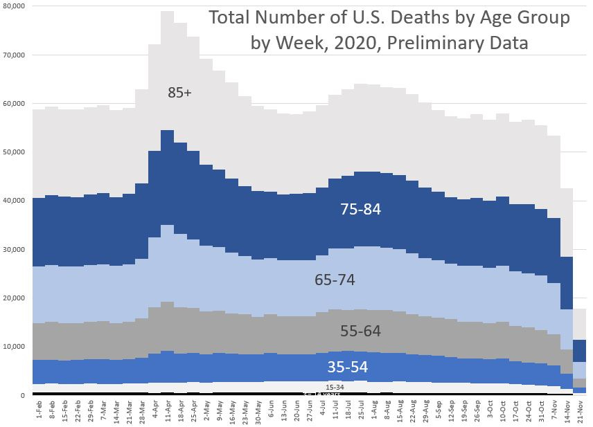
I thank a reader who realized I screwed up a graph on a prior post: COVID Mortality with Meep: The John Hopkins Post That Was Yanked. The reader saw that the y-axis must be doubled, given that there are about 3 million deaths in a year, and if one breaks it out by ~50 weeks, you get about 60K deaths per week…. not 120K.
What had happened is I forgot to filter out that the data set has deaths totaled by sex (male/female) and then gives the all sexes total. So each death was, indeed, counted twice.
Here is the fixed graph, which of course has the same proportions as before, just everything halved:
The graph has been fixed in the old post.
The accompanying spreadsheet is found here, with fixes… plus, I took the opportunity to do a few more graphs.
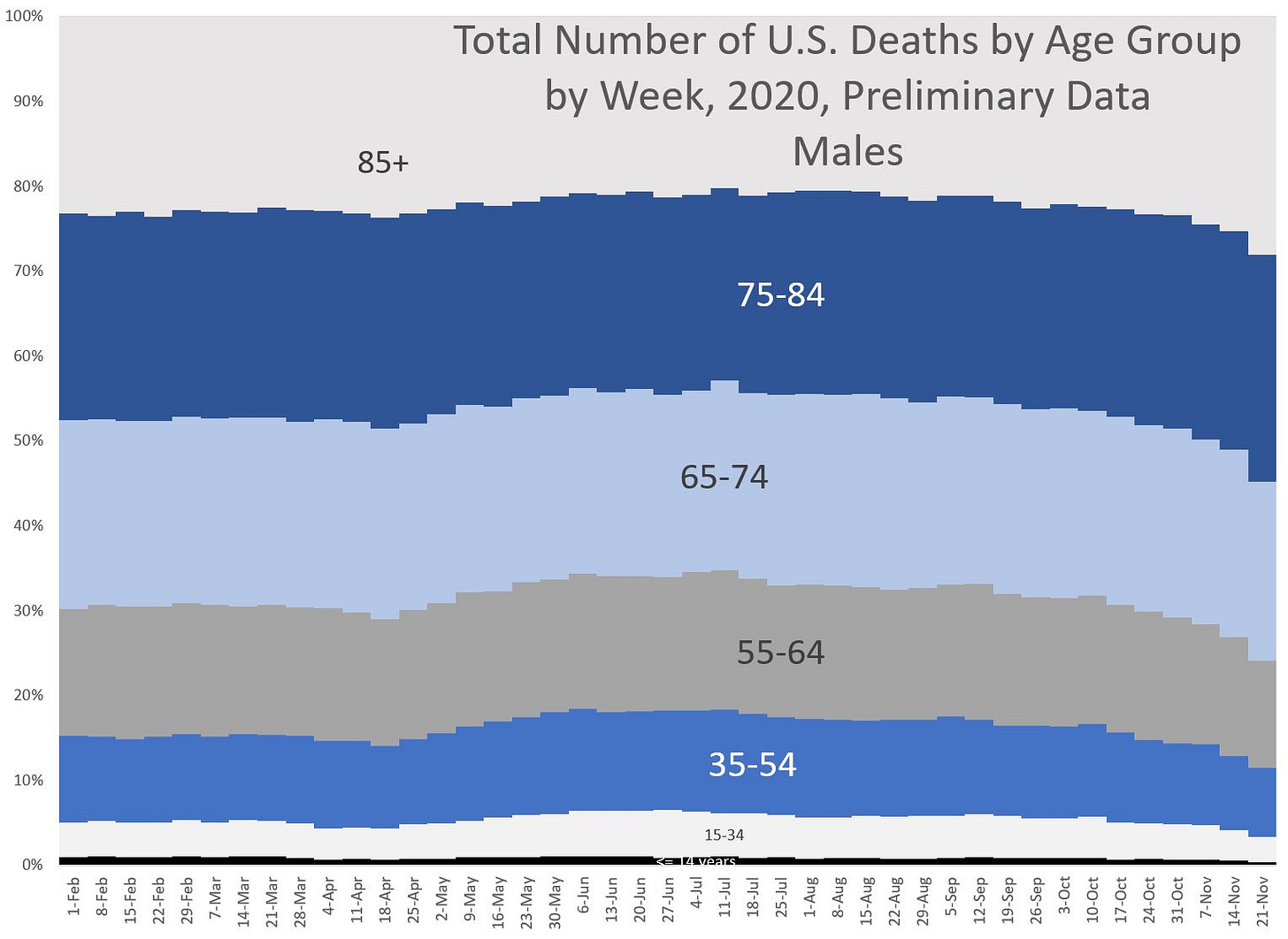
Male Deaths by Week
Totals:
For the entire period, there are 1,346,939 male deaths recorded (all causes)
Percentages:
For the entire period, only 22% of male deaths are among ages 85+.
Female Deaths by Week
Totals:
For the entire period, there are 1,232,515 female deaths recorded (all causes). That’s 9% less than male deaths. That’s a pretty sizable gap.
Percentages:
For the entire period, 38% of female deaths are among ages 85+.
Quick observations
First, look at the percentages — the difference in the age 85+ category popped out at me, partly because it’s at the top, and mainly because it’s so huge for females. Almost 40% of female deaths in 2020 (so far) have been in the age 85+ category.
So, where do the differences with males among categories come in? Obviously, the difference is huge for age 85+ — only 22% of male deaths are up there.
Interestingly, the same proportion occurs for age 75-84: 24% of deaths for both males and females.
The differences can be seen in ages 15-74. Males have higher percentages of deaths at those ages compared to females.
Here, let’s just compare directly:
I am really not liking that huge amount for men under age 55. That is disturbing to me. I will have to go into that in a later post.
But let us consider another difference — both sets have a peak for the week ending April 11. How high is that peak compared to the “natural” level? (aka 3 weeks earlier)
Male deaths went up 36%, female deaths went up 31%.
By the way, one can see that the percentage dying by age group has changed over time, and during “post-COVID” times, we’re seeing many more men age 15-54 dying compared to before COVID hit.
For women, the percentages mainly changed during the April peak, but I’m seeing some elevated mortality in the 15-54 group for them, as well. It’s just not as pronounced among women.
As I’ve mentioned in this post, Mortality with Meep: Comparing COVID-19 and 2020 Total Death Rates Against U.S. Historical Rates, I believe the heightened mortality for the younger age groups is not coming directly from COVID, but all the social and economic fallout of COVID-related policies and behavior.


