COVID Mortality with Meep: Making Comparisons, by Age, Week, and State
Looking at the big picture before drawing conclusions
First up, a notice: I will be doing a Twitter conversation with R. Dale Hall of the Society of Actuaries and Magali Barbieri of the Human Mortality Database:
Unfortunately, the United States is about to reach and exceed 3,000,000 deaths for the first time in a single year. In addition, the U.S. may reach 1,000 deaths per 100,000 of the population. At the SOA, we’d like to hear your comments and thoughts on these trends. Is 2020 an anomaly? Will these mortality trends continue?
….
That’s why we want to hear from you. What’s your expectation for 2021 and forward? What’s been the impact to your work? So let’s hear your thoughts – send on to us at research@soa.org your thoughts or comments on these emerging mortality trends.Join us for the SOA’s Twitter chat on Dec. 8 at 1 p.m. Eastern on mortality challenges and trends. This twitter chat on @SOActuaries will include SOA member Mary Pat Campbell, FSA, MAAA, Magali Barbieri from the Human Mortality Database, and R. Dale Hall, FSA, CERA, CFA, MAAA, SOA managing director of research. Join us Dec. 8. #SOATalksMortality
Obviously, the conversation will remain on Twitter after it’s done on Tuesday, but you can always remark to us. (My Twitter handle is meepbobeep.)
In my own death projections for 2020, I agree with Dale that the total is almost definitely going over 3 million this year. We had been approaching that level just through the aging of U.S. society, and had had 2.8 million deaths in the U.S. in 2018, the last year with full data.
My projections currently have U.S. deaths coming in over 10% higher than 2018, which would definitely push us over 3 million.
Age structure of total deaths by week
In prep for the discussion on Tuesday, I’ve downloaded the most recent CDC data, last updated on Wednesday, December 2. The data go up to the week ending November 28, but of course the most recent 4 weeks or so are very incomplete. I will include those weeks, though, just because. For week-by-week graphs, this incompleteness will be obvious.
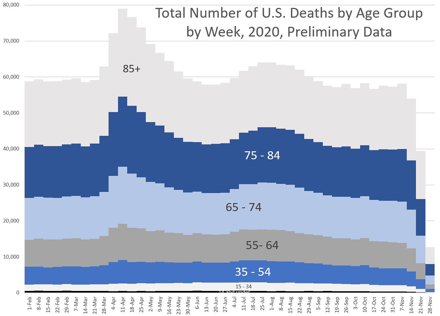
Here are the total deaths by week:
Again, total deaths. You may disbelieve the COVID-specific graphs to come (whether you think COVID deaths are over-counted, under-counted, or something else), but the total death count is a metric that is difficult to fake. You can clearly see two waves of excess mortality in this graph, and the first wave was severe.
Total deaths increased from about 60K/week to a peak of almost 80K over a 3-week period. That’s an increase of about one-third in three weeks. During “bad” flu seasons we’ve not seen a spike that extreme in terms of magnitude, though sometimes in that sort of speed.
I wish I had similar data like that for the Spanish flu, but that is difficult to come by. Getting week-by-week death counts on a national level was not a priority in 1918, given they were wrapping up a war and had other issues to deal with.
Age structure of COVID-19 deaths by week
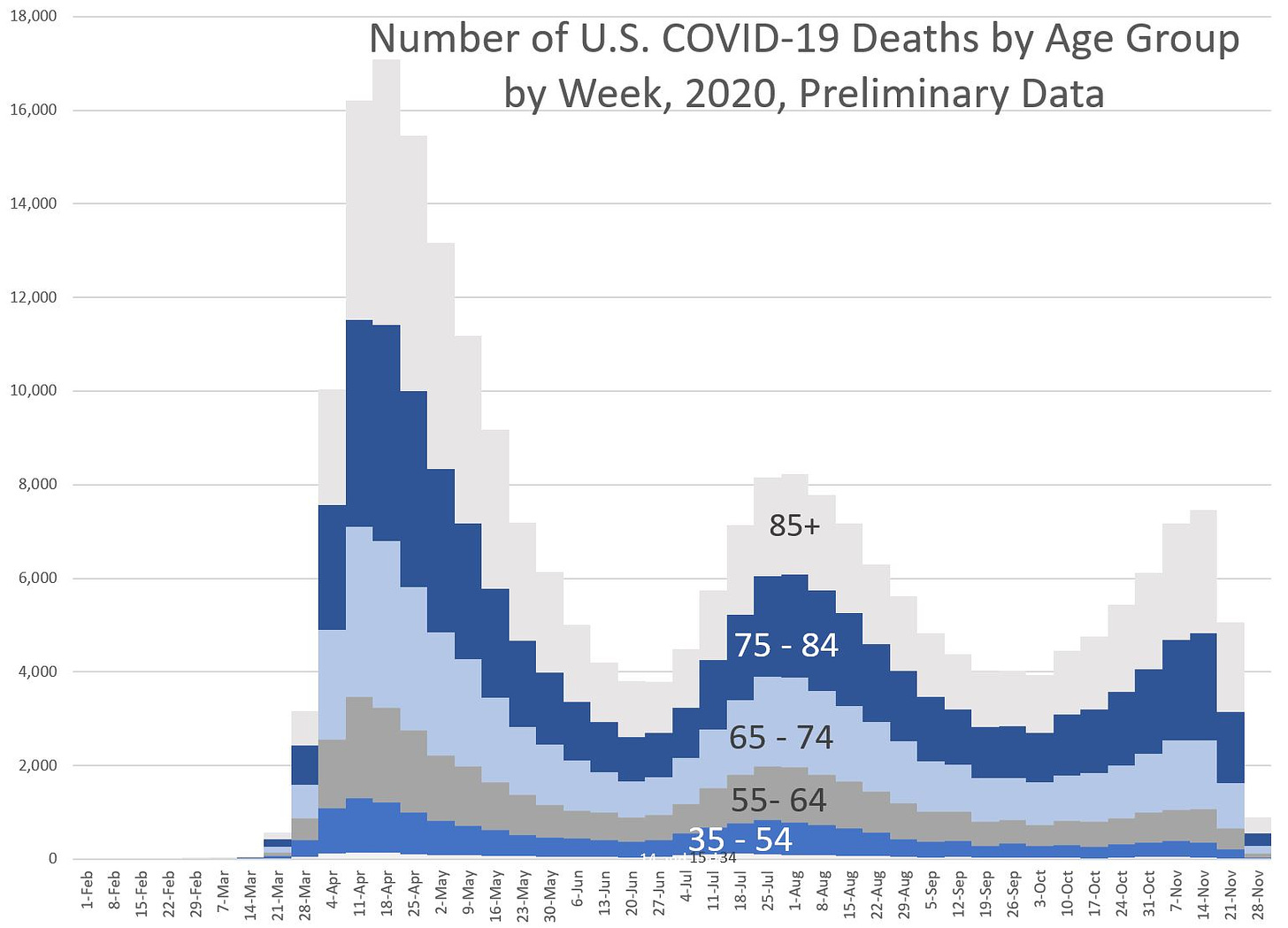
So now let me graph the COVID deaths:
We can see three waves in this graph, which we really don’t see in the prior graph (yet). I think part of this pertains to how deaths are reported to the CDC — for obvious reasons, COVID deaths get priority in reporting. Other deaths may be processed more slowly, and so while we may be close to complete of COVID deaths for the week ending November 7, say, we may be far from having all the deaths from all causes reported.
What portion of deaths this year have been attributed to COVID-19?
One way we could test this theory is to graph the percentage of reported total deaths that have been attributed to COVID-19. This may show us data issues as well as spikes in COVID mortality.
Well, that certainly is interesting. Obviously, there is still the three-wave structure, and now we can clearly see that COVID deaths are a small percentage of total deaths for those under age 35.
I added a big black dashed line so you can see the pattern for the whole population, and you can see how different age groups deviate from that. I still say past November 14, there is an issue with the completeness of data, but that will get cleared up over time. We see a drop off in percentage for COVID deaths those last couple weeks, so perhaps that has to do with which states report their deaths the promptest.
Some states have been notorious this year in being tardy in reporting to the CDC: I’m calling out CT, NC, and WV in particular, though CT has been getting a little better.
Animated gif of COVID deaths as percentage of total deaths
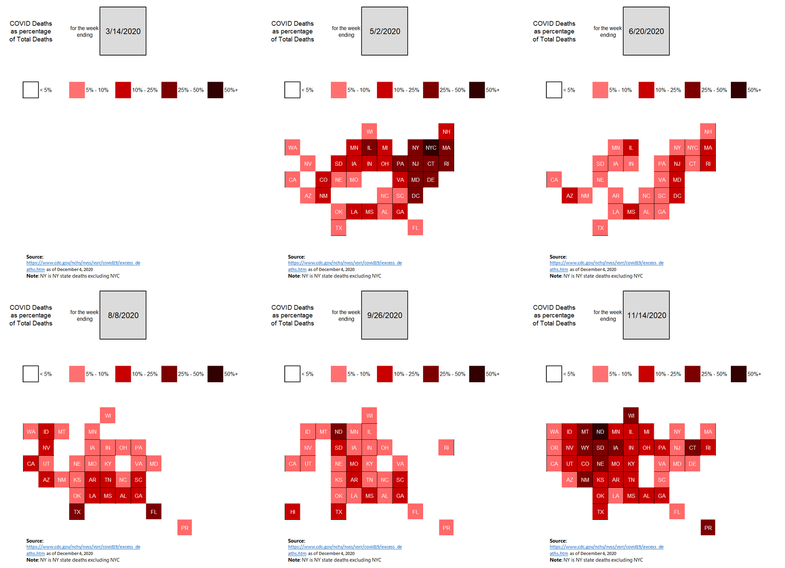
Let’s look at how the COVID deaths spread across the U.S.
The three waves can be somewhat seen: the one in April is centered around NYC, the summer one was more south and west, and the fall one is worst in the upper midwest, more or less, but has spread throughout the country.
(NC and WV disappeared in October/November not because they have low COVID deaths, but that they’re really slow in reporting to the CDC.)
Notice in all of the above, I am not positing why we’re seeing these patterns. I just want people to see the patterns for now, in context of everything else.
Too often, a lone statistic is plucked with respect to deaths, infections, whatever, without comparing/contrasting among areas. While it passes the time if you’ve got nothing better to do, it doesn’t help to get at true cause-effect chains, or if the lone statistic is a spurious correlation.
Related posts
Nov 23: Mortality with Meep: The Sex Gap in COVID and Total Mortality
Dec 1: COVID Mortality with Meep: Update of Graph -- Plus Age and Sex Breakout by Week
Oct 23: Mortality with Meep: Comparing COVID-19 with Historical Mortality and Prior Pandemics
Nov 7: Mortality with Meep: Comparing COVID-19 and 2020 Total Death Rates Against U.S. Historical Rates


