Updated Public Pension Projection Tool -- Includes Fiscal Year 2023 Data
Merry 4th Day of Christmas! Let's make this an annual treat!
I looked, and it seems that, with all the [waves arms] this year, I didn’t get around to officially releasing a Public Pension Projection Tool update for FY2023.
Well, here it is now! One year after last year’s update!
Spreadsheet: with FY 2023 Data
Data Info
Basic info: Public plan data comes from the Public Plans Database, which comes from the group at the Center for Retirement Research at Boston College, ably run by the now-retiring Alicia Munnell.
For the data in this release:
The Public Plans Database (PPD) currently contains plan-level data from 2001 through 2023 for about 230 major state and local government pension plans — with about half of plans administered at a state level and half administered locally. This sample covers 95 percent of public pension membership and assets nationwide. The sample of plans is a carry-over from the Public Fund Survey (PFS), which was constructed with an eye toward the largest state-administered plans in each state, but also includes some large local plans such as New York City ERS and Chicago Teachers.
I downloaded the full data set today, 28 December 2024, using the PPD plan-level data. There are multiple data sets (retirement systems, police and fire supplement, defined contribution, investment details, fixed income: credit rating, fixed income: duration, etc.) that I am not currently incorporating in this tool, as it is a simple model.
If you go to their data release info page:
The December 2024 update featured:
FY 2023 data for virtually all of the state and local defined benefits plans in the PPD, sourced from plan reports released through September 2024.
All the FY2023 reports should be there, except for the total slackasses.
I reviewed plans with missing data (see ASOP 23). As long as I had data that looked “okay” up to the last year available, I kept it. I still had to remove a handful of plans.
The model used for projections is extremely simple: a constant annually compounding investment return, and constant growth rate for various cash flows:
Contributions
Benefits
Expenses
I project only to FY2040, as even a decade’s worth of projections with such simplistic dynamics is questionable.
I will demonstrate how the tool works with two plans, so you can see the sorts of inputs and outputs.
Illinois Municipal
Do NOT confuse this with Chicago Municipal (that will be the second test case).
When you open the file, make sure of two things:
You’re on the tab labeled “Projection Results”
You have the calculation set up as Automatic (if it’s on manual, make sure you force a calculation after each selection change).
After download, you’ll see that Illinois Mutual is already selected. Let’s just go with what’s there as the default.
All the items in the yellow can be changed — the plan and the projection assumptions. All the remaining items are outputs.
If you scroll to the right, you will see the 5-year and 10-year statistics for the plan:
Interesting — a negative contribution growth rate for Illinois Municipal.
To the lower left, there is a graph of the assets, with one color showing the actual asset balances up to the reported fiscal year, after which it’s the projected amounts using the assumptions given.
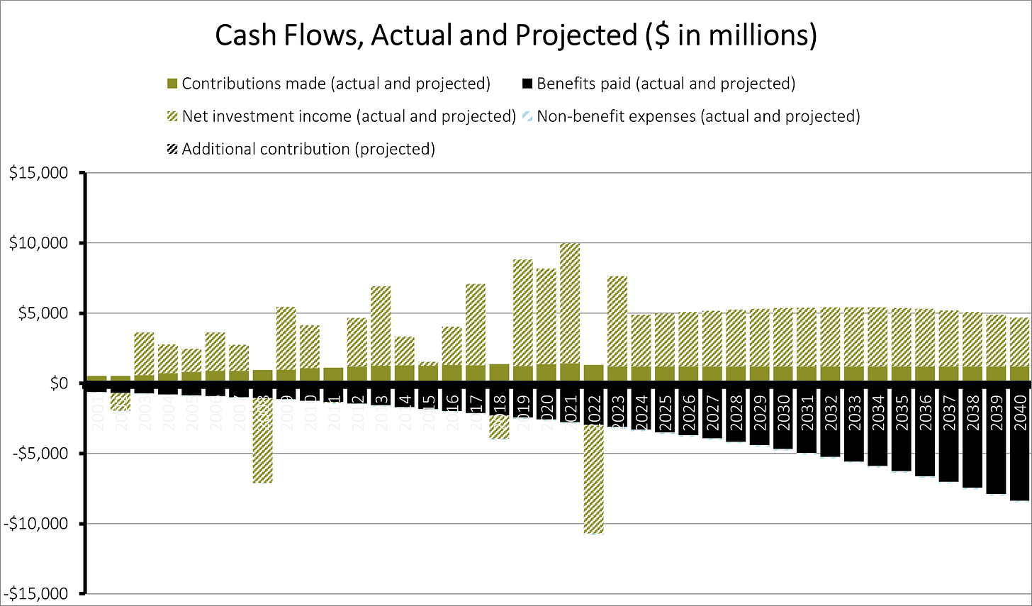
On the lower right is a cash flow diagram, with columns above the horizontal-axis being cash-flows in (contributions, positive net investment income — gains!) and columns below the horizontal-axis being cashflows out (benefits, expenses, negative net investment income — losses!)
The Illinois Municipal Retirement Fund is highly funded, and even with increasing benefits and no increasing contributions, it shows a sustainable pattern to the model horizon of 2040.
This is a very simple model, though.
Chicago Municipal
Let’s go back to the plan choice. There is a little arrow in the corner of the cell - if you click on that arrow, a drop-down list will appear.
There are 221 plans in the tool (I had to remove some due to my data quality requirements), listed in the drop-down list in alphabetical order. Let us choose Chicago Municipal.
Before we choose the projection assumptions, let’s look at the actual statistics for this plan.
I don’t think those contribution growth rates are sustainable.
As a stress test for this plan, let’s check out what happens if we freeze the contributions, have the benefits growing at 5% per year, and assume no investment returns. (This is unrealistic — I’m just trying some ideas.)
The assets run out by FY2036, as noted in the Projected Fund Depletion Date, and the second number explains how much the contributions need to be boosted in FY2036 to cover the outgoing cashflows.
If you look at the FY2037 column, the first column past asset depletion, the contribution had to be increased 75% compared to the prior year.
It keeps growing after that on a pay-as-you-go basis — that’s what happens when public pensions run out of assets. They become pay-as-they-go.
(Or pay-only-partly-as-they-go.)
Related Posts
The list of older posts below will give you an idea of what uses I put this tool to, and prior updates:
April 2017: Watching the Money Run Out: A Simulation with a Chicago Pension
May 2017: Testing to Death: Which Public Pensions are Cash Flow Vulnerable?
Dec 2019: Merry Christmas! Have New Public Pensions Projections
Sep 2022: Labor Day 2022 Gift: Public Plans Projection Tool Update!
March 2023: Congrats to Lori Lightfoot! No Pension Failures on Her Watch!
July 2023: Chicago Pensions: Drowning, Not Waving
December 2023: Updated Public Pension Projection Tool -- Includes Fiscal Year 2022 Data


