COVID Mortality with Meep: The John Hopkins Post That Was Yanked
Yes, COVID is a serious mortality event; no, JHU is not involved in a conspiracy
I’m getting extremely angry over COVID mortality items again, and there is a lot of blame to go around.
I have seen this in multiple places, and I will link to only one version of this, because this is the one I’ve seen shared most often.
At Not the Bee: “corona is nbd” (no big deal)
I share this post’s complete title, and then I’m going to rip it apart.
Johns Hopkins published this study on [last] Sunday which posits that Covid is nowhere near the disaster we’re being told it is. I would summarize it for you or offer pull-quotes but honestly you just have to read it yourself because it’s mind-blowing. The original article is now deleted from the Johns Hopkins website … for some reason. Luckily the internet is forever and it’s available via the Wayback Machine. Here is the article in its entirety:
I would get to that article, but you can, first, follow the link, and here is the conclusion the Not the Bee author comes up with:
Facebook and Twitter will certainly block this article within hours of its publication. Just like Johns Hopkins deleted it from its site. The question is … why?
Facebook and Twitter block all sorts of dumb stuff, and lets other things through, so I’m not going to answer for them.
UPDATE: JHU tweeted that they deleted the article because it “was being used to support false and dangerous inaccuracies about the impact of the pandemic.”
…..Importantly, they didn’t say anything in the article was incorrect. So we’re just memory-holing studies that don’t align with the narrative? Got it.
GRAAAAAAAAAH.
Yes, it’s entirely true but the conclusion isn’t what you say it is “Doc Holliday”, if that is your name.
In this crap, I know I will not get as much circulation as the pseudonymous Doc Holliday, nor the idiot move by JHU, but I have two points:
1. That we get the same age profile (in percentage of deaths) in a COVID year as in prior years does not lead to the conclusion that “COVID is nbd”
2. Johns Hopkins University has had a dereliction of duty if they yanked a post like that. They should have kept it up and explained what I’m about to explain about point #1.
I will try to address these in turn, but before that, here are some of my prior COVID mortality posts:
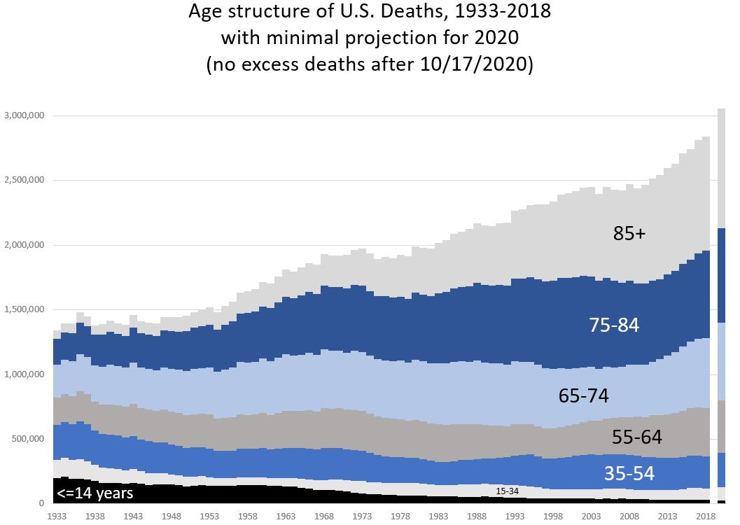
October 23: Mortality with Meep: Comparing COVID-19 with Historical Mortality and Prior Pandemics – this is comparing total number of deaths increases going back to 1933, the earliest I can get detailed data in the U.S.
November 7: Mortality with Meep: Comparing COVID-19 and 2020 Total Death Rates Against U.S. Historical Rates – comparing death rates going back to 1933
November 23: Mortality with Meep: The Sex Gap in COVID and Total Mortality
For that last item, I noted that the sex gap in COVID mortality, 2020 all-causes mortality, and “before times” all-causes mortality was not all that different.
Fundraiser plug: I’m wrapping up my fundraiser for the Movember Foundation for 2020 — I fundraise because they support programs for reducing men’s deaths (and I love men!), but mainly because of my husband Stu, who has advanced prostate cancer, diagnosed in 2017. Please donate!
That COVID is killing off men proportionally to how other things kill off men does not mean it’s “no big deal”, no more than if I pointed out black people in the U.S. were getting killed off by COVID proportionally to how everything kills them more.
Does it sound so great when I put it that way?
The original JHU blog post
The Not the Bee link copies the original post, but let’s use the Wayback link, just in case.
I’m not copying the whole thing, but what I consider the heart of the results.
According to new data, the U.S. currently ranks first in total COVID-19 cases, new cases per day and deaths. Genevieve Briand, assistant program director of the Applied Economics master’s degree program at Hopkins, critically analyzed the effect of COVID-19 on U.S. deaths using data from the Centers for Disease Control and Prevention (CDC) in her webinar titled “COVID-19 Deaths: A Look at U.S. Data.”
From mid-March to mid-September, U.S. total deaths have reached 1.7 million, of which 200,000, or 12% of total deaths, are COVID-19-related. Instead of looking directly at COVID-19 deaths, Briand focused on total deaths per age group and per cause of death in the U.S. and used this information to shed light on the effects of COVID-19.
…..
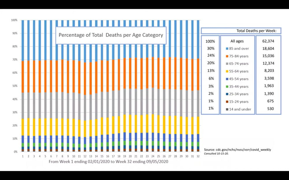
After retrieving data on the CDC website, Briand compiled a graph representing percentages of total deaths per age category from early February to early September, which includes the period from before COVID-19 was detected in the U.S. to after infection rates soared.Surprisingly, the deaths of older people stayed the same before and after COVID-19. Since COVID-19 mainly affects the elderly, experts expected an increase in the percentage of deaths in older age groups. However, this increase is not seen from the CDC data. In fact, the percentages of deaths among all age groups remain relatively the same.
Let me see if I can replicate the same results. I wouldn’t be surprised if I did, because I have seen something close to what they’re showing when I did my earlier posts:
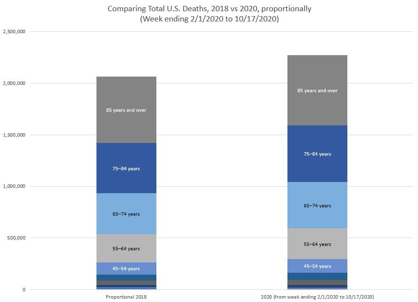
One of the graphs from my spreadsheets (go get the spreadsheet to check it’s there) I didn’t share was this one:
The reason I didn’t share that one was because I thought it was boring compared to this one:
The first graph does show that the proportion of deaths during the “COVID times” is about the same as it was in 2018. It just so happens that the total number of deaths for that period was about 10% higher than that seen in 2018.
The shape of mortality is robust
I want you to think for a moment: if deaths doubled for each age group, then the age distribution of deaths would remain proportional, too. Keeping the same age structure of deaths doesn’t tell you how bad a pandemic is.
That the age structure stays the same may tell us something interesting about the shape of mortality, which actually holds to a “law” that we haven’t emphasized much in actuarial science in recent years, because it’s so easy for us to get data now. But there is a functional form that fits mortality rates by age extremely well, and actuaries use it to smooth out mortality tables, particularly for ages past those we have a lot of experience data for.
The Wikipedia entry for this is the Gompertz-Makeham law of mortality, which isn’t so much a law as an observation that works really well at advanced ages. It doesn’t work that well for ages under 35 or so, but it works extremely well after that. (Okay, some argue it doesn’t work very well for very advanced ages, but we’ll ignore that for now).
Replicating mortality results
In any case, let me do the same week-to-week mortality graphing. The week-by-week data by age and state can be found here.. I just downloaded the data, which was last updated on November 25, 2020.
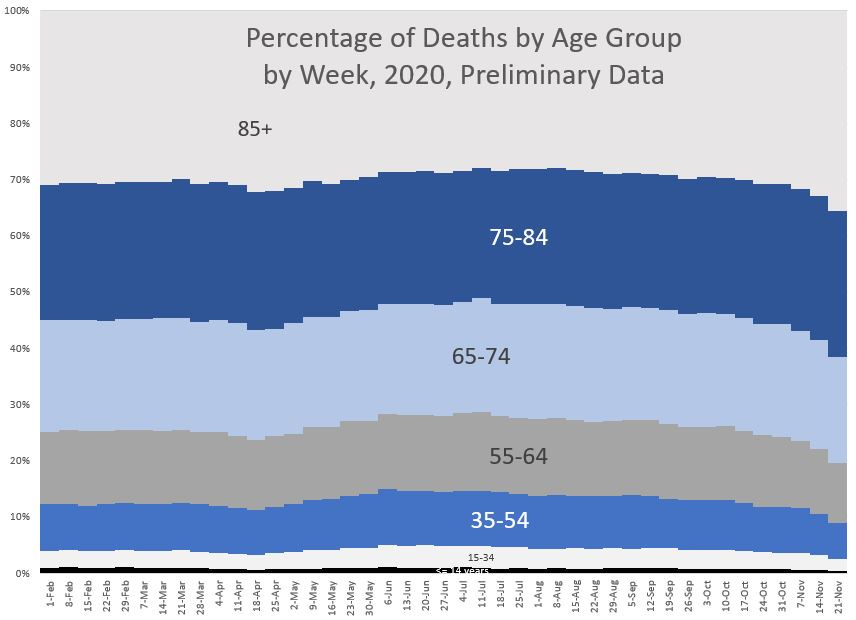
Here is the percentage graph by age group for the entire United States, week-by-week:
Hmmm, there are some fluctuations, but the structure is pretty intact. Obviously, the last few weeks are distorted because we have only partial data for about the last month.
(Note: I can get really snooty about how I’ve set up Excel graph templates, and I don’t use the Excel defaults, yadda yadda. BUT I AM BETTER THAN THAT (no I’m not (go pay for my webinar on making graph templates)))
Okay, let’s pretend there are no fluctuations in the age structure. That has little meaning.
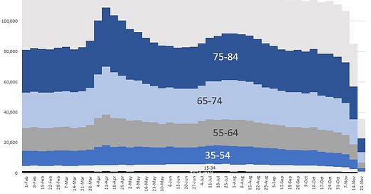
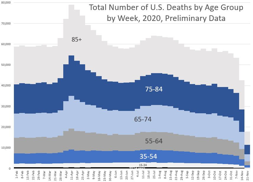
Let’s look at the same graph where it’s not the percentage of total deaths, but just the count of total deaths.
UPDATE: The prior version of this graph had doubled numbers. See here for explanation.
Okay guys, do you see how the deaths spike in April? And there’s another peak in the summer?
From the base of about 60K deaths per week before the COVID spike, we had a peak of almost 80K deaths for the week ending April 11, 2020.
Over a three week period, from the week ending March 21 to the week ending April 11, the number of deaths increased by 33%.
THIS IS NOT “nbd”. (“no big deal” for those not familiar with the initialism.)
The age structure of death can be entirely the same, but the total number of deaths skyrocket. As it is, the increase year-over-year looks like it will be 10%-ish in the order-of-magnitude neighborhood. That’s worse than prior pandemic mortality impacts for over 100 years — the Spanish flu pandemic was far worse, but that’s how far back we have to go to get something that bad.
Shame on JHU for yanking a blog post
Here is what stands where the original blog post used to be.
I’m going to be both nice and nasty in my response to what JHU did.
The blog post was written by Yanni Gu, and that author relayed what Genevieve Briand presented. Briand was just plain wrong in some of her conclusions, and perhaps she was the person who asked the post to be yanked, because she was embarrassingly wrong.
But no matter who asked for the blog post to be taken down, it should not have. They should have left it up, and had a more knowledgeable person at JHU do direct rebuttals where Briand was wrong. I did not like this bit in their excuse:
As assistant director for the Master’s in Applied Economics program at Hopkins, Briand is neither a medical professional nor a disease researcher.
Yeah, well, I’m not a medical professional nor a disease researcher. But I know how to count dead people. Medical professionals and disease researchers are not known for their statistical prowess, either, and if you’d like to argue that, buy me some drinks. And I will argue with you.
That said, Briand was just plain wrong. There has absolutely been excess mortality this year (I don’t know how she whiffed that soft ball), and no, not all the excess mortality has been directly from COVID. But the excess mortality has been extremely noticeable, in absolute terms and terms of death rates. It is possible she plain miscalculated things, but I will not speak for her.
I’ve had my own multi-million-dollar calculation errors (buy me a drink, and I’ll tell you about it… it’s not a blog thing), but on my blog, when I’ve screwed up, I don’t delete the post. I make corrections. Here is an example: UPDATES and REPOST: Public Pension Watch: How Important is the Mortality Assumption? And Other Assumptions?
Yanni Gu simply reported what Briand had presented, and it’s not fair to Gu to yank their piece like that. JHU should have left the piece up, and then added whatever rebuttals were necessary for Briand’s errors.
Pulling the piece has simply fueled the conspiracy theory folks, and JHU should have known that was what would have happened. I absolutely agree that Briand screwed up in her analysis, but frankly, pulling her piece does her no favors. Leave it up, let it be rebutted, and we could all have moved on.
COVID has been a serious mortality event in 2020
For the record, COVID has absolutely increased mortality in the United States in 2020 at least 10%, compared to 2018 (I don’t have 2019 data). That is a huge increase, yes, even over two years.
I have done my own analysis based off of CDC data, by week of death (date of occurrence, not date it was reported), age grouping, and even sex. I have done multiple posts on this.
I would love to have an argument over policy decisions, but I can’t do that until I can get people to agree, at a very minimum, the total deaths we’ve seen in 2020. If you think that deaths increasing over 10% is “no big deal”, I can’t have a policy discussion with you. You have no clue what the historical results have been.
I have my own view on policy, and many of the people who agree with me on policy are trying to minimize the impact we’ve already seen. Then the people I don’t agree with on policy abuse the statistics in other ways.
Sorry, guys — sometimes there are no win-win choices. Sometimes you’re looking at situations where all the outcomes are bad, and you’re trying to make the argument that one is less bad than another.
If you start fantasizing about scenarios that are not within our realm of choice, then no, I can’t have a discussion with you.
Here are the spreadsheets used in all the above analysis:
Provisional_COVID-19_Death_Counts_by_Sex__Age__and_Week as of 25 Nov 2020.xlsx – file updated on 1 Dec 2020, see here
COVID pandemic mortality comparisons and 1933-2018 number of deaths.xlsx
COVID pandemic mortality comparisons and 1933-2018 death rates.xlsx
All my data comes from either the CDC or mortality.org (which ultimately came from the CDC research reports). If you find any issues with my spreadsheets, feel free to email me at marypat.campbell@gmail.com.
I have no issue with correcting myself. My highest value is truth, and me being wrong is something I expect.

