Cancer Death Rates by Age and Gender for the U.S., 1968-2023
Yes, there was a strange spike in cancer deaths for the elderly in 2021. Hmmm.
Let’s get cracking!
Spreadsheets will be downloadable at the end of the post.
Male Cancer Death Rates
I do have all the age groups represented in this graph… you just can’t see the under age 35 groups because their death rates are so low. We’ll get to them in a moment.
Some notes:
There’s a spike in the death rates in 2021 for the oldest men. Hmm. Interesting. I’ll come back to that.
Each of these older male death rate curves has a peak in death rates… but that peak is at an earlier year for younger males. Here is a list of when the highest death rate occurred for each group:
Age 85+: 1995
Age 75-84: 1990
Age 65-74: 1990
Age 55-64: 1985
Age 45-54: 1978
For the younger groups, it was pretty much a decrease in the rates the entire time.
Younger Male Trends
Isn’t that great?
The pattern we see with older men is almost entirely related to smoking history and lung cancer, though we’ve seen some similar patterns with prostate cancer, as I’ve written about in the past.
Female Cancer Death Rates
There are similar patterns in female cancer death rates, except the rates are lower than males, and the peaks occurred at later dates:
Age 85+: 2000
Age 75-84: 2000
Age 65-74: 1994
Age 55-64: 1985
All the younger groups show a decreasing trend throughout.
Younger Female Trends
As with the younger males, the younger females show an improving trend in cancer death rates throughout the period — and there isn’t much difference in these very low death rates for those under age 25 years old.
Looking at the oldest age groups
When I put both male and female curves on the same graph, you can see the large mortality rate gap between the sexes.
When it comes to cancer specifically, some of the differences come from the history of smoking differences. Smoking has had a huge impact on cancer incidence and survivorship.
Out World in Data has a page on smoking specifically, and let us look at the section on gender differences:
The period they cover is 2000 to 2020 (though I’m skeptical that 41% of American men smoked in 2000) — American men did have a peak of smoking post-World War II, after many men who went off to war got hooked on free cigarettes they got with their kit. That’s how my grandfather got started. The peak for men smoking in the U.S. was probably in the 1950s.
But it wasn’t socially acceptable for women to smoke - until about the 1970s. So the peak for women smoking didn’t come until some decades later.
So the peak for lung cancer for women came decades later.
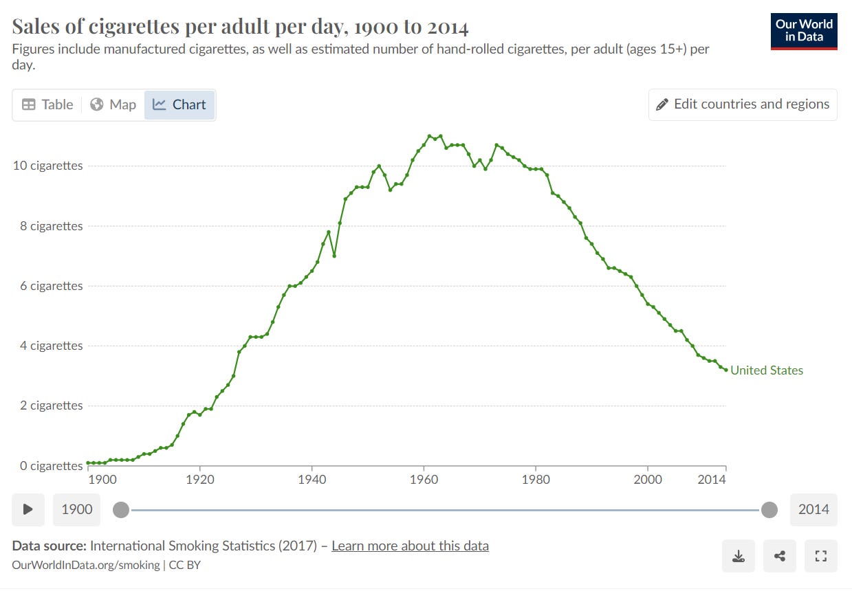
This doesn’t give a gender split, but you can see the peak for cigarette sales was the early 1960s.
That’s the average per capita per adult — once can make estimates based on how many cigarettes a regular smoker usually smokes, yadda yadda… and then how apt women are to to smoke, etc. In any case, the above chart is heavily tied to what we see with older person cancer mortality.
But what about that cancer spike in 2021?
The Danger of Estimates?
So I went looking at what the various cancer types and numbers of deaths, and then realized what had happened… in the denominator of what I was calculating.
For these calculations, we’re using Census estimates of the population for the particular group, as of mid-year.
This is what happened to the age 85+ population estimate year-to-year: (I’ll start with 2010)
Something odd is going on, eh?
Now, we know there was a large death event for the elderly in 2020, so that would obviously have an effect on the population estimate for 2021.
In general, the death rate for those age 85+ is fairly high (though decreasing year-over-year), but the population increases because those age 84 live to be age 85, and there is a small amount of immigration of elderly people.
But mainly it’s that more people age 84 survive to age 85 than those age 85+ die.
The question is: do we believe that the total age 85+ population dropped 10% from 2020 to 2021?
And then increased 9% from 2021 to 2022?
The problem seems to be something going on in the population estimates - that is the estimate in the denominator, not the numerator.
Something seems off.
I will need to email the WONDER folks to see what’s up. I think their estimate may be wrong. But that would also explain why there is a spike in cancer rates for age 85+.


I'm guessing the estimate is somehow tied to nursing home populations, and in 2020, no one with other options went into full care nursing facilities.