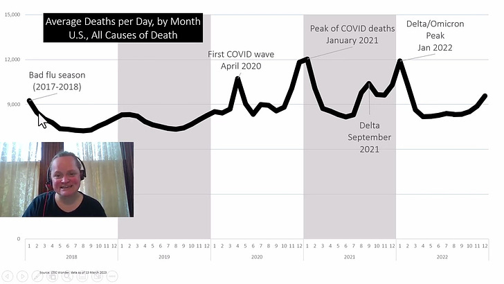
Video: U.S. Mortality Through the Pandemic, All Causes and by Age Group, Provisional through 2022
First video of a series
As mentioned in a prior post, I recently gave a talk to Iowa Actuaries.
I promised to make some videos based on that talk, but because I assume most of this audience is not actuaries, I am going to be doing more explanation, and splitting the talk into sections.
Video: High-level trends through 2022
In this video, I look at the mortality rates through 2022 for the United States. The 2022 rates are provisional.
I got the data in mid-March 2023. Data will not be finalized until December this year, at the earliest, just from experience. The finalized 2021 data were not released for use through CDC WONDER until January 2023, for example.
As promised, there will be more videos forthcoming. This is just the first 9 slides from a 70-slide deck. Oh yes.
Graphs from Video
For convenience, here are the graphs
Crude rate & age-adjusted rate
This is using the 2000 std population weights for age-adjusted rates, as shown in this publication: “Age Adjustment Using the 2000 Projected U.S. Population”.
Because the CDC doesn’t sit waiting around for the Census Bureau to get the census done, the weights never exactly match the actual population.
More on crude rate vs age-adjusted rate: Mortality Basics with Meep: Age-Adjusted Death Rates v. Crude Death Rates for U.S. 1968-2020
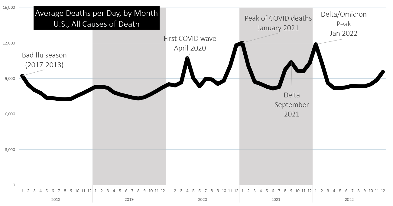
Average Deaths per Day (by Month), 2018-2022 (provisional)
Percentage Change in Deaths Compared to 2019, Monthly
Death Rates by 5-Year Age Group, 2018-2022, U.S. - Linear Scale
Death Rates by 5-Year Age Group, 2018-2022, U.S. - Logarithmic Scale
I mentioned Gompertz-Makeham form here: Geeking Out: Fitting Florida COVID Case Fatality Rate to Gompertz-Makeham Form
To condense this down – there is a “frailty” that seems to grow with age, such that the “force of mortality” (the logarithm of the probability of death… instantaneously (just go with it for now)) grows linearly.
Basically, past a certain age, the probability of death doubles every n years, if most of the deaths are “natural” – i.e., infectious disease, cancer, heart disease, etc. That’s why it works well for age 40 and above — below that age, there are too many “unnatural” deaths by accident, homicide, suicide, drug use, etc. Those causes exist above age 40, but they’re not as large a cause as the natural causes.
Actuaries often “complete” mortality tables via using functional forms at very high ages. In general, even the accidental causes of death follow a frailty pattern at very old ages.
Percentage Difference from 2019 Death Rates, by 5-year Age Groups, U.S., 2018-2022
Of course, this is the key graph we will be thinking about in future videos - why does it look like this?
Links
Dropbox
My slides and spreadsheets can be downloaded from my dropbox here:
https://www.dropbox.com/sh/nbqey8kyb3l4mla/AABIHYHzsk4zCi-WMqjJCvJla?dl=0
Society of Actuaries
In the video, I mentioned that there was SOA research where different definitions of “excess mortality” was examined and applied to the pandemic in the U.S. Here are the pages for that research — all reports by Rick Leavitt, ASA, MAAA.
August 2022: 2020-2021 Excess Deaths in the U.S. General Population by Age and Sex
2020 Excess Deaths in the U.S. General Population by Age and Sex (Updated May 2021)
In addition, the SOA puts out a variety of mortality related reports. I highly recommend this report on general U.S. population mortality, using finalized data:
U.S. Population Mortality Observations – Updated with 2021 Experience
And check out this Tableau dashboard:


