Geeking Out: Fitting Florida COVID Case Fatality Rate to Gompertz-Makeham Form
Also, looking at Florida COVID vaccination numbers
Okay, I was going to do a Taxing Tuesday, but screw it, I’m going to indulge myself.
It’s the eleventh day of Christmas! Party! Time for those pipers!
Noticing a pattern in Case Fatality Rates
It started, as it does, with a tweet:


I squinted and noticed that the data had a shape that looked familiar to me:

I’ll stop there with the tweets, and do a quick intro to Gompertz-Makeham’s “law”.
Observing a pattern to natural frailty
The Wikipedia article on Gompertz-Makeham law of mortality states that mortality rates by age can be decomposed into an age-dependent part (which takes an exponential function) and age-independent part…. I don’t want to delve too deeply into this for right now (I can do a full actuarial lecture later, and start bringing up papers on comparing Gompertz-Makeham fits for different countries.)
The upshot is this: if you take a logarithm of the probability of death (by age), you will generally see something like a straight line over older ages, usually from about age 40 (for the U.S.) up to about life expectancy or so. It gets a little weird for very old ages.
Gompertz wrote about his observation in 1825:
I now call the reader’s attention to a law observable in the tables of mortality, for equal intervals of long periods …. I observe that …. if the differences of the logarithms of the living at the ages n, n + m; n+m, n + 2m; n + 2m, n+3m; &c. be constant, then will the numbers of living corresponding to those ages form a geometrical progression; this being the fundamental principle of logarithms.
Art. 2. This law of geometrical progression pervades, in an approximate degree, large portions of different tables of mortality ; during which portions the number of persons living at a series of ages in arithmetical progression, will be nearly in geometrical progression
…..
Art. 4. It is possible that death may be the consequence of two generally co-existing causes ; the one, chance, without previous disposition to death or deterioration ; the other, a deterioration, or an increased inability to withstand destruction.If, for instance, there be a number of diseases to which the young and old were equally liable, and likewise which should be equally destructive whether the patient be young or old, it is evident that the deaths among the young and old by such diseases would be exactly in proportion of the number of young to the old; provided those numbers were sufficiently great for chance to have its play; and the intensity of mortality might then be said to be constant; and were there no other diseases but such as those, life of all ages would be of equal value, and the number of living and dying from a certain number living at a given earlier age, would decrease in geometrical progression, as the age increased by equal intervals of time; but if mankind be continually gaining seeds of indisposition, or in other words, an increased liability to death (which appears not to be an unlikely supposition with respect to a great part of life, though the contrary appears to take place at certain periods) it would follow that the number of living out of a given number of persons at a given age, at equal successive increments of age, would decrease in a greater ratio than the geometrical progression, and then the chances against the knowledge of any one having arrived to certain defined terms of old age might increase in a much faster progression, notwithstanding there might still be no limit to the age of man.
To condense this down – there is a “frailty” that seems to grow with age, such that the “force of mortality” (the logarithm of the probability of death… instantaneously (just go with it for now)) grows linearly.
Basically, past a certain age, the probability of death doubles every n years, if most of the deaths are “natural” – i.e., infectious disease, cancer, heart disease, etc. That’s why it works well for age 40 and above — below that age, there are too many “unnatural” deaths by accident, homicide, suicide, drug use, etc. Those causes exist above age 40, but they’re not as large a cause as the natural causes.
This type of frailty model is used for all sorts of “failure”-type models, not just for human mortality.
Fitting a Gompertz-type function to COVID case fatality rates in Florida works pretty well
Given COVID is a pretty natural process, as viruses go, and given the graph I had seen, I thought that trying to fit a Gompertz model would work pretty well.
Jon Taylor, of the tweet above, directed me to his github, where he has scripts to grab the latest official data from the state of Florida. So I grabbed the latest caseline data (too big to fit into Excel, btw, so I just used Access to create a Crosstab for me).
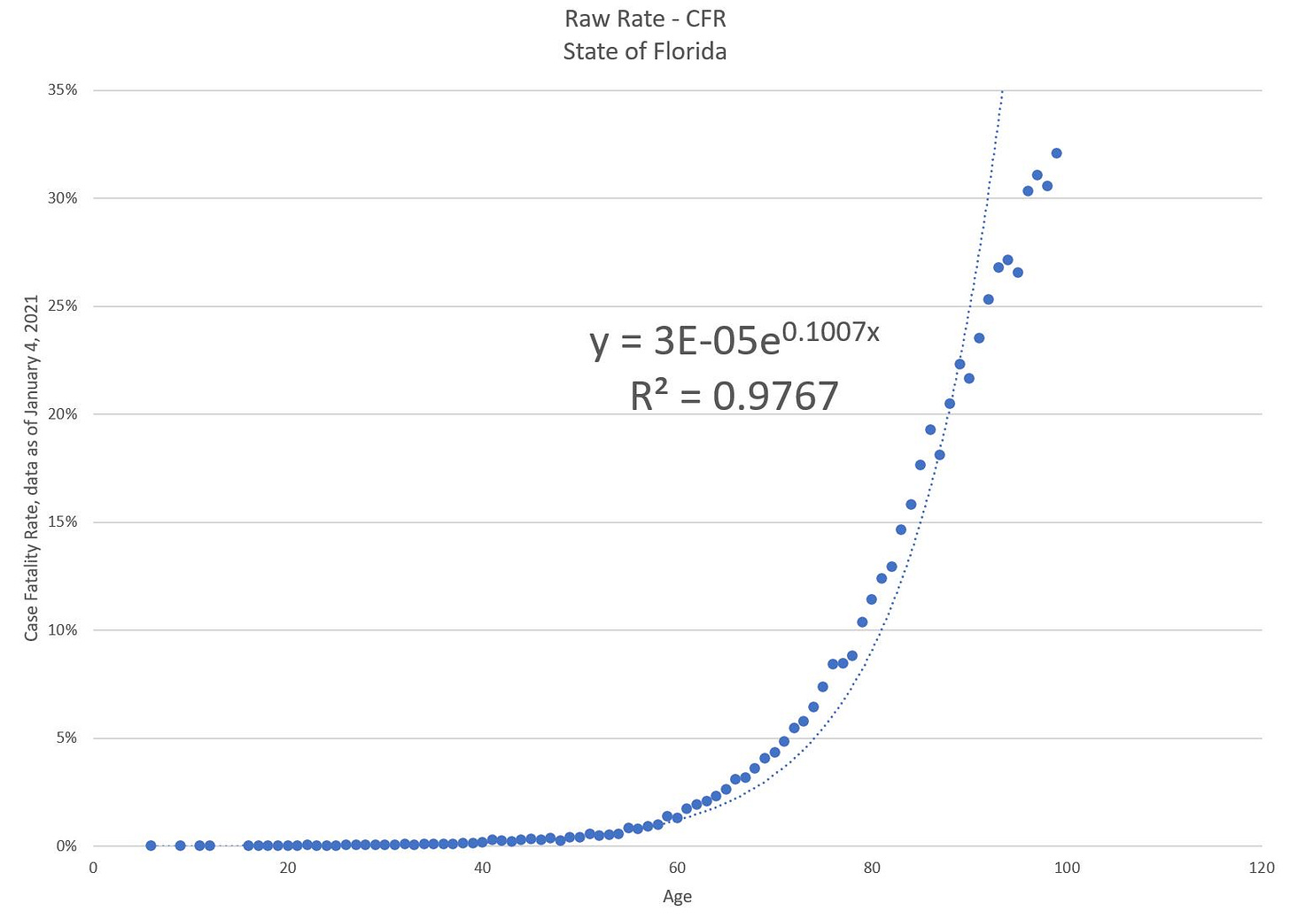
Here is the raw COVID case fatality rate plotted: [I excluded the 1000 cases or so where age was unknown], and using Excel’s built-in “trendline” functionality for scatterplots:
Now, a fit with an R^2 of 0.9767 is really good, but I didn’t like the pattern of how that exponential fit that curve.
So now it was time to massage the data.
Fixing the data for a better fit
Now, I actually had “massaged” the data for that first fit — exponential fits don’t work if any of your data points are 0, so I filtered out all the ages where they had recorded no COVID deaths among their cases.
But there are other issues with the data as well — for really old ages, there were very few cases to begin with. For age 55, for example, there were about 21,000 COVID cases in the sample.
At age 100, there were only 258. There’s an issue of “credibility” if there are too few samples.
So I did a few things to the data:
I “binned up” both very low and very high ages, separately, so that there would be sufficient deaths at young ages, and sufficient cases at old ages.
For these binned up groupings, I calculated a weighted average, weighted by cases, to determine the representative age for that grouping. I calculated the overall CFR for that grouping
I took the natural logarithm of the CFR
Then I did a linear regression.
Here is the transformed fit:
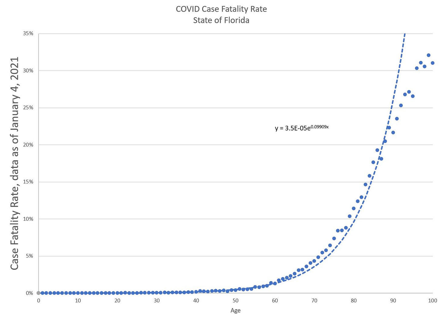
And here is that new fit transformed back:
Note that I cut the curve off over age 100. Again, the rates above 95 or so are iffy due to the rareness of cases.
Anyway, I’m very pleased with this fit. It’s pretty nice. And you can clearly see the age component here.
What does it mean?
It just means that for a specific data set, I was able to fit a particular functional form that works well in that situation. This does not mean we will see the same parameterization in 2021 results, or 2022, etc.
Indeed, the Gompertz-Makeham law fits all sorts of mortality/frailty curves, not just human, but the parameters differ wildly.
The structural form works well, and if you watch how the best-fit parameters change over time, you can see if the whole level goes up & down or the slope or both.
The CFR, of course, may barely budge now, with vaccines — what would change is the number of cases (denominator) — I wouldn’t necessarily expect the ratio to fall unless treatment improves.
Another, more contentious, age issue: vaccine distribution
And before I leave my geekery applied to Florida statistics, here is something different:
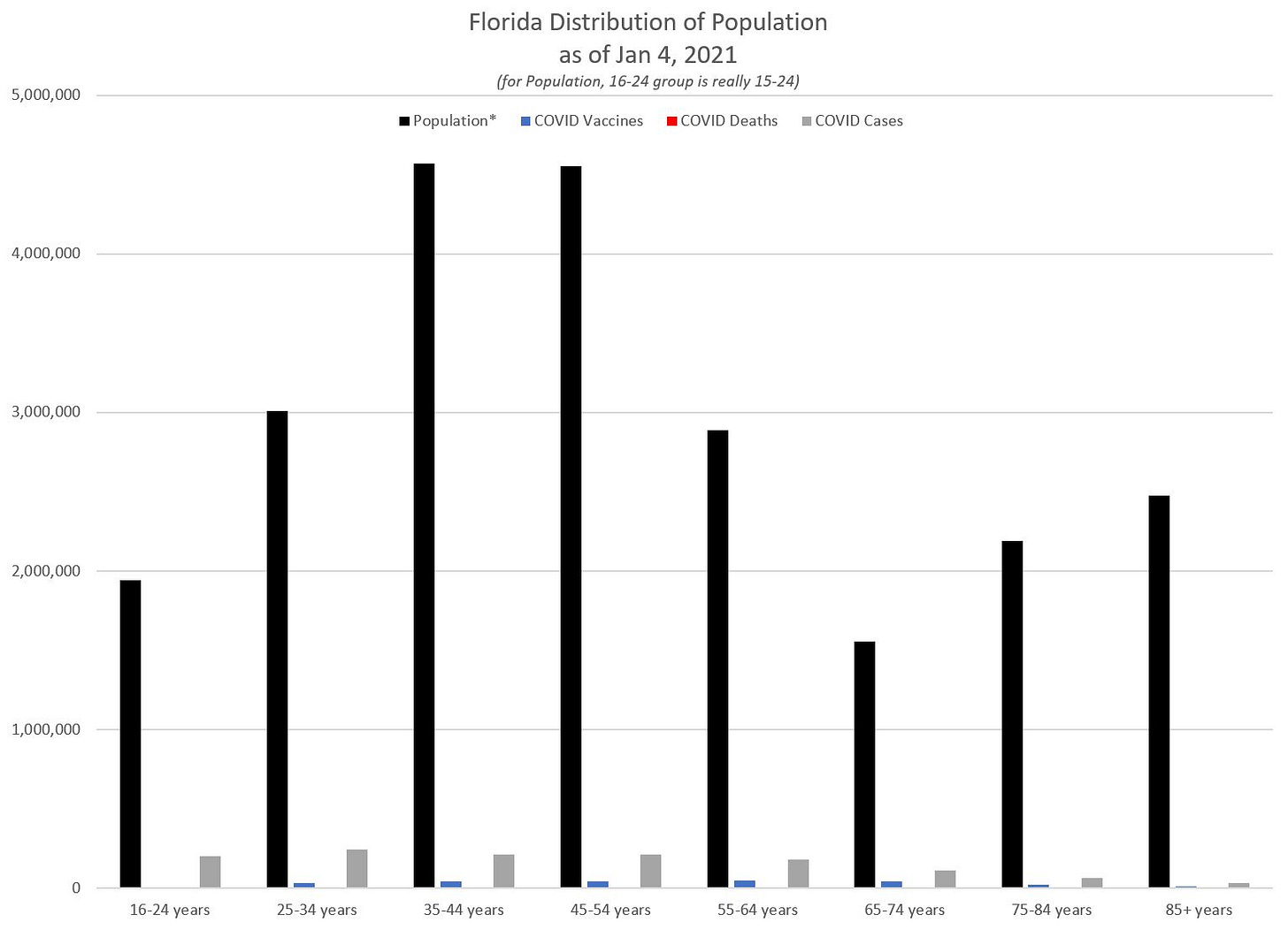
I noticed they had the age distribution of deaths, age distribution of vaccines… but not the age distribution of the population in Florida. I want you to think of why that third series of numbers is an important comparison to make, both for the deaths and for the vaccines. I also decided to throw in the distribution across recorded cases as well.
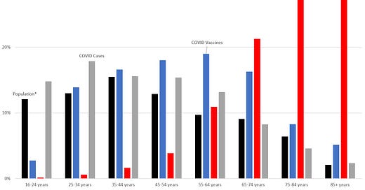
So here is a fixed graph with the percentages:
But the problem with that graph is that you don’t really know how large each group is, in actual numbers.
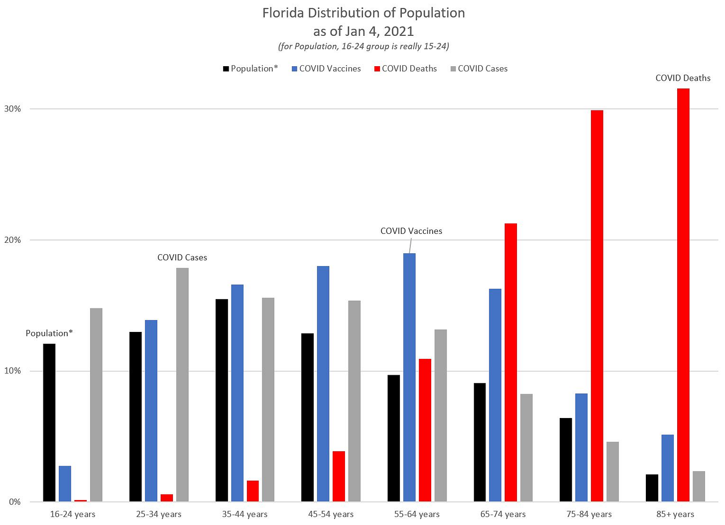
So here are the actual numbers:
Yes, the COVID deaths really are on that graph. If I wanted to make a further comparison, I would have my projection of 2020 total deaths.
But, more to the point: barely anybody has been vaccinated as of yet, in any state. In Florida, only 260,655 people had received a first dose out of a state with a population of over 22 million people. Basically, a little over 1% of the population has been vaccinated. And the priority has been for frontline medical workers to get the first vaccine.
So feel free to argue about what those graphs mean, but it does help to make some comparisons to relevant distributions. So far, the vaccine has been distributed in Florida older than the state’s population and COVID cases, and younger compared to the COVID mortality burden.

