Know Your Models: COVID-19
Everybody Becomes an Expert in What They're Not Expert In
Earlier, I did a post: Know Your COVID Data, and I mentioned you want to be clear about measured data [positive/negative tests, number of deaths, etc.] and modeled numbers.
Today, I look at the uncertainty built into the models.
Know Your Models: Modeling Hospitalizations and Deaths
One of my preferred models is from IHME, at the University of Washington. You can see their projections here: https://covid19.healthdata.org/
I actually grabbed screenshots yesterday, using the April 5 model update. Here is one screenshot from April 5.
If you can’t see it: there is a peak projected on April 16, of about 3K deaths per day, ranging from about 1.3K to 7.7K. That is quite a range, if you think about it.
The April 7 update just was adding other countries, and the death projection is currently the same. We will come back after April 16 and see what actually happened.
That said — don’t get hung up on the specific numbers. The point is to notice the shape of the curve. The reason I mention that is because what we’ve been seeing from Korea.
South Korean COVID-19 Experience
Of all the country-level data, I trust the South Korean data the most. Eventually, U.S. data will get there, but we’re not past our peak yet, and South Korea has “bent the curve”.
South Korean data from Worldometers: https://www.worldometers.info/coronavirus/country/south-korea/
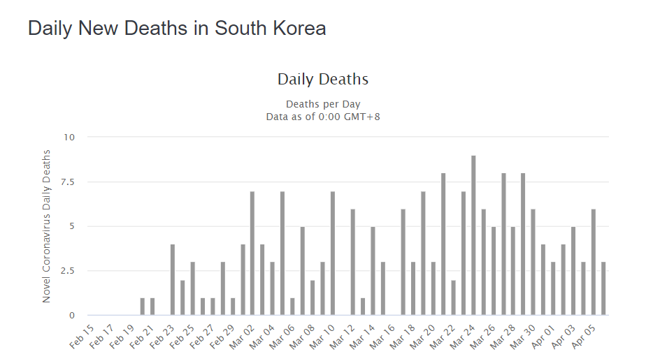
Um. That doesn’t look like that nice curve at all, does it? South Korea has a total population of about 51 million. That’s more than the population of California, the most populous U.S. state. So it’s not that they don’t have enough people who could become infected. There’s not the issue of Connecticut, with its population of 3.6 million, may be too small to have nice patterns.
Heck, South Korea doesn’t even have 10 deaths in a day.
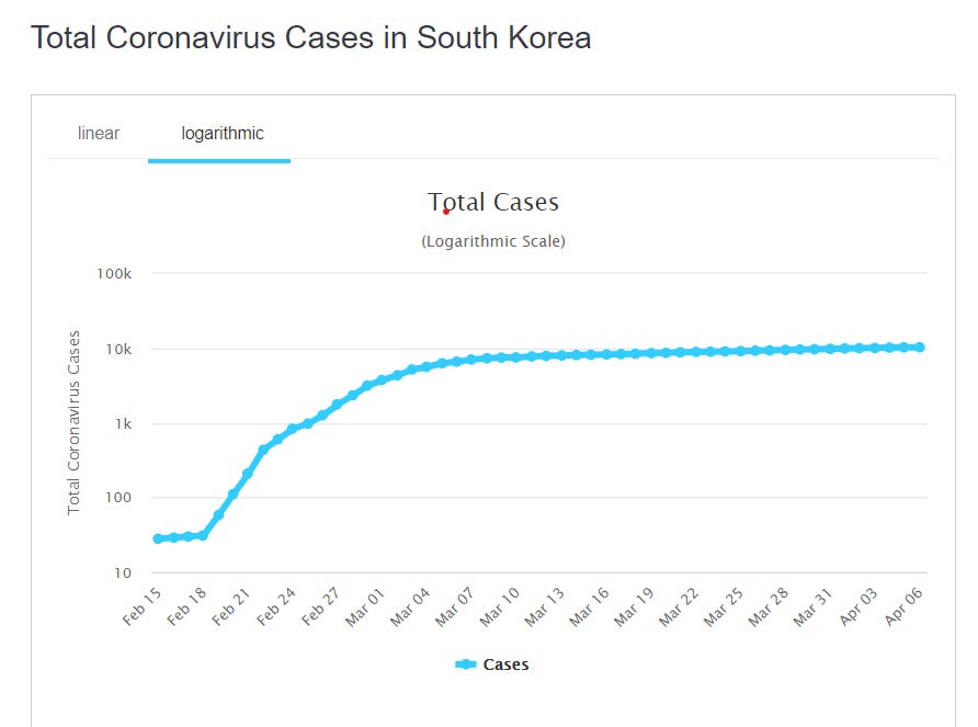
That said, the curve for total official cases does follow a nice shape.
Hmm. Something to think about.
Because the hard-hit countries, like Italy, well…
Yeah, that looks more like the death curves the IHME projects.
U.S. COVID Model Critiques
From the video I mention Sean Davis critiques the IHME model results [especially noticing the changes]. Here is the Twitchy post that collected some of his tweets: ‘Utter NONSENSE’: Sean Davis takes IMHE COVID models apart with examples of ‘hot spot states’ in must-read thread
I will take one of his tweets and see if he has a point in that specific tweet. [It’s the first one on the Twitchy post]


Okay, these are the results from the April 5 model. The range for beds needed was 2,079 to 7,294. The average model result [note: it’s not half-way between the extremes; confidence intervals need not be symmetric] is 4,037.
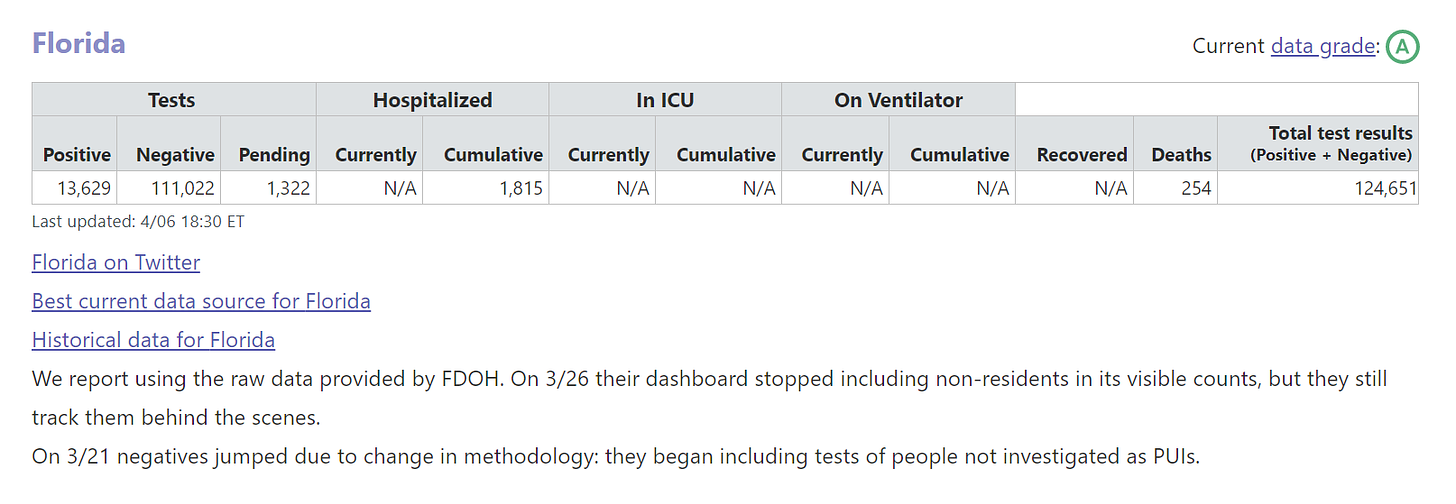
Checking my favorite U.S. COVID-data aggregator, covidtracking.com, we see that for April 6, the data for cumulative hospitalized in Florida was 1815.
Look, Davis has a point here — it’s not merely that the 4,000 hospitalized projection is off - it’s that the lower end of the range is too high for the number, too. The hospitalization projections seem the iffiest of the projections.
The other links mentioned:
American Spectator: Coronavirus: The Wrong Numbers
The Atlantic: Don’t Believe the COVID-19 Models
Quoting the second:
Here’s the tricky part: When an epidemiological model is believed and acted on, it can look like it was false. These models are not snapshots of the future. They always describe a range of possibilities—and those possibilities are highly sensitive to our actions.
….
That variety of potential outcomes coming from a single epidemiological model may seem extreme and even counterintuitive. But that’s an intrinsic part of how they operate, because epidemics are especially sensitive to initial inputs and timing, and because epidemics grow exponentially.
….
The most important function of epidemiological models is as a simulation, a way to see our potential futures ahead of time, and how that interacts with the choices we make today.
I didn’t talk about sensitivity testing, but you can see from the wide range of results projected that these models are very sensitive to specific inputs. I have done annuity modeling where I saw a 5% change in one parameter led to a 20% impact on baseline results. Certain things amplify.
Details and Expertise Actually Matter
The main lesson of all this, though: the details do matter. The models themselves are very simplified from real life, and one needs to think through the effects of various parameters, and how constant those parameters actually are.
A lot of people who have math-y backgrounds like me have jumped into these models and results with both feet, and I don’t think it’s necessarily making them look good. The math in these models is pretty simple. As I mentioned in the video, I did models like these when in college and in teaching college math. I recognized the curves.
But the moment I started thinking about these models, I understood that they were shot through with uncertainty. I highly appreciate the documentation the IHME researchers have been putting into these models.
They have made the FAQ accessible to non-experts: http://www.healthdata.org/covid/faqs
They have shared a pre-print of the technical paper describing the model structure [and gives the first model result release]: https://www.medrxiv.org/content/10.1101/2020.03.27.20043752v1
For each update, they provide notes, and you can get archived versions of the results in spreadsheet form: http://www.healthdata.org/covid/updates
These are detailed, and they have interacting parts. One can test sensitivity to data and specific parameters, and these are not novel models, even if the virus itself is novel. The dynamics of how these models behave should be well-known to those who have worked with them. I will pull some quotes out from the pre-print academic paper:
While results of these models are sensitive to starting assumptions and thus differ between models considerably ….
Uncertainty in the model estimates is driven by two components: (1) uncertainty from fixed effect estimation and (2) uncertainty from random effects, with the latter dominant because of the high variation between locations ….
Uncertainty will also be reduced as we gain more knowledge about the course of the epidemic in other countries …..
Because of sparse US data for some aspects of health service utilization, we have used data from the US, Italy, and China.
The paper was from March 30, and parameterization has changed a few times since then. It’s not clear to me that either Italy or China were good data sets to use to project U.S. results. But this is the problem: when you have scanty data from the area you’re interested in, sometimes you shoehorn in data from other places, and hope that, with adjustments, it works for your purposes.
However, immediately following the above:
As more data on US treatment accumulate, further revisions will be able to more accurately reflect US practice patterns for COVID-19. For this reason, we will revise the model every day, providing an updated forecast for health service providers and the public.
They have been updating it rather frequently, even if it’s not exactly daily. The numbers have moved around a lot for certain projections, because those initial parameters based on China and Italy probably were too different from the U.S. experience.
I will note that they did not try using South Korean data, though it was high quality, because the behavior was so obviously different from the trajectory in the U.S.
Personal Meep Stuff
It’s been a week since my last post… I’ve been beat. That said, the weather is clear and cool now, and I’m feeling a lot better. I’ve been writing about personal life stuff on my livejournal (I’ve been on there for 20 years now!) if you’re curious.
I’m doing okay, and as far as I know, nobody in my family has COVID. We’re trying to keep it that way.
Keep well!


