Geeking Out: Replicating Nate Silver's COVID & Partisanship "Work"
Showing how to test regressions and selecting variables
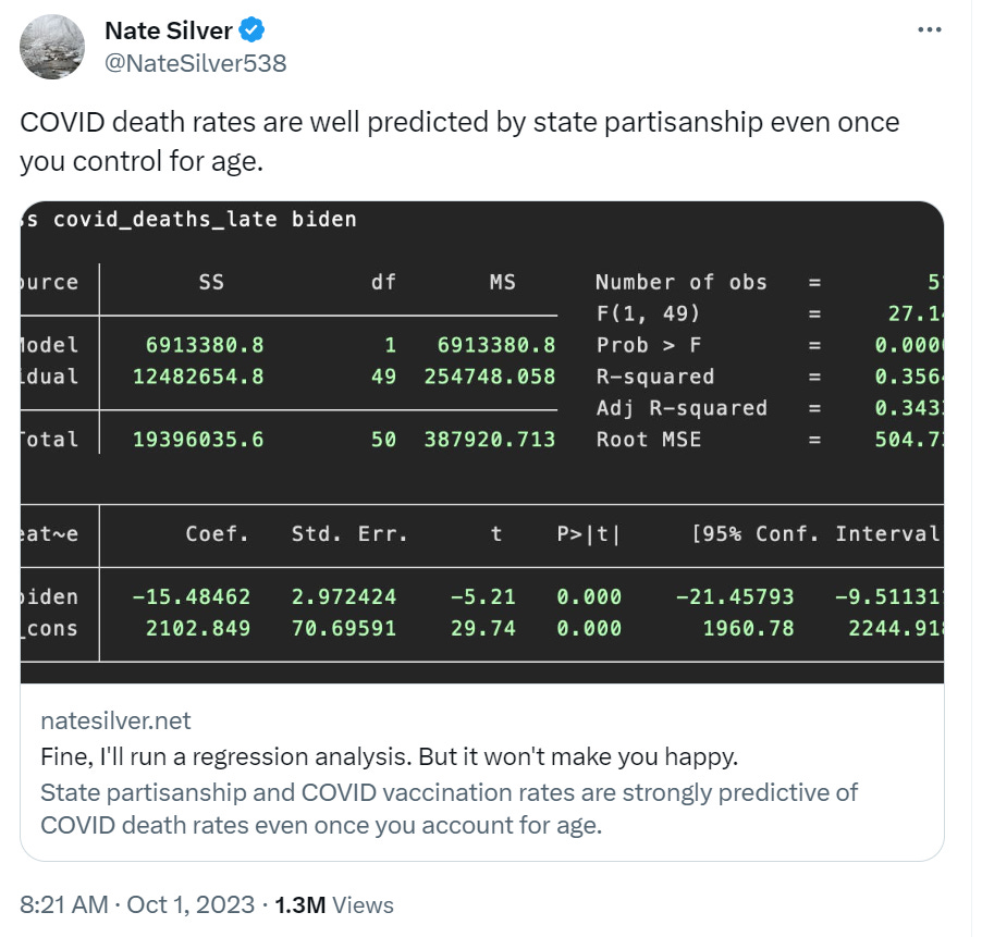
A bunch of people are annoyed at Nate Silver. Let me show you why:
https://twitter.com/NateSilver538/status/1708457048642408627
So I grabbed the link to his post. I will likely have at least one more post on this, where I redo the analysis I did back in December 2022, looking at COVID mortality on a state-by-state basis.
All I’m trying to do in this post:
Replicating the work he did
VISUALIZING some of the data
Putting the data and results in a format that is shareable for other people (aka a spreadsheet)
Bitch at Nate Silver for being a pain in the ass… for the sloppy way he does his work.
(I will try to keep #4 short)
Death data
Ugh, what a pain in the ass, but I’ll do this.
This is what Silver says is his source on COVID deaths:
In this specification, covid_deaths_late is the number of COVID deaths per 1M residents (source) since Feb. 1, 2021 (I chose this date in Friday’s post since it approximates when COVID vaccines became widely available to vulnerable groups.)
Hmmm, the “source” is Worldometers page for U.S., and it would be a real pain in the ass to try to figure out what the covid deaths would have been on Feb. 1, 2021… Except I have the Wayback Machine!
Here is the data on Feb 1, 2021 so I could just subtract off what we saw yesterday, given he did the post yesterday.
SLOPPY DATA PRACTICE: Link to a data source that changes daily. Do not give date/time stamp of your data.
[Yeah, I’ll just capture this as we go along]
State partisanship
Silver uses this page as a measure of state partisanship.
Meanwhile, biden is Joe Biden’s margin of victory or defeat against Donald Trump in 2020 (source).
I will critique that in a short bit.
I noticed on the page there were other data columns not enabled… I enabled them for my own purposes (for future analysis).
Regression
So I ran my regression through Excel - I will not show you the spreadsheet results, because I matched Silver’s regression results, so yay. I was able to replicate his data, though he had sloppy data practices.
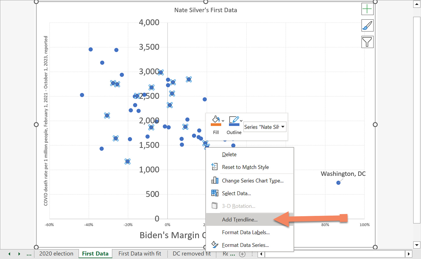
I mean, it’s a simple regression, but I want to show you something, as when you’re only regressing to one variable as here (Biden’s margin of victory over Trump in 2020), you can just put it on a scatterplot in Excel and ask Excel to put a trendline on the graph and give you the R^2.
Let me show you: The original scatterplot:
Yes, I marked Washington, D.C. for a reason. We will be returning to it.
Adding a trendline to an Excel scatterplot
Now select the data series and right-click:
Ooooh, what’s this?
And once you’ve added a trendline you can format it:
Oh, nifty — we get the regression equation and the R^2!
To be sure, we don’t get all the fancy statistics to tell us statistical significance, and all that jazz. But it’s a start.
Interocular trauma test and removing outliers
The interocular trauma test is one of the best-known to those who actually work with statistics and, in particular, are seeking the truth.
That is, you visualize the data in an appropriate way and see if the result hits you between the eyes.
Many times, certain things jump out at you… like that weird DC data point. Maybe, you wonder, is the DC data point distorting the results?
Well, it’s easy enough to remove the point and see what happens.
Actually, it didn’t change a huge amount. That’s good!
The equation of the line barely moved. The R^2 did decrease. If we switch these to correlations, the correlation went from about 60% to 55%. Not too shabby.
I was annoyed that Silver didn’t show scatterplots for at least the one-variable regressions.
Additional regression: percent over age 65
Fine, I grabbed the data, did the regression. It matched. Huzzah.
The percentage over age 65 wasn’t correlated with the Biden margin, by the way.
It’s good to check this sort of thing. You don’t want to add a variable that is simply repeating information you already have, speaking of which…
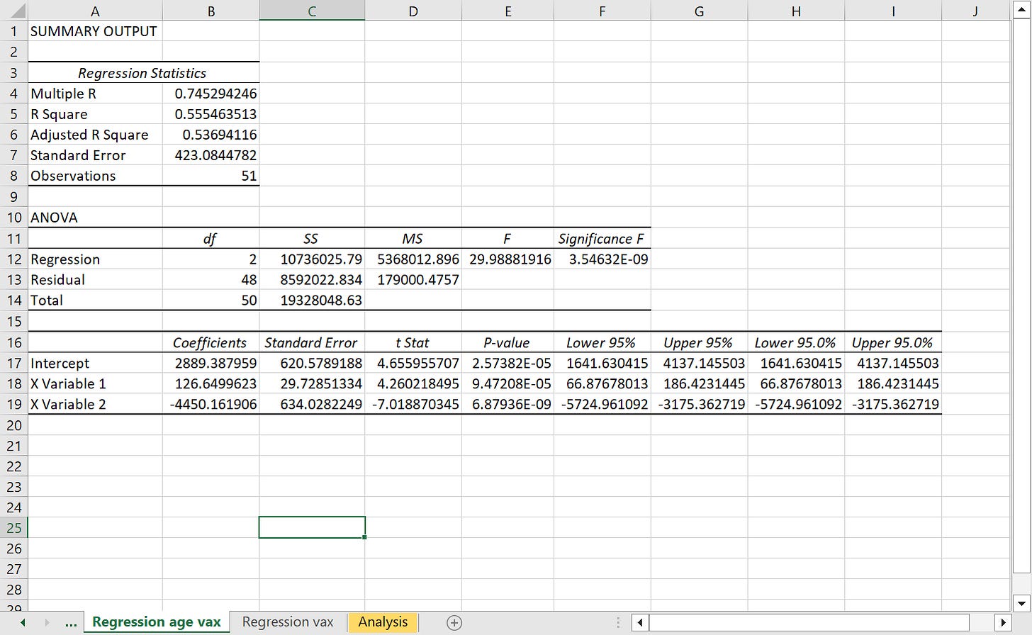
Regression with vaccination status added
Here’s the last data set to add as input: vaccination status (warning, that’s a NY Times link, could be paywalled).
I’m going to do the regression there, too, but there is an issue - with all these variables in, now you’ve got two “independent” variables that are highly correlated.
These are highly correlated variables. I wouldn’t use both of them in a model. Pick one or the other.
So let’s see the fit (I’ll leave DC in) of just the vaccination rate regression, and ignore the political dimension.
Fine, the result is this: regression with vax status & percent over age 65 was a very good fit. Adding in the Biden margin barely gave extra information.
Ta da.
Sloppy work
Why not just start with the vaccination status and Biden margin in the first place?
THAT WAS AN 84% CORRELATION!
ARGH.
Anyway, of all the things people hold against Nate Silver, the thing I hold against him is this sloppy kind of approach to modeling, but seriously, I don’t even know why anybody is going to political affiliation if you can JUST GO TO VAX STATUS TO BEGIN WITH!
Isn’t that supposed to be what this argument is about? That those stupid Republicans aren’t vaccinated and thus dying of COVID? If you had the vax info, just start with that!
And why are all these people allergic to drawing graphs? There are plenty of free options if you are so cheap you can’t afford the Excel license (jeez, I mean.. what?)
You can see the correlation right there! That’s why I go to the interocular trauma test every time!
Now, I do not like the data sets Silver used, and I will be doing a second post on this where I use other data sets (in addition to these). I will demonstrate how I approach this.
Spreadsheet
This has the datasets, regression results (I used Excel’s AnalysisPak), and graphs.


He’s ridiculous and the “fight” between him and Martin K on “X” feels contrived to me.
Regardless, thank you for bringing your clear-eyed analysis to the table.