Years of Life Lost: An Exploration, U.S., 2018-2022 (Provisional)
Initial calculations, with more to come
“Years of life lost”, like “period life expectancy”, is a metric I do not like.
I will get into my complaints in a podcast episode later, though, so you don’t have to listen to my moralizing unless you really want to.
I will provide detailed sources and methodology at the end of this post.
That said, I will calculate “Years of life lost” because somebody asked nicely (and also paid for the privilege) and because somebody else annoyed me.
But first, let’s look at the results and get an explanation.
Provisional Mortality Results for 2022: 13% — 16% worse than in 2019
Of course, this is depending on the metric you use.
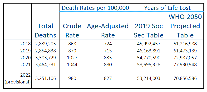
First the numbers:
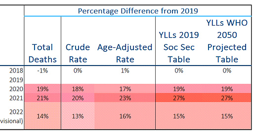
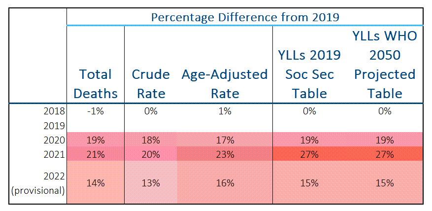
And the percentage difference compared to 2019:
Total deaths are easy enough to understand.
The crude rate is just the number of deaths divided by the population. In general, the population continues to grow in size, so the crude rate grows more slowly than the total number of deaths (this is a thing about fractions — both the numerator and denominator are growing).
The age-adjusted rate is more complicated, in that it is taking a weighted average of death rates across different age groups, based on a standardized age distribution that is currently standardized to the year 2000. This is a bit out-of-date compared to the current population ages. I have written about age-adjusted death rates in more detail in this post:
Let me explain the Years of Life Lost metric.
Years of Life Lost: An Explanation
The concept is simple enough — one posits that there is a theoretical “perfect” mortality table, such that if only everything in the world were perfect in terms of treatment, behavior, yadda yadda, at any given age you would have a specific life expectancy in years from that age left.
And if you died at that age, the number of years of life lost would be that life expectancy.
So you can just take a weighted average of those life expectancies times the number of deaths at each age and get the total years of life lost for a population. That is what I did in the table above.
There is a rate version of YLLs, which I will be looking at in future posts, but for today’s post, I’m just adding up YLLs.
The YLL concept was developed in general for measuring the impact of “preventable” causes of disease.
Which life expectancy?
I used two different life expectancy assumptions for this comparison, one using the calendar year of 2019 as its baseline and the other using a projection to 2050.
The calendar year 2019 table is easy for anybody to see: Period Life Table, Calendar Year 2019, from the 2022 Social Security Trustees Report
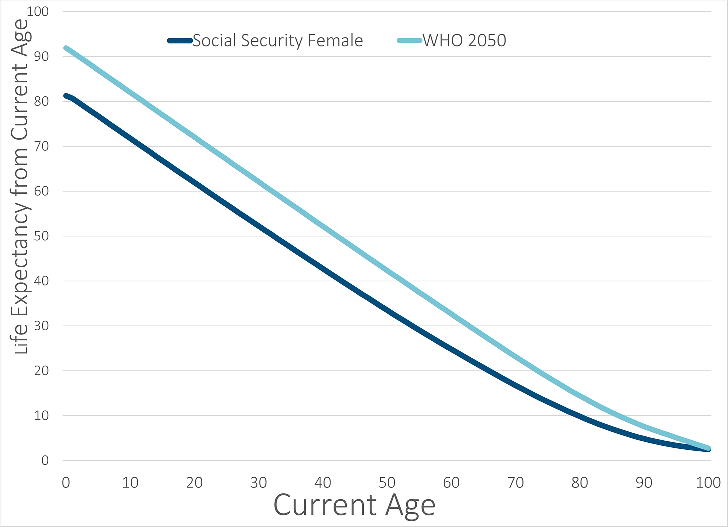
For the other one, I actually had to use the Wayback Machine to get the PDF document. The details (and links) are at the end of this post. To make it simple, here is a graph of the life expectancy from each table I used for the weights at each age.
As you can see, it looks mainly like straight lines until you get to very old ages.
At birth, the 2050 WHO life expectancy is about 10 years higher than the 2019 (female) Social Security life expectancy.
Unsurprisingly, the two curves converge at age 100.
The point of these is that younger ages are weighted heavier under this approach, which is not the case for age-adjusted death rates and definitely not for crude death rates or total death counts.
Back to Interpretation
Let’s look at the percentage changes again.
I will note that the changes for Years of Life Lost showed higher changes in 2021 compared to the other measures.
You may think that age-weighted death rates, which are also a weighted average, would behave similarly, and you would be somewhat correct — however, the way these weights relate to each other is very different.
In future posts where I apply YLL metrics to specific causes of death, there will be different results compared to age-weighted death rates. Age-weighted death rates simply normalize to a general age distribution.
YLLs give higher weights to younger ages. This will have a disproportionate effect for certain causes of death, such as homicide.
We don’t see much difference in these tables because I’m looking at all deaths, no matter the cause. Once we start looking at subsets, you will see very different results.
Many Motivations
The initial motivation is a request from a paying subscriber, as requested in this comment:
Unrelated special request - could you run an analysis on Years of Life Lost comparing the excess accidental deaths to Covid deaths for 2020 and 2021? Back of the envelope I come out with YLL greater in the accidental deaths despite being 1/10th the number due to age difference.
Could you do it properly? Will gift a subscription :)
At the time, I demurred, as I don’t like this metric to begin with (and I’m not fulfilling the direct request in this post — I will do it in a future post. I just wanted to try out calculating the metric at a high level.)
The one privilege paying subscribers get is the ability to comment directly on substack posts.
To be sure, anybody can reply to me on Twitter (I’ve never locked my account @meepbobeep) or can email me (marypat.campbell@gmail.com). However, I don’t feel obligated to read my email, and I definitely don’t feel like I need to read all my tweet-replies.
I do read all the comments posted on my substack. Y’all paid for the privilege of my attention, so I will pay attention.
Separately, this happened:


There is no real link between the subject Rochelle Walensky was talking about and whether I will find anything of note among YLLs (I may, and I may not), but I thought “I know this is a metric that has been used by public health agencies for other purposes, and I haven’t heard it being used lately. HMMMM.”
I got suspicious that I hadn’t heard much, in other words. Maybe the results weren’t what they liked. Who knows?
Also, they may have rethought the use of the metric, but I don’t know about that, either. I really don’t like it.
Methodology
Provisional mortality data for 2022 was queried from the CDC WONDER system on 19 Feb 2023.
Suggested Citation: Centers for Disease Control and Prevention, National Center for Health Statistics. National Vital Statistics System, Provisional Mortality on CDC WONDER Online Database. Data are from the final Multiple Cause of Death Files, 2018-2021, and from provisional data for years 2022-2023, as compiled from data provided by the 57 vital statistics jurisdictions through the Vital Statistics Cooperative Program. Accessed at http://wonder.cdc.gov/mcd-icd10-provisional.html on Feb 19, 2023 4:32:48 PM.
Information on Years of Life Lost came from older World Health Organization documents, which required pulling documents from the Wayback Machine:
“WHO methods and data sources for global burden of disease estimates, 2000-2011”, Department of Health Statistics and Information Systems, WHO, Geneva, November 2013
Page 4:
I did not use a sex difference in my calculations, for simplification purposes.
I used the Annex Table B WHO Standard Life Table for Years of Life Lost (YLL), on page 58, which is footnoted “Based on projected frontier period life expectancy and life table for year 2050 (UN Population Division 2013)”.
The spreadsheet with data, calculations, and graphs:


You did it! Can’t wait to read! Thank you
Who should I gift a subscription? 🤔