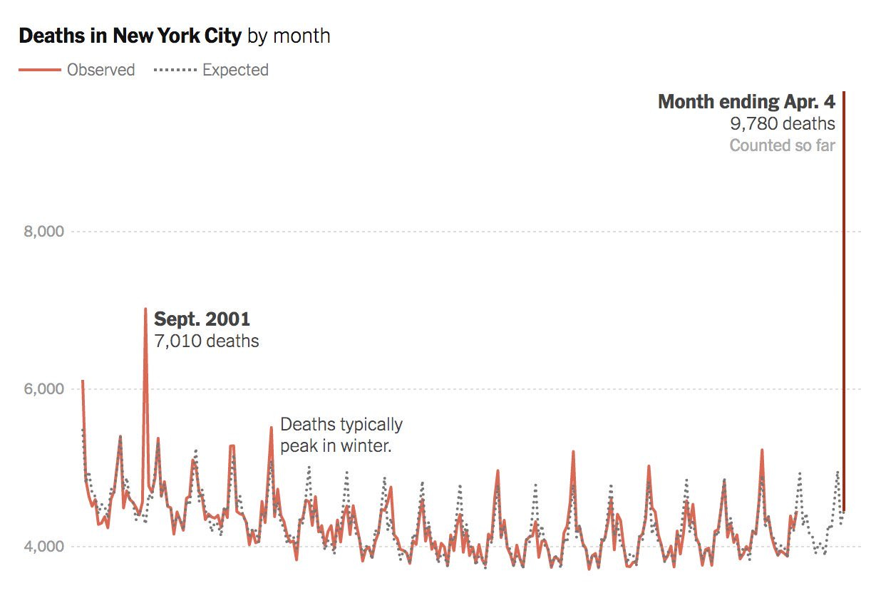
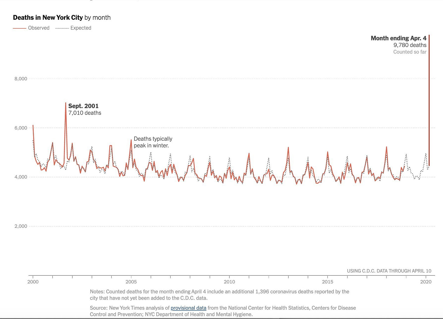
Here are two versions of the same graph, showing total deaths in New York City, by month, going back to 2000. The first is a cropped version, and the second is the full version, as it ran in the New York Times. The cropped version was on twitter.
The reason the tweeter was posting this graph was that they had wanted to emphasize the large increase in the total number of deaths in New York City. With this graph, you can see a number of patterns: seasonality of deaths [not unique to NYC], 9/11 [that is specifically labeled], some bad flu seasons [and some weird flu seasons]. You also see where recent data are not available.
But notice something: you don't actually see the horizontal axis. Indeed, some people complained that the cropping over-emphasized the increase in deaths in March 2020 by starting the axis a little below the average number of deaths per month instead of at zero.
Here is the original graph, as it appeared in the NY Times: ["Deaths in New York City Are More Than Double the Usual Total", By Josh Katz and Margot Sanger-Katz, April 10, 2020]
This version is uncropped, with a vertical axis that starts at zero deaths. We now have a less exaggerated jump. You can still see the jump in deaths, and the proportion of the jump is now in line with what actually happened.
The Spread and Influence of Data Visualization
According to ZDnet, the COVID-19 data sets may be the most visualized infectious disease outbreak ever. They note a variety of dashboards, from the well-known Johns Hopkins dashboard, to an IBM/Weather Channel collaboration, to graphics based on EMS data. One of the more infamous visualizations right now regards projections of resource need and number of deaths, from the Institute for Health Metrics and Evaluation: COVID-19 Projections. This sort of modeling influenced key decision-makers in setting policy in order to reduce deaths due to the outbreak.
Visualizations can be very powerful in influencing, especially for important decisions. Humans have a great deal of innate processing power built into their brains just to interpret visual information, and it influences us in a way written text does not.
Of course, that visual processing power can be misled with graphics. Above we saw how one could visually exaggerate the impact of COVID in New York city by cropping an axis. The classic book How to Lie With Statistics, first published in 1954, dedicated a whole chapter to misleading through graphs. With modern software, it is even easier to construct misleading graphics than the hand-drafted examples of mid-20th century.
Tell the Truth, or At Least Don't Lie
You may make a great hit with a sensational graph in the short run, but over-hype erodes itself in the long run.
With the spread of ease in creating graphs, more people have been catching onto the tricks [just as with click-bait headlines - "Check these 10 great tips for data visualization; Number 7 will shock you!"].
If you are a numbers person, you generally want to be effective. You want people to pay attention to your results, not dismiss them as boring. [Unless they are boring, which is also useful to know.] Using graphical tricks to make your results look more shocking will get attention... but if people realize you were trying to trick them, you build distrust in you specifically.
"Honesty is the best policy" because generally people will get repeated exposure to you and your work. You can fool some of the people some of the time, but it is tough to repeatedly fool the same people over a working lifetime. You can still have powerful visualizations if you have a powerful result to relay. No need to distort the presentation.
A time like now, we could use more trust, and that works only if people act in a trustworthy manner. That applies to data visualization, just like every other endeavor.
Upcoming Webcast on Data Visualization: Wednesday, April 29, 2020
I have an upcoming webcast with Actex Learning on 29 April 2020, 1pm - 2:30pm ET, which can be found at this link:
Data Visualization Best Practices for Actuaries
Data visualization is powerful tool for communicating results; however, we actuaries rarely get training in it. When we do get training, it’s generally to avoid being misleading in our visualizations, but not necessarily how to be effective.
This session will explore key principles for data visualization, in making more effective communications for results. The examples given will be in Excel – though the principles extend to any major system.
It does say "for actuaries", but this is intended for technical professionals in general who want to improve their communication of numerical results. The principles will be broad, applicable to any system, but to make my examples more accessible, they will all be done using Microsoft Excel.
I hope to see you there!
More Resources on Data Visualization
I have been writing and presenting on data visualization topics for some years now.
Here are some of my old webcasts [for purchase]:
Data Visualization Practices and Principles in Excel [On-Demand]
Advanced Techniques for Data Visualization in Excel [On-Demand]
My old articles [for free]:
The Where of Data Visualization
The What of Data Visualization
Copied from my post on LinkedIn: Use Data Visualization Responsibly
https://www.linkedin.com/pulse/use-data-visualization-responsibly-mary-pat-campbell/


