


The Geography of Homicide -- States, Base Rates, Increases, and Correlations
Spoiler: there's no correlation to prison population decrease

Continuing my prior post on homicide death rates, I want to dig further into geographic differences in homicide death rates, and, in particular, if there are any patterns to the increase in homicide rates in 2020 that we can detect.
Setting the stage: large increases in 2020 and continuing to be bad in 2021
As a reminder, age-adjusted death rates for homicide increased 30% between 2019 and 2020, which is the largest single-year increase going back through 1968. The second-highest year was 2001, which had an increase of 20%, due to the September 11th terrorist attacks. So this was worse.
Even so, homicide is only 1% of all deaths in 2020. Even with COVID being such a huge cause of death, it has come behind heart disease and cancer, all three being big killers of old people.
But homicide is a huge killer of young people, and in particular, young black men.
In 2020, over 20% of deaths of 15-19-year-olds (all sexes and races) were homicides.
Baseline homicide rates in 2019 — crude rate and age-adjusted rate
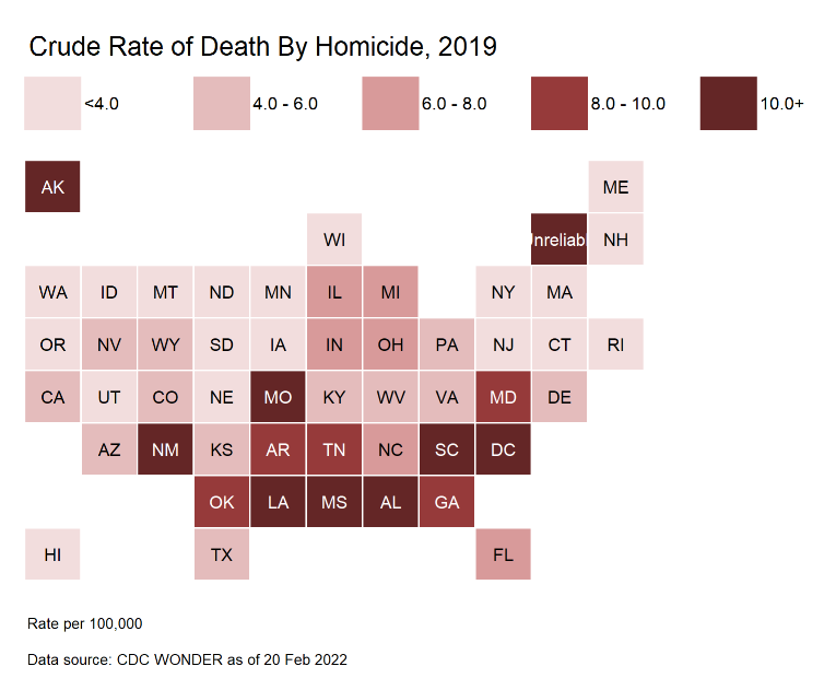
First, let us look at tile grid maps of the death rates for homicide by state in 2019.
The crude rate (just number of deaths by homicide divided by total population):
The age-adjusted rate (weighted average to a standardized age distribution):
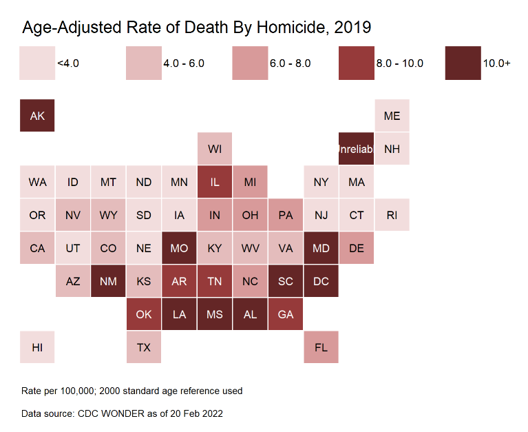
It’s not too different in their distribution. I’m using the same scale for both tile grid maps for easy comparability.
Some observations:
I know it’s hard to see, but Vermont says “Unreliable”. In some years, the low population states had very low numbers of homicides (VT being the lucky state in 2019), and the confidence intervals for the rates are too broad to get a statistic you can do much with.
The highest homicide death rates are along the south, as you can see, for the crude death rate.
When we switch to age-adjusted death rates, we see Illinois joins the bad crowd.
In general, out west and up north is pretty low in rates (yes, I’m ignoring Alaska. The low population states are actually difficult to gauge.)
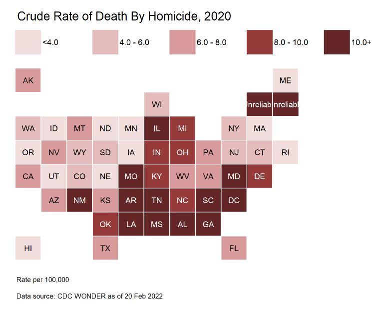
2020 distributions for homicide rates
Yes, I’m using the same color scale as with 2019 so we can see how it shifted.
Crude rate:
Age-adjusted rate:
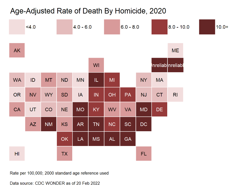
Observations:
It’s bad. The places that were bad before continue to be bad (no surprise there), but pretty much everything got a little darker. It’s widespread.
Yes, both Vermont and New Hampshire are unreliable in these maps. That’s what happens when the numbers are too low. A few low population states will not have statistically significant results.
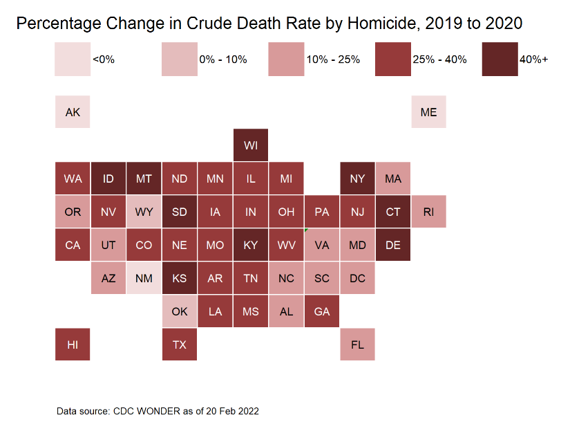
Percentage change from 2019 to 2020
For crude rate:
For age-adjusted rate:
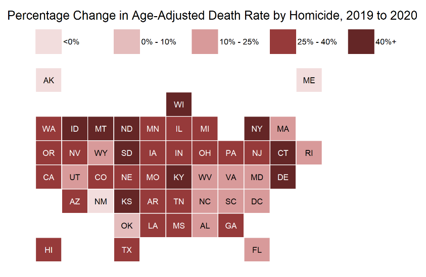
Observations:
This simply confirms what I said above: the increase was widespread.
A few states did have decreases, but again, not many.
Table of changes for largest states
To break away from graphs for a moment, let’s look at a table. The nationwide statistics are going to be most influenced by the most populous states.
Small states, like aforementioned unreliable Vermont and New Hampshire, have little influence on the overall rate.
So let’s focus on the top ten states by population.
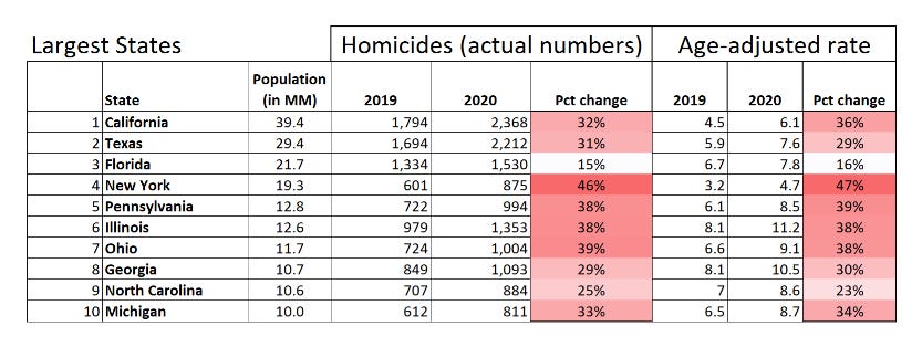
Very interesting.
So Florida didn’t have much of an increase in homicides, many of the large states had increases near the nationwide average increase of 30%, and then some of them had very large increases — like New York. An almost 50% increase.
What’s up with that, hmmm?
I mean, it’s not like people were streaming into New York in 2020… or fleeing Florida. So that’s not the answer.
To be sure, Florida started at a higher homicide death rate than New York… but others, like Ohio, started at a similar rate and ended up much higher. I am kind of curious why Florida homicide death rates did not increase as much as the other large states.
Correlations: prison population reduction and homicide rate increase
In my last post, I queried whether people being released, or simply not put into prison as crimes are being committed, may have contributed to the rise in homicides.
This is a pretty stark increase, after all.
So let’s try a scatterplot and see if we can see any patterns.
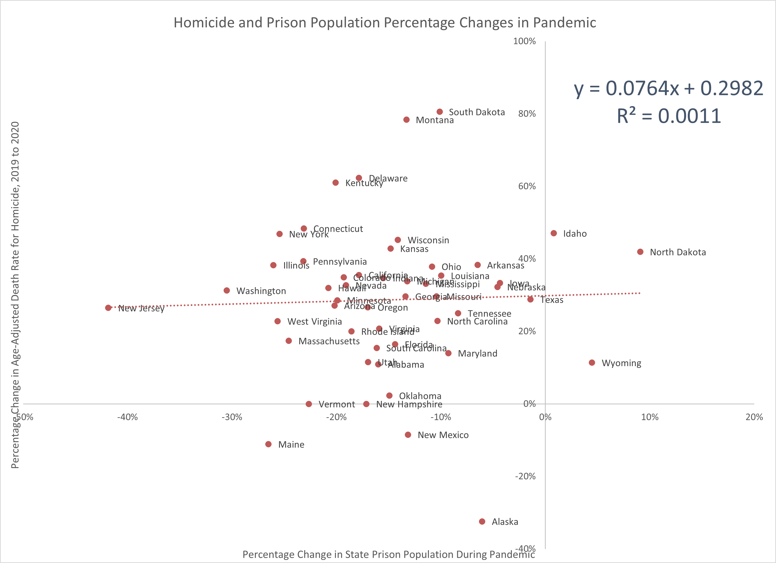
Guys.
Dudes.
Y’all.
I see nothing.
There are problems with both data sets, which I realized when I tried to see if I could get a more detailed analysis than just at a state level (I can grab death data at a county level, after all).
First, those state-level prison data are not actually over the same period of time, come from different data sets, and are not necessarily gathered the same way. I saw some weird patterns in the data, which may be real (mass releases at the beginning of the pandemic did occur in some places, as sentences were cut short for some types of offenses). But in particular, some of the states had only a few months of data, and other states had data for almost all the months they collected data. So I’m not sure I can rely on the prison population change for some of those states.
Second, the homicide rate change is not very reliable for the smaller population states. However, I don’t want to start just pulling out data points like Idaho and North Dakota, because yeah, it will look like the correlation will improve… but then it will be questionable practice. It would be better to get better data… if it existed.
Mainly building tools for later analyses
But even then, I think this is fuzzy, and I want to focus on two other causes of death that are even bigger than homicides: drug overdoses and motor vehicle accidents.
It’s good to consider that, in addition to potential differences in age, sex, and race/ethnicity, there may be differences across the country by geography by cause of death.
With respect to the homicide rate increase, that was pretty broad across the U.S., affecting places that already had relatively high rates as well as places that had lower rates.
I don’t know what’s going on in Florida, which looks pretty anomalous compared to the other states. Everybody went to the beach?

It does seem the southeast, in general, saw a less-severe increase in homicide death rates.
It will be useful to see if other changes in causes of death or even total death rates, no matter the cause of death, have similar geographic patterns as I go through these differences.
Spreadsheet: