Political Mortality: Revisiting Supposed Excess Republican Mortality
Let's look at the crocodile tears and some alternative explanations
I’ve seen this paper going around recently: Excess Death Rates for Republican and Democratic Registered Voters in Florida and Ohio During the COVID-19 Pandemic
Let me drop the abstract here:
Importance There is evidence that Republican-leaning counties have had higher COVID-19 death rates than Democratic-leaning counties and similar evidence of an association between political party affiliation and attitudes regarding COVID-19 vaccination; further data on these rates may be useful.
Objective To assess political party affiliation and mortality rates for individuals during the initial 22 months of the COVID-19 pandemic.
Design, Setting, and Participants A cross-sectional comparison of excess mortality between registered Republican and Democratic voters between March 2020 and December 2021 adjusted for age and state of voter registration was conducted. Voter and mortality data from Florida and Ohio in 2017 linked to mortality records for January 1, 2018, to December 31, 2021, were used in data analysis.
Exposures Political party affiliation.
Main Outcomes and Measures Excess weekly deaths during the COVID-19 pandemic adjusted for age, county, party affiliation, and seasonality.
Results Between January 1, 2018, and December 31, 2021, there were 538 159 individuals in Ohio and Florida who died at age 25 years or older in the study sample. The median age at death was 78 years (IQR, 71-89 years). Overall, the excess death rate for Republican voters was 2.8 percentage points, or 15%, higher than the excess death rate for Democratic voters (95% prediction interval [PI], 1.6-3.7 percentage points). After May 1, 2021, when vaccines were available to all adults, the excess death rate gap between Republican and Democratic voters widened from −0.9 percentage point (95% PI, −2.5 to 0.3 percentage points) to 7.7 percentage points (95% PI, 6.0-9.3 percentage points) in the adjusted analysis; the excess death rate among Republican voters was 43% higher than the excess death rate among Democratic voters. The gap in excess death rates between Republican and Democratic voters was larger in counties with lower vaccination rates and was primarily noted in voters residing in Ohio.
Conclusions and Relevance In this cross-sectional study, an association was observed between political party affiliation and excess deaths in Ohio and Florida after COVID-19 vaccines were available to all adults. These findings suggest that differences in vaccination attitudes and reported uptake between Republican and Democratic voters may have been factors in the severity and trajectory of the pandemic in the US.
Given people forgot, this was released in preprint form last fall.
Some technical complaints
I wrote about it back in October 2022, when it was a preprint:
On COVID (and all-cause) Mortality and Political Affiliation Studies
I had some specific comments regarding: how they identified party affiliation.
For one, there is no party affiliation in Ohio. They went by how people voted in specific years’ party primaries. So that required people to have voted in specific primary elections.
That excluded a lot of people who may have otherwise identified themselves as Republican or Democrat. It includes people who actually consider themselves unaffiliated, but felt moved to vote in particular primaries, because Ohio primaries are open.
(This contrasts drastically with New York, where you need to be registered with a particular party a full year before the given primary in order to vote in that party’s primary. The parties do not want spoilers playing at “Operation Chaos” and any such bullshit.)
Florida party affiliation was identified in the normal way: party registration. Whether or not the people voted in a primary.
So you’re already starting with very inconsistent definitions.
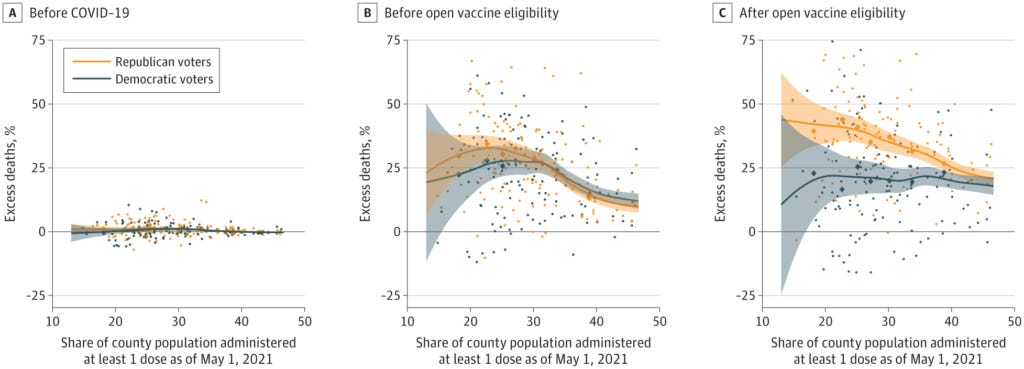
There are far more technical critiques I have, but I’m just getting in the weeds at that point. I’ll show you one item:
Mmmmm, big old cloud of dots.
There are issues. One of the big issues they should have checked for, though they probably don’t have this data, is obesity levels. I bet that would have shown a much stronger result than this haze.
If you want to see another’s recent technical critique, here ya go:
A lot of these were the same critiques I had back in October 2022.
Don’t cry to me about “science disbelievers”
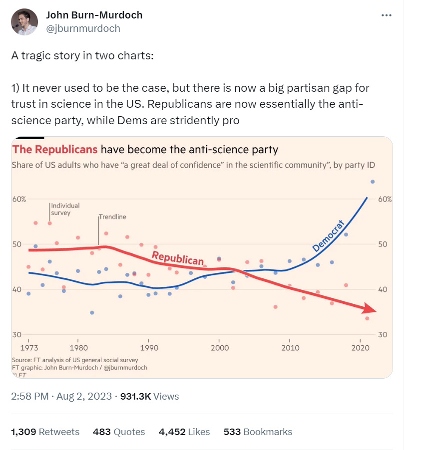
But this is the thing that I found to be total crap:
https://twitter.com/jburnmurdoch/status/1686813844469858319
You want to know why Republicans don’t trust “science”?
It’s not science that we conservatives don’t trust.
It’s scientists. Particularly the ones who work for the government and who get most of the media coverage.
Because instead of checking some driving variables (such as obesity and diabetes … you know, the co-morbidities of COVID), you go straight for supposed political party affiliation.
Some people are not being trusted because they have shown themselves not to be trustworthy.
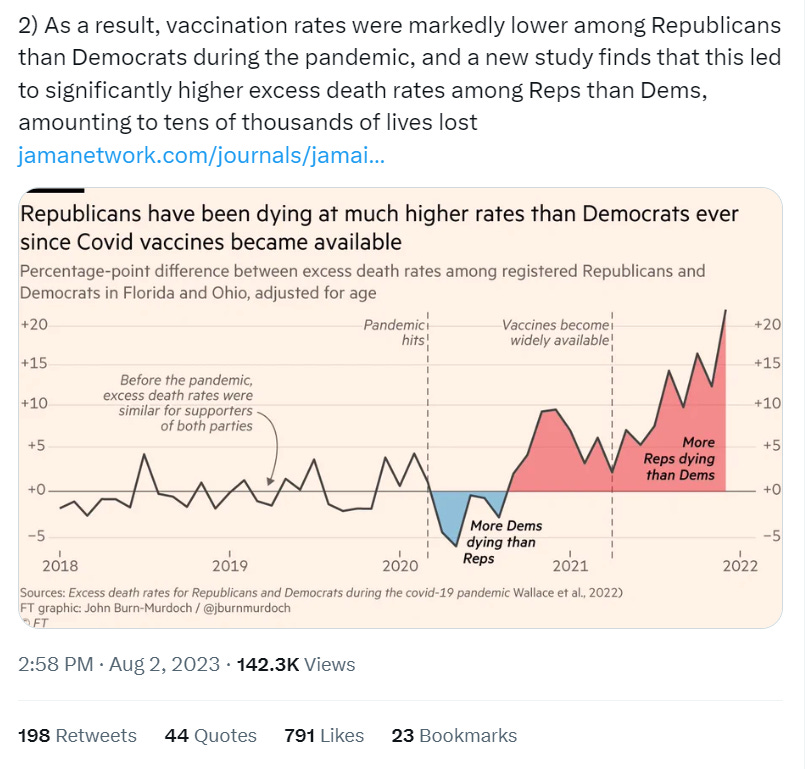
This was the second, supposedly tragic graph.
https://twitter.com/jburnmurdoch/status/1686813850123853824
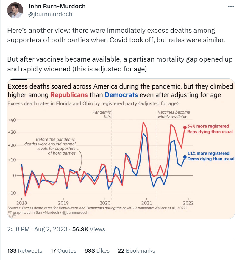
https://twitter.com/jburnmurdoch/status/1686813855874170891
In Ohio (for their weird definition of party affiliation) and Florida (using imputed data), that is. And then trying to extrapolate it to the whole country.
Ohio and Florida are hardly representative of a continental-wide country. A country that is the third-largest in area and in population in the world. Come on.
Dude, you’re a Brit. I know you’re in the journalisming biz, but have some pride.
WE HATE YOU … WHY WON’T YOU TRUST US?
But also, don’t pretend like you think this is some great tragedy.
As Vinay notes:
It is OK to criticize Republicans as being stupid people who deserve to die
John Mandrola wrote: Bad Science Needs to Be Called Out
I won’t repeat the many limitations of this paper. The simple fact is that it is an observational study looking back at associations. Even the highest quality non-random comparisons suffer from substantial threats of confounding factors. It borders on anti-science to make causal inferences from highly biased studies. Experts in public health who amplified this study surely know that.
The authors find an association between higher death rates based on voter registration but then strongly suggest that vaccine denial was the cause. Yes, of course, they include the usual ‘limitations’ section buried at the end of the paper. But their feelings are clear.
Such foolish leaps of causation are common in the medical literature. But this is worse because it is nakedly political.
The authors implicate vaccine denial but they did not have vaccine records. They did not control for basic things like socio-economic status, BMI, diabetes.
That leads me to the second problem: that this analysis was conceived. These are Yale scientists. Why would they spend time and effort on a project that had no chance of reliably answering a question? And. They would have been unlikely to write this manuscript if the results were different.
The researchers may have looked… and not published if it came out differently.
But the main thing is they could have looked at other variables and THEY DIDN’T.
Or… didn’t they?
Maybe they did and saw that there were stronger links to obesity, income levels, and other similar issues.
The reason I say this is that we’ve seen those linkages in the actuarial results, even preceding the pandemic, and noted diverging results during the pandemic.
Simpler explanations
The Society of Actuaries has been doing a different kind of analysis of U.S. mortality experience.
It still has correlative issues - as I often say, we actuaries will just tell you what’s going on, but we can’t tell you why. I can give you a bunch of possibilities. But correlation isn’t causation, after all.
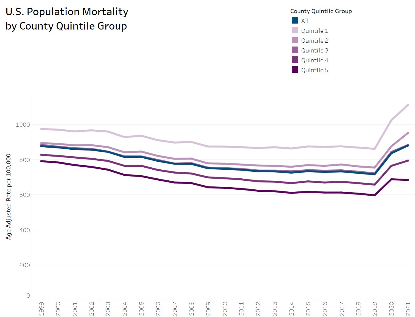
One method has been to categorize each county in the U.S. by socioeconomic quintile.
Check out what mortality looks like when stratified by these quintiles:
These are age-adjusted death rates. Being on top is bad.
Quintile 1 is the lowest in terms of socioeconomic status - lowest income, lowest education, etc.
Quintile 5 is the highest in terms of socioeconomic status.
Look at that graph: all quintiles got worse in 2020, but in 2021, they all got worse, except quintile 5.
That is, the top socioeconomic status counties improved in age-adjusted death rates in 2021 compared to 2020.
Isn’t that interesting?
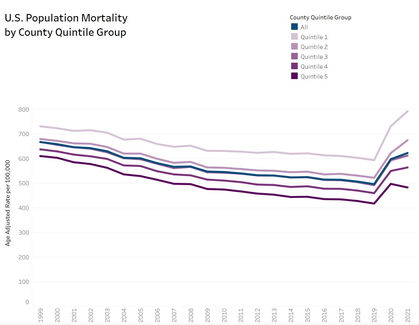
It’s interesting to make comparisons by cause of death. Most physiological causes of death break out like this:
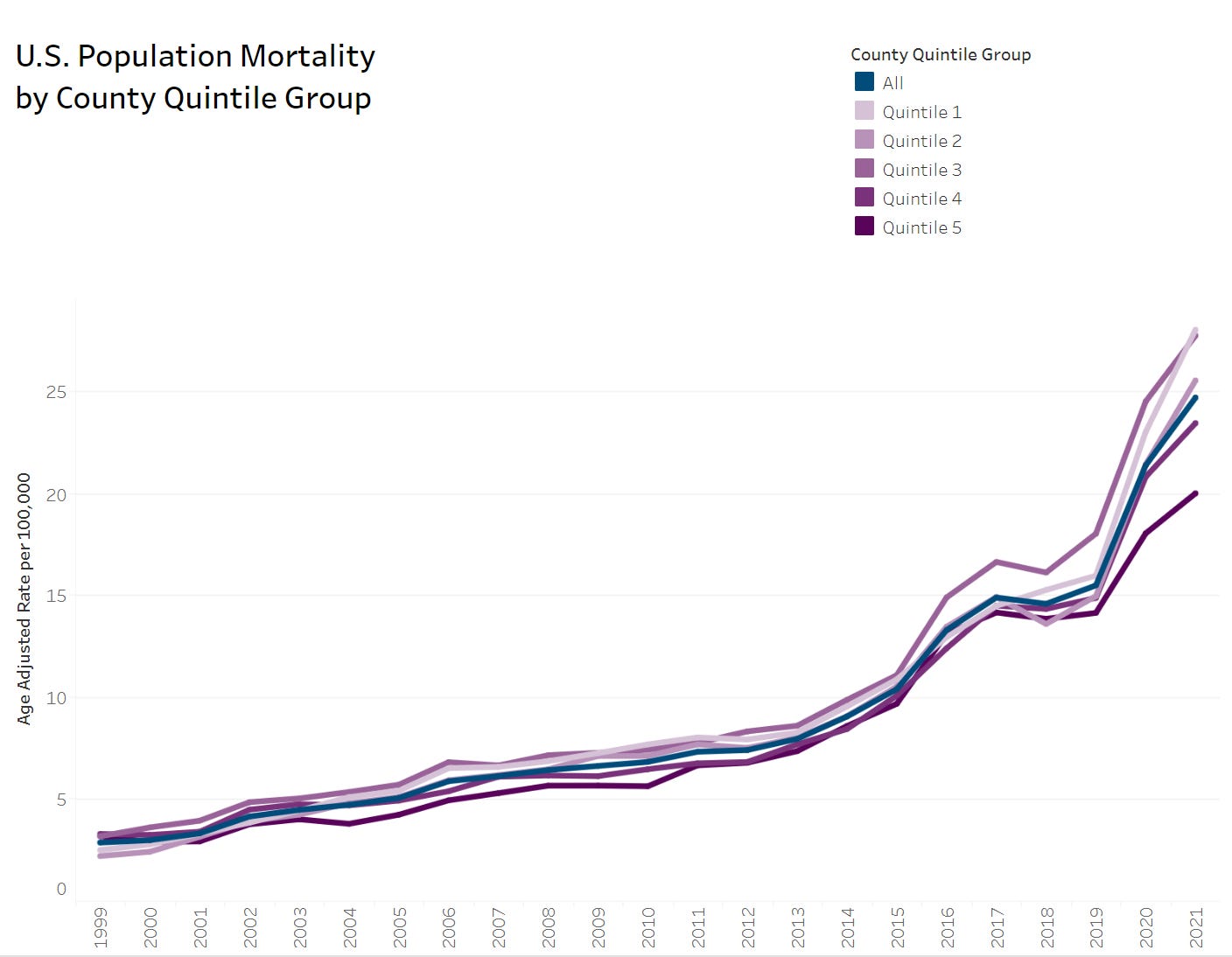
But drug overdoses look like this:
It may be the case that these other variables may have even stronger correlations than political parties. Political parties are likely only downstream of these other issues.
And… if you want people to trust you — perhaps you should seek truth and behave in more trustworthy ways.
I highly recommend getting back to basics in terms of throwing the net wide for explanatory variables.
If you only seek the answer you desire, I’m sure you will find it… but you will persuade only those who already agree with you.



All about details...