Mortality with Meep: U.S. Life Expectancy Fell 2.4% in 2020, and Death Rates Increased 16.1%
These are very bad.
And both those are very large compared to recent trends, though small compared against the Spanish flu pandemic.
Via Benefits Pro (and using the Actuarial News link): Life expectancy in U.S. dropped by almost two years between 2018 and 2020
Life expectancy in the United States between 2018 and 2020 decreased by 1.87 years (to 76.87 years), which is 8.5 times the average decrease in other high-income nations. What’s more, decreases in life expectancy among Hispanic and non-Hispanic Black people were about two to three times greater than in the non-Hispanic White population, reversing years of progress in reducing racial and ethnic disparities. The life expectancy of Black men (67.73 years) is the lowest since 1998.
I want you to understand what this means to you as an individual.
Because you are sitting here alive reading this (unless you’re a ghost reading this, in which case I’m wondering why you don’t have more fun things to do as a ghost): it means basically nothing. This is not going to give you any idea of your own likely life expectancy.
Don’t ever try planning how long your retirement will be, or whether you need life insurance, based on media reporting on life expectancy. It’s not that they’re deliberately trying to mislead you, but that the life expectancy they’re reporting on is something different from what most people think
Life expectancy reported in the media: squishing a lot of info into a single number
If you want the really detailed, nerdy explanation, I did this a few years ago: Mortality with Meep: Cohort vs. Period Mortality Tables
Here is the short, not-as-nerdy version:
When you hear about life expectancy reported in the media, it almost always means “period” or calendar-year mortality. That means they calculate life expectancy from birth, assuming the mortality we saw in the last year holds for all time.
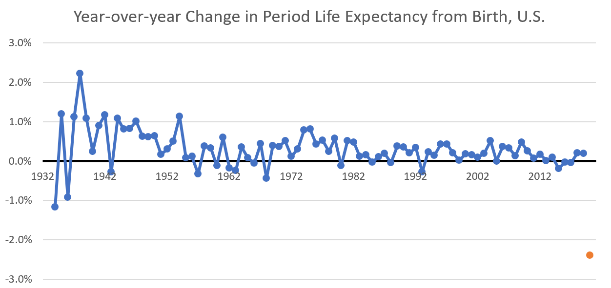
This measure does capture large-scale mortality changes — using the research report above, it was a 2.4% decrease in life expectancy from 2018 to 2020. That is a substantial decrease. Here is a historical demonstration, reaching back to 1933:
The data are from The Human Mortality Database, which ultimately use CDC data. Check out the lonesome orange dot for 2020, which is well below all the other years.
So, yes, a 2.4% drop in life expectancy is really bad.
The issue is that mortality changed a lot at different ages, and the life expectancy number is trying to capture all the changes, which of course changed across ages, sexes, and races in a variety of increases (and, in the case of children, decreases). Increases in mortality at younger ages have a much larger impact on period life expectancy than increases in mortality at old ages.
As an actuary, simply giving me a period life expectancy doesn’t tell me where the mortality increased/decreased. I can basically play around with all sorts of mortality increases at different ages to get those same results.
There is a similar problem with my preferred single mortality statistic: age-adjusted death rate, which is a weighted average of mortality rates across ages.
Any time you’re collapsing something that is multi-dimensional into a single number, you lose information.
Period life expectancy is a snapshot and will likely rebound
But, most importantly, the mortality results we saw in 2020 were a one-time hit. These mortality stats are not going to hold for anybody throughout their lifetime. I already see mortality going back to normal-ish levels, so the effects on period life expectancy will probably be gone by 2022.
The Spanish flu pandemic gives us the demonstration of what happens when there is a short-term large increase in mortality.
Using Social Security records of period life expectancy, there was a huge drop in life expectancy in 1918…. and then a huge increase in 1919. But going from 1917 to 1919 wasn’t really that big of a difference.
The period life expectancy drop was 12% for females, 13% for males in 1918.
Then there was an increase of 15% for females, 20% for males in 1919. The Spanish flu hit the U.S. hard in 1918, and let up in 1919.
If you compare 1919 against 1917, the life expectancy from birth increase was 1% for females, and 4% increase for males — male life expectancy was down in 1917 compared to 1916, probably related to World War I.
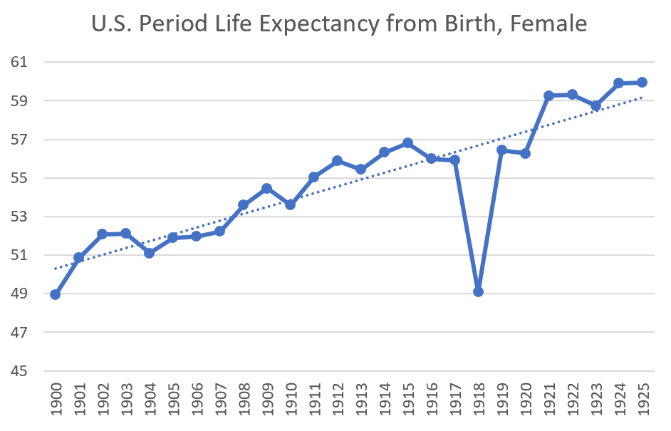
Here’s a graph of the period in question, just sticking to female life expectancy to avoid the issue of World War I:
I put in a trendline so that you can see that period life expectancy was very steadily increasing, and the Spanish flu pandemic basically affected the 1918 stats, and that was it. Most of the Spanish flu pandemic mortality effects were felt in the fall of 1918, with very little of the excess mortality hitting in 1919.
Actuarial results: 16% increase in total death rate, 4% increase in non-COVID death rate
So rather than quibble about life expectancies, let me get back to mortality rates, which is my preferred measure.
The Society of Actuaries has just released: U.S. Population Mortality Observations, Preview of 2020 Experience – June 2021 Update, with a direct link to the PDF report.
I had a twitter thread on the paper. I will be getting into the details (especially accidental deaths and suicides) in future posts.
Let’s take a look at the overall increase in death rates:
Including all deaths, that is a 16.1% increase in raw death rates (not age-adjusted) in 2020.
If you remove the “with COVID” deaths, there is still a 4.4% increase in death rates.
Just pushing back our experience to 1999, the largest increase in death rates in a single year was 2015, with a 1.2% increase. So 4.4% is a large increase just for the non-COVID causes of death.
COVID death pattern
Everybody has been talking about COVID deaths, and I will just take a snapshot here:
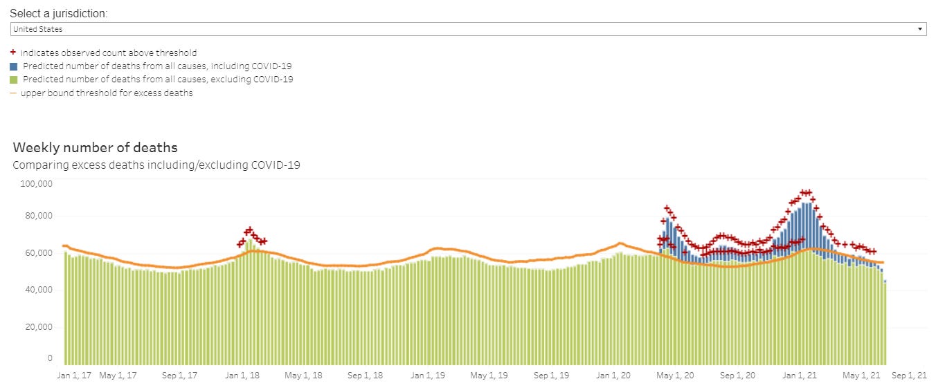
This is the record of total deaths, week-by-week, in the U.S. from January 2017 up until June 2021 (with the most recent weeks being estimates that should be ignored).
The orange line is a “excess mortality” threshold that is set at 95% confidence level of certain mortality trend assumptions (you see there’s seasonality to that orange line), and the red pluses indicate when the level of deaths is above that orange line.
The blue portion of the bars are “with COVID” deaths, and I just want to point out that there are three waves of that “with COVID” death, with:
1. The first wave centered around NYC and was a very tall, sharp spike – peak in early April 2020
2. The second wave was diffuse and along the south of the U.S. (notably affected areas being Arizona, Texas, and Florida) – over all summer
3. The third wave hit basically everywhere, especially the places missed by the first two waves – peak in early January 2021
I want you to remember the timing of these, and the location, because this will be coming up again.
Coming Attractions: Digging into the non-COVID causes of death
What I will be looking at in posts and videos to come are the major non-COVID causes of death, broken out by major groups.
Using preliminary data, we’re going to try to see why this occurred:
The causes of death are ordered here, left to right, by whether they’re top causes for the total population. Heart disease and cancer both came in above COVID deaths, as discussed in my April 2021 post.
Once we start digging into the data, we’ll see that some causes of death had patterns similar to that of the COVID waves, and some did not. That certain causes of death also peaked with COVID deaths may indicate underdiagnosed COVID deaths, or may indicate other causal dynamics.
But some of these did not have a similar pattern, and yet had large increases.
For now, I will let you guess which did what.


