Mortality with Meep: Pennsylvania, Illinois, Ohio, Georgia, North Carolina, and Michigan by Race/Ethnicity and Week
Putting it all together: New York was a huge driver in excess mortality
Let’s round out the top ten states in population by graphing out the relative mortality experience of the remaining 6 states.
For each state, I will just share the graph of the percentage excess mortality for non-Hispanic Whites, non-Hispanic Blacks, and Hispanics.
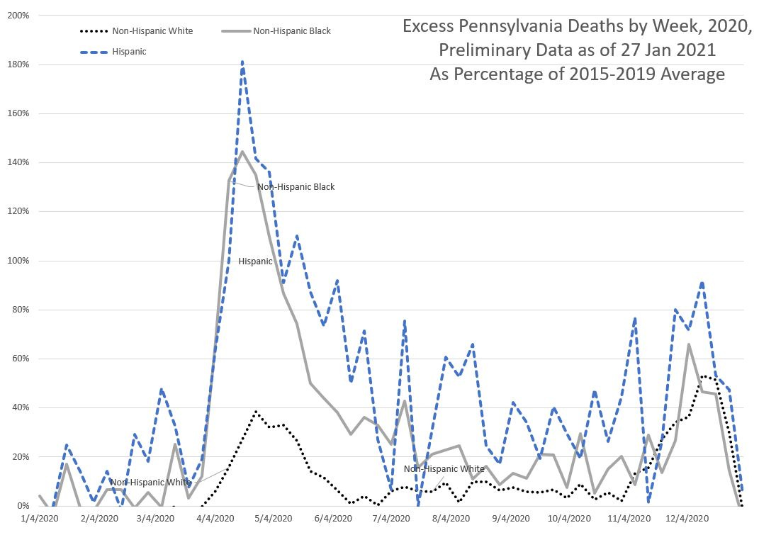
Pennsylvania mortality experience
We can see that Pennsylvania had the spring wave, as well as the winter wave. One thing to note is that there is a lot of volatility in the Hispanic excess mortality, but if you look at the underlying numbers, it’s because it’s on the order of magnitude of less than 100 deaths per week for Hispanics. The Hispanic population is not very large (or old) in PA.
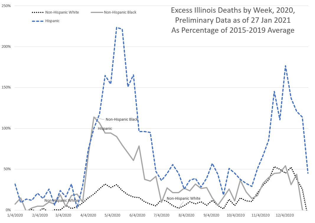
Illinois mortality experience
We can see two waves – one in spring and one in the winter. One needs to be careful about the winter data – that fall off at the end likely represents the reporting lag.
As we have seen with other large states, the Hispanic mortality impact has been much higher than the other groups.
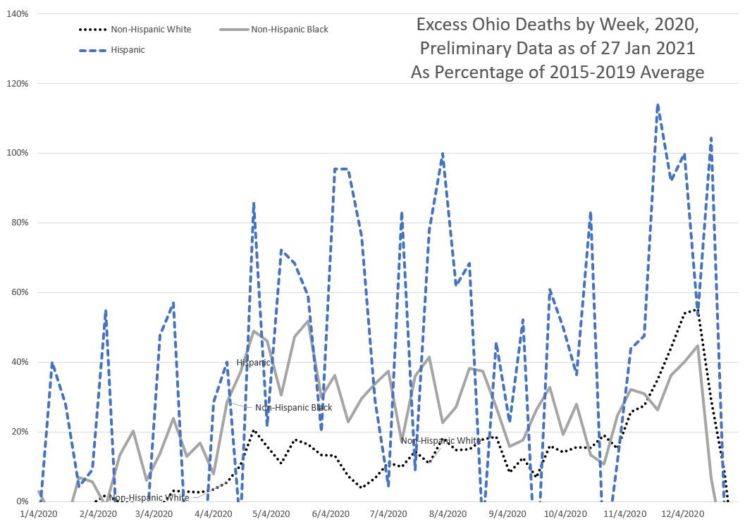
Ohio mortality experience
Ohio basically has had a winter wave.
Yes, the results for both Black and Hispanic populations are extremely volatile… because Ohio is almost entirely non-Hispanic White in its population. The number of deaths for those populations in normal years can also be relatively volatile.
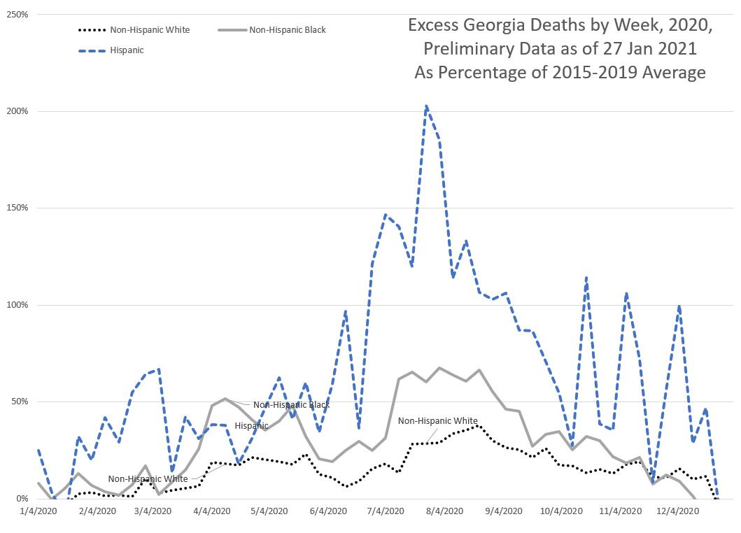
Georgia mortality experience
One sees some heightened mortality in the spring, and I assume that was centered on Atlanta. But it’s mainly a summer wave.
One thing to note about Georgia demographics: it has a very large Black population – almost one-third of its population. Non-Hispanic Whites are about 45% of the population. Hispanics are about 13%.
Looking solely at Atlanta, over 50% of the population is Black.
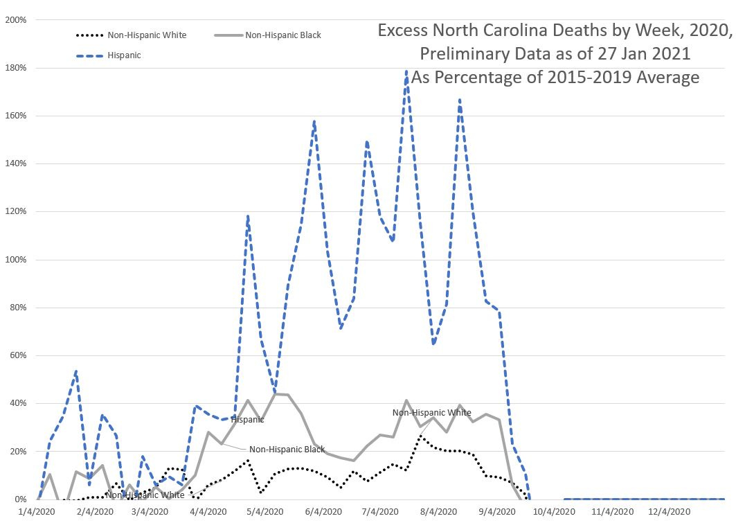
North Carolina mortality experience
Sigh
I can’t do much with this. Yes, there’s a summer wave, and yes, it’s worse for Hispanics, but the data cuts off at October 2020.
North Carolina — frickin report your data to the CDC, dammit.
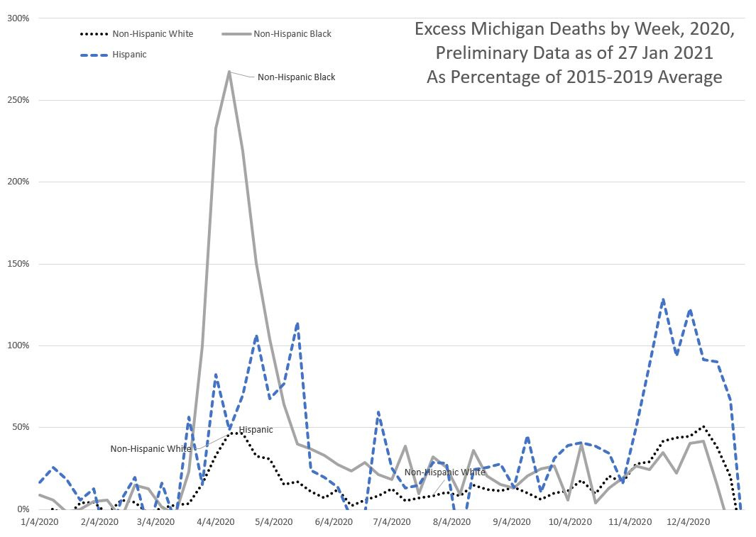
Michigan mortality experience
In this one, we see a pattern we didn’t see before — very high non-Hispanic Black mortality in the spring wave, and a winter wave with high Hispanic mortality.
If you recall, Detroit specifically was affected in the spring wave, and Detroit has a large Black population — over 75% of the population.
Aggregated excess mortality
While I’ve been graphing the week-by-week excess mortality so we could see the waves of disease differing geographically, we saw with some of the states where certain groups generally have very few deaths per week it was difficult to interpret given volatility.
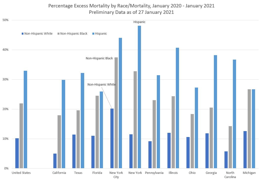
So let’s aggregate all the excess mortality for each of these states (and the entire U.S.). Again, we’ll be doing a percentage comparison against 2015-2019.
Overall, excess mortality (in a relative sense) for Hispanics is about three times than that seen by non-Hispanic Whites, and non-Hispanic Blacks have excess mortality about twice that of non-Hispanic Whites.
Note that New York City by itself has a very large amount of excess mortality. You can see why New York, as an area, reacted very drastically last year. When I saw the mortality spike coming from the city last year, I was just fine staying at home… because I could. The trade-offs have been relatively easy for me to see.
But it hasn’t been quite so extreme elsewhere.
I will wait for more data to see if I can do more in-depth race/ethnicity & age analysis, because it’s not just a case of geographic distribution differing, but the age distribution is very different, too.
Resources
CDC dashboards for excess mortality 2020-2021
Downloadable spreadsheet at my DropBox – note: you need to enable Macros in order for the graphs to be properly updated (the VBA forces calculation, and re-titles all graphs.)
Videos:
Mortality with Meep – On Excess Mortality
Mortality with Meep – U.S. Total Mortality 2020 by Race and Ethnicity


