Mortality with Meep: On Florida COVID Deaths and Reporting Lag
Graphs and geekiness; you have been warned
Before I jump into this, I miss the days where I could figure out numbers about “suspicious” Dominican deaths.
Or suspicious deaths of Russian men.
Man, those were the days.
So let’s get to it…
…um, prepare to count the dead
Looking at Florida COVID deaths by reporting lag
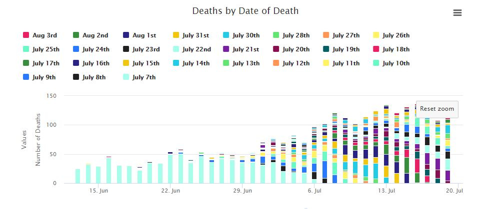
I mentioned that Jon Taylor in Florida has been taking official reported data, and regraphing COVID deaths by actual date of death.
He’s done his own post, explaining the difference between when the COVID deaths in Florida were reported and when they actually happened. What’s great about all his graphs is he has a widget where you can download his graph data…. and I’m going to rework one of his graphs.
Here is the original graph:
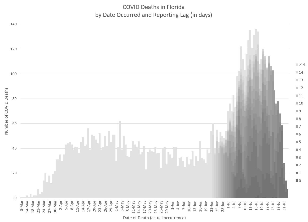
And here is my reworking:
The shade of the segment is by the number of days between when the death occurred and when it was reported: aka, the reporting lag.
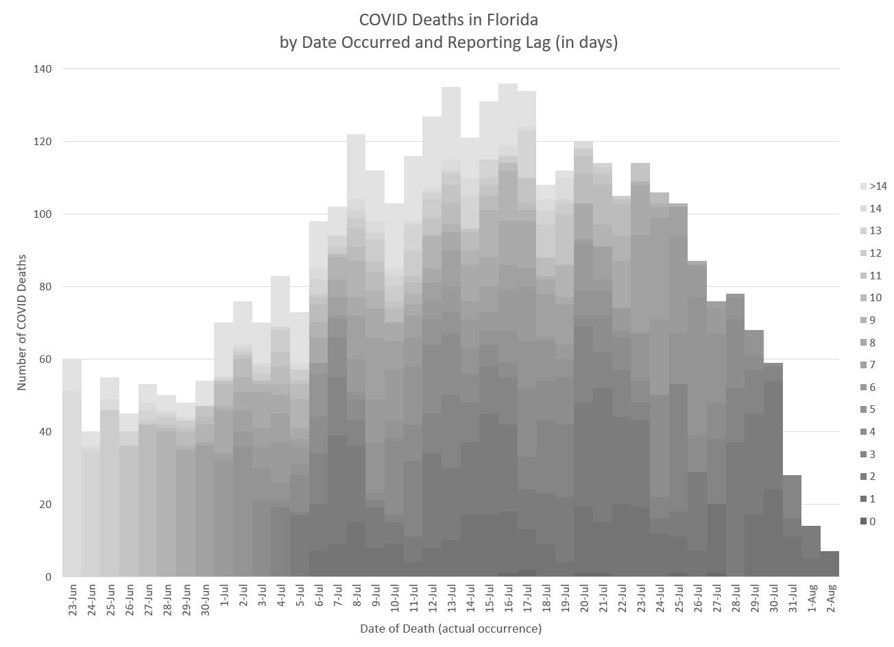
The darker the color, the shorter the reporting lag; the lightest shade is for a reporting lag of over 2 weeks. We’ll look a bit closer on where the increased activity occurred:
So, if we want to estimate when the peak of COVID deaths occurred in Florida (or whether it has yet to occur), we need to look at the average reporting lag, and the distribution of COVID death reporting lag in general.
What is the actual reporting lag for Florida COVID deaths?
I actually calculated the average reporting lag on COVID deaths for the deaths occurring after July 7 – this includes lags of 0 days, when the deaths are reported on the same day they occurred.
The COVID death reporting lag in Florida, on average (based on this data) is basically 7 days. One week.
Obviously, when deaths are reported, some happened on that day, and some happened more than 2 weeks before. There’s a whole distribution – let’s check it out!
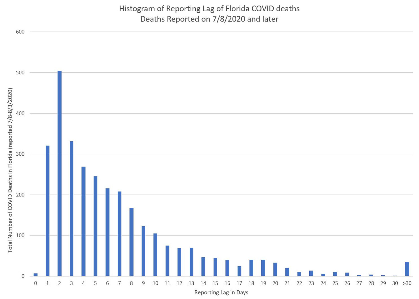
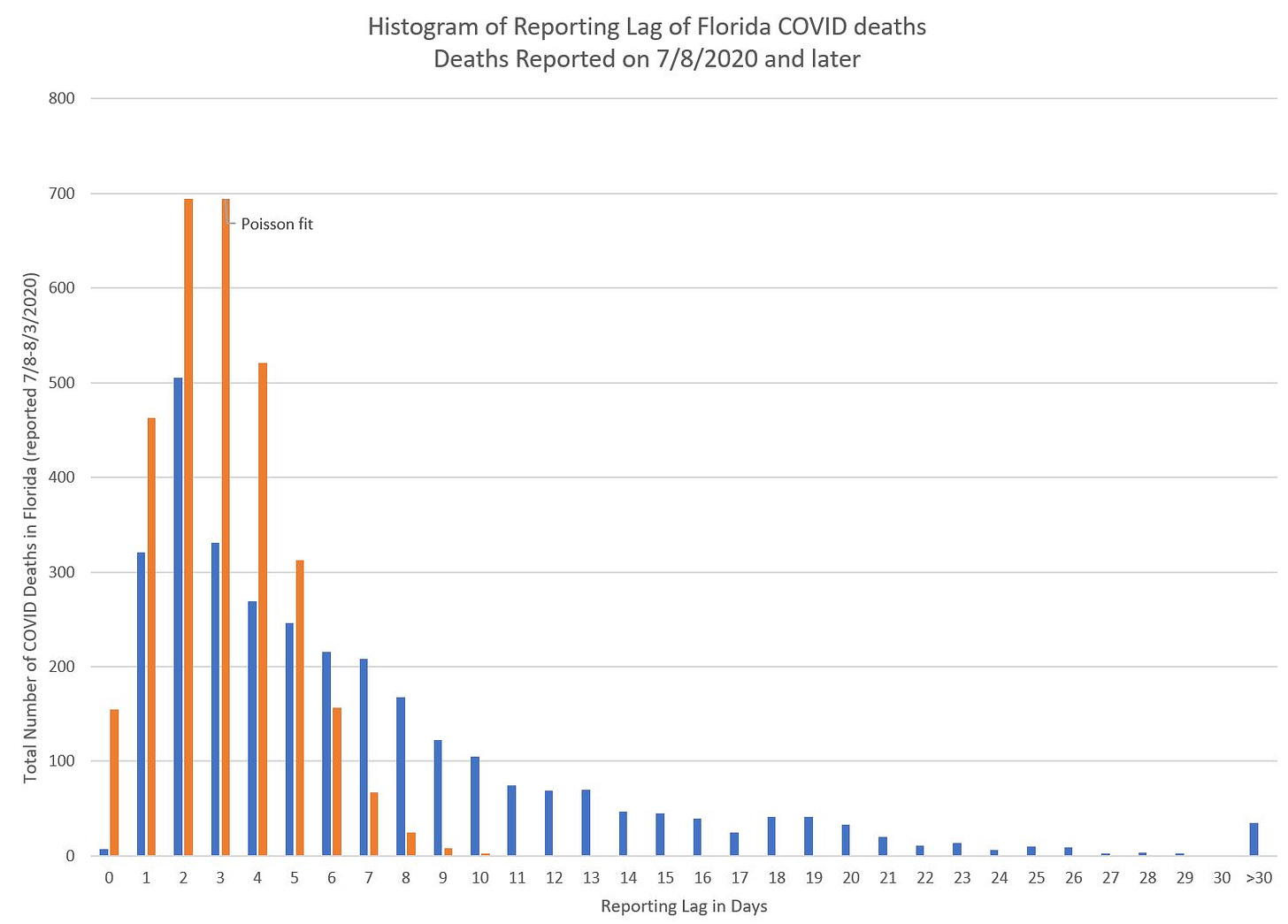
Here is a histogram of the lag (excluding the deaths reported on July 7 and before):
The average (mean) lag is 7 days, but the mode (the most common lag) is 2 days.
If we look at percentiles:
Median: about 4.5 days
75th percentile: about 9 days
90th percentile: 15 days
Basically, almost all the COVID deaths are being reported within 2 weeks.
Yes, there are niceties about how the shorter lags are “overweighted”, and if the peak is yet to come, we’ve definitely underestimated the lag.
That said, I believe these reporting lags to be credible, and that almost all COVID deaths in Florida are reported within a couple weeks.
The exponential-looking curve of the histogram is a nice pattern, and does seem to accord with natural processes. Heck, I would model this reporting lag with a Poisson process, frankly. Let’s try it:
Hmmm, not Poisson. This distribution has a fatter tail.
(That’s what HE said.)
Okay, back to seriousness.
Why should we care?
Mainly because when deaths are reported, as opposed to occurring, is meaningless. Other than to show if you’ve got a process that has way too large lags in it.
However, a one-week average, 4.5-day median, 2-day mode in reporting lag seems pretty good to me. The issue is, you’re not going to know the peak occurred until at least a week or more after it actually happened.
As I noted above, it does seem there’s a “fat tail” in the reporting lag, and if you simply take a look at how many new deaths were reported, the reporting peak will happen a week or more after the actual peak occurred.
It is possible for the Florida COVID death count to get higher than it has, but the current pattern I’m seeing looks like the peak occurred in mid-July. Maybe it will spike again when school starts… and maybe it won’t.
By the way, the average weekly deaths for Florida in July is about 3800 per week, or about 540 per day. The peak of COVID deaths for Florida seems to be under 150 daily, which would be a substantial excess mortality… but nothing like the over-500% excess mortality we saw in New York City in April.
I have done a quick update of my excess mortality figures that I’ve updated using July 29 data, and it does look like Florida’s mid-July excess mortality is about 25% over normal. That would accord with about 150 deaths per day at the peak.
So here is why we care: we have been told that the “second wave” of COVID deaths could be more severe than the first…. but I haven’t seen it so far. Part of the reason why is that the newer wave is mainly being spread among younger people, and not in nursing homes where so much of the extra mortality occurred in the northeast in April.
I’m not saying additional mortality is a great thing, but if we do actually see a dampening of death rates (and case severity) as we get multiple waves, then that might be the best we can do.
We’ve not managed to wipe out the common cold — or even the flu, while we have vaccines for that — so it may merely be wishful thinking that we’ll even get a vaccine for this specific disease.
People in developed nations have gotten fairly lax with respect to infectious diseases in general, forgetting what it was like when infectious diseases were top killers, and when it was more children who were killed than old people. Now we have a disease that has a mortality profile by age that is very close to the profile we see for all causes of death, with the oldest being the most vulnerable.
In any case, a lot of the numbers being reported are misleading, and in general, it’s because the people doing the reporting are ignorant. The headlines will blare “highest death toll reported today!” and then months later, you realize those “record deaths!” headlines were occurring weeks after the true peak had passed. If you’re making decisions based on delayed data…. you can overreact (or underreact, depending.)
There still is no excuse for the official state COVID dashboards for graphing deaths by the day they were recorded.
You know when the deaths occurred; you should be graphing that instead.


