Mortality with Meep: Excess Mortality in California, Texas, and Florida by Race/Ethnicity
Top Three States Driving Hispanic Excess Mortality
In my last post, I covered excess mortality from NYC and New York state. New York City was the epicenter of a really bad COVID spread, with a huge spike in mortality that disproportionately affected Hispanics and Non-Hispanic Blacks.
We’re going to see disproportionate effects in other localities as well, but big differences in the pattern and magnitude.
California excess mortality by race/ethnicity
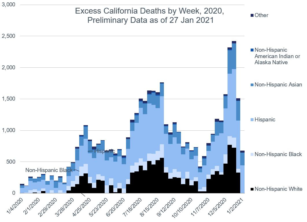
Now let’s go to the largest state, California, with a population of over 39 million and excess mortality from 2020 of 44,000.
Here is a graph of all the excess deaths, by week and by race/ethnicity.
The entire state of California has that three-wave structure seen for the whole U.S., but the trend is different: a relatively mild spring wave, a higher-peaking one in the summer, and an even higher-peaking one in winter.
We also see a very large Hispanic component to the excess mortality, but then California, like the other Southwestern states, has a very large Hispanic population.
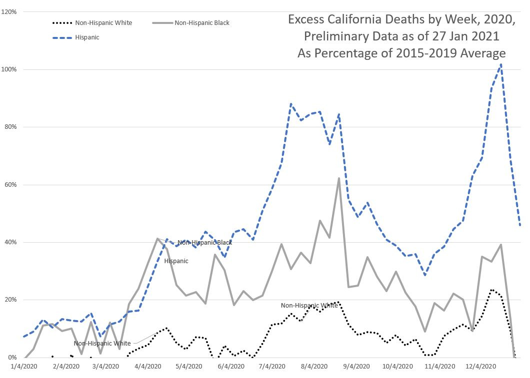
Let’s look at the results in a relative sense:
As with New York and New York City, the Hispanic excess mortality is far worse than the other two groups. Given the very large Hispanic population in California – over a third of its population is Hispanic – this has an outsized effect on the excess mortality for Hispanics for the entire country. In a moment, we’ll see that these three states: California, Texas, and Florida, provide the majority of the excess Hispanic mortality. To be sure, they also represent areas with large Hispanic populations.
Texas excess mortality
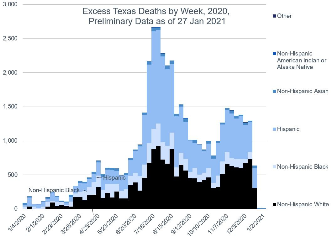
Total excess deaths by race/ethnicity:
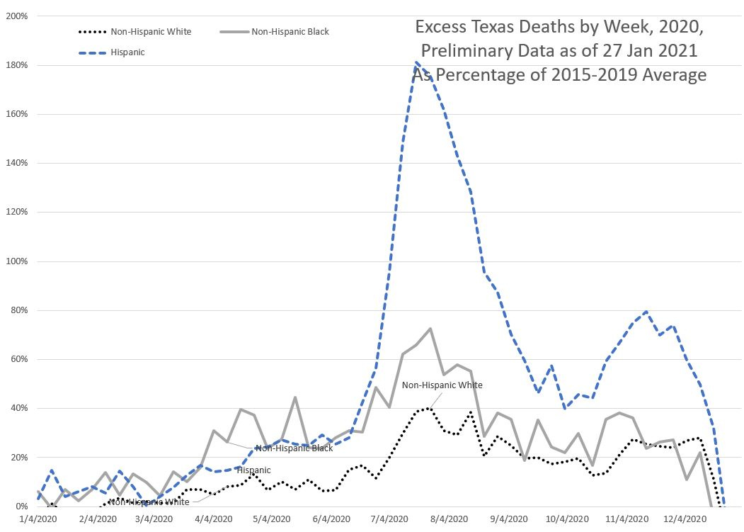
Percentage excess deaths:
There’s not much of a spring wave in Texas, but definitely a summer and fall/winter one. Indeed, the fall/winter one looks like a lot of data are missing, and may get even worse than what we see here. It may be another month before the data are complete enough for a proper Texas analysis.
Still, we can see that summer wave really affected Hispanics in the state disproportionately. There is a little extra mortality for non-Hispanic Blacks compared to non-Hispanic Whites, but not by much.
Florida excess mortality
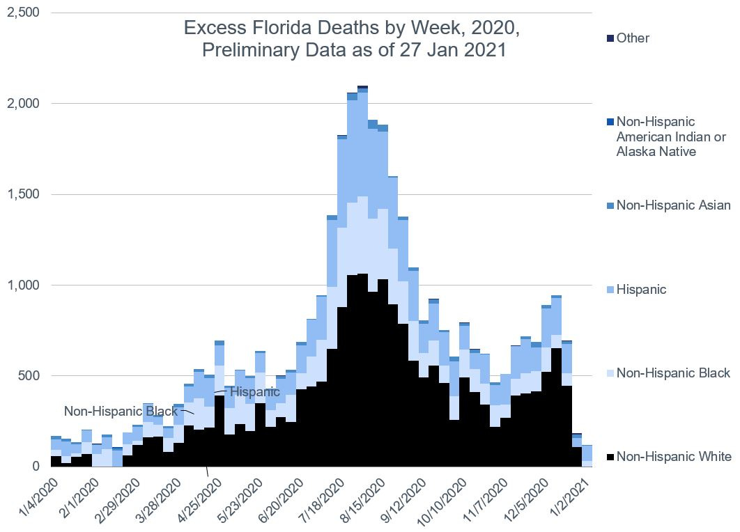
Finally, the same two graphs for Florida:
Total excess deaths by race/ethnicity:
Percentage excess deaths:
Now this is interesting. Unlike the prior two (and New York/New York City), we see that Hispanics and non-Hispanic Blacks have similarly high relative excess mortality.
One difference for Florida versus Texas and California may be related to its relatively high proportion of Blacks. Florida has a proportion higher than the national average, and Texas and California has proportions at about a half or less the national average. The different ethnic groups have very different geographic distribution patterns, with Blacks concentrated in the southeast, Hispanics in the South (all across the South), and Asians on the West coast. This obviously reflects the entry patterns for each group of people. Yes, obviously, people have moved around, but even with the Great Migration, the vast majority of people stay put. In the next post, we’ll see the effects of the Great Migration in the excess mortality pattern, when we see a spike in Michigan.
Proportions of excess deaths
The excess mortality patterns of California, Texas, and Florida greatly contribute to the excess mortality seen by the Hispanic population of the U.S.
Let’s look at what percentage of excess deaths came from each state so far:
For non-Hispanic Whites, these 4 states + one city account for less than 25% of the excess mortality seen for that group.
For non-Hispanic Blacks, these places account for just over 30%.
For Hispanics, it’s two thirds, with most of it coming from California (23%), then Texas (21%), then Florida (10%). New York City accounts for 9%, and then the rest of New York state for 3%.
UPDATE: Checking out the Hispanic population by state, these percentages are a little in line with national distribution — California (26% of U.S. Hispanic population), Texas (19%), Florida (9%), New York (including NYC — 6%). The most disproportionate effect comes from New York City.
You can also see, for non-Hispanic Asians, one-third of their excess deaths come from California. I did not graph it much in the above, but most of the Asian excess mortality in California has come in the third, fall/winter wave.
Part of this exercise is to realize that yes, the United States is a big place (as are the 4 states I’ve looked at so far), and that to really get at the underlying patterns, you do have to dig down at least one additional layer. There has been strong geographic differences, as well as ethnic/racial differences in the effects of the pandemic coming through.
In the next post, I will round out the remaining 6 top-population states (and complain about North Carolina. Again.) And also look at the aggregated excess mortality for the groups in general.
Resources
CDC dashboards for excess mortality 2020-2021
Downloadable spreadsheet at my DropBox – note: you need to enable Macros in order for the graphs to be properly updated (the VBA forces calculation, and re-titles all graphs.)
Videos:
Mortality with Meep – On Excess Mortality
Mortality with Meep – U.S. Total Mortality 2020 by Race and Ethnicity
See you tomorrow!

