Mortality with Meep: Excess Mortality in New York and New York City
Looking at the Worst-Hit U.S. Location First
As with my video in which I focus on racial/ethnic differences in excess mortality, I am going to do a few posts looking at what the excess mortality looked like for the three major racial/ethnic groups in states with the largest populations.
The top ten states by population are:
1. California 39.4 million
2. Texas 29.4 million
3. Florida 21.7 million
4. New York 19.3 million
5. Pennsylvania 12.8 million
6. Illinois 12.6 million
7. Ohio 11.7 million
8. Georgia 10.7 million
9. North Carolina 10.6 million
10. Michigan 10.0 million
I will not be addressing these in order. I am going to start with the mortality epicenter from April 2020: New York City. I will also look at excess mortality in New York state (excluding NYC).
New York City Excess Mortality
I keep hitting it, but you need to keep in mind: the mortality hit in New York City was extreme.
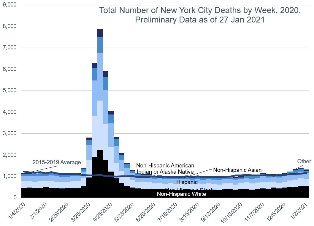
Here are the total deaths:
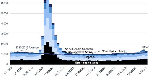
So, there’s essentially been only one mortality wave in New York City. The “normal” level of deaths for NYC is about 1,000 per week. It spiked to almost 8,000 at its peak.
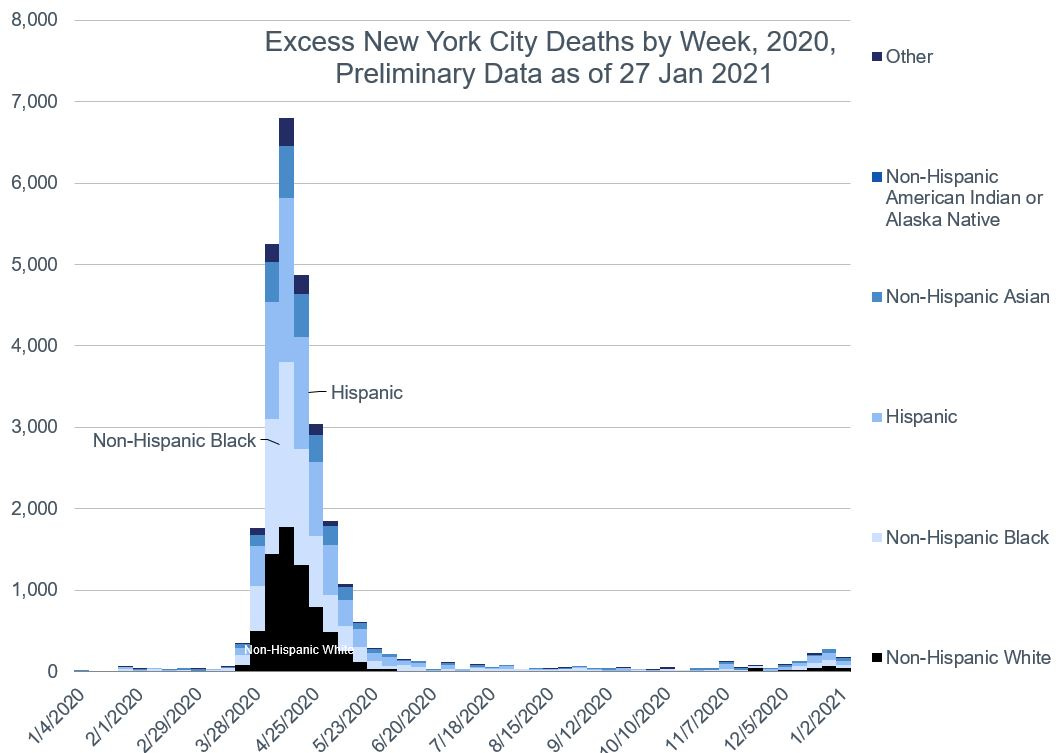
Let’s break out the excess deaths by race/ethnicity:
Yeah, it’s essentially the same shape. Just chop off about 1,000 per week.
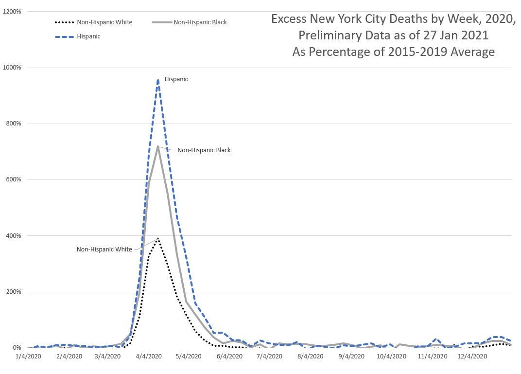
So now let’s look at the percentage excess mortality for the three largest racial/ethnic groups:
Yowza. That’s almost 1000% excess mortality for Hispanics, 700% excess for non-Hispanic Black, and 400% for non-Hispanic White.
NYC’s Share of Excess Mortality
I want you to think about how much the national-level-excesses are driven by the NYC results.
For the data I have as of 27 January 2021, NYC mortality provides 9% of excess mortality for non-Hispanic Black people in the entire U.S. [8,638 excess deaths for Black people in NYC out of total 99,514 excess deaths for Black people in the entire country].
We get the same statistics for Hispanics in NYC: 97,725 excess deaths for the whole country, and 8,608 in NYC alone.
So excess deaths for these two groups have about 9% each coming just from NYC alone.
That’s a pretty substantial amount, and can move the trend for a particular group.
By the way, we will see that there are some very different patterns by geographical area. While 9% of excess deaths for these two groups come from NYC alone, only 2% of excess mortality for non-Hispanic White people comes from NYC.
New York State Excess Mortality (excluding NYC)
Let’s be complete and look at the same graphs for the rest of New York state.
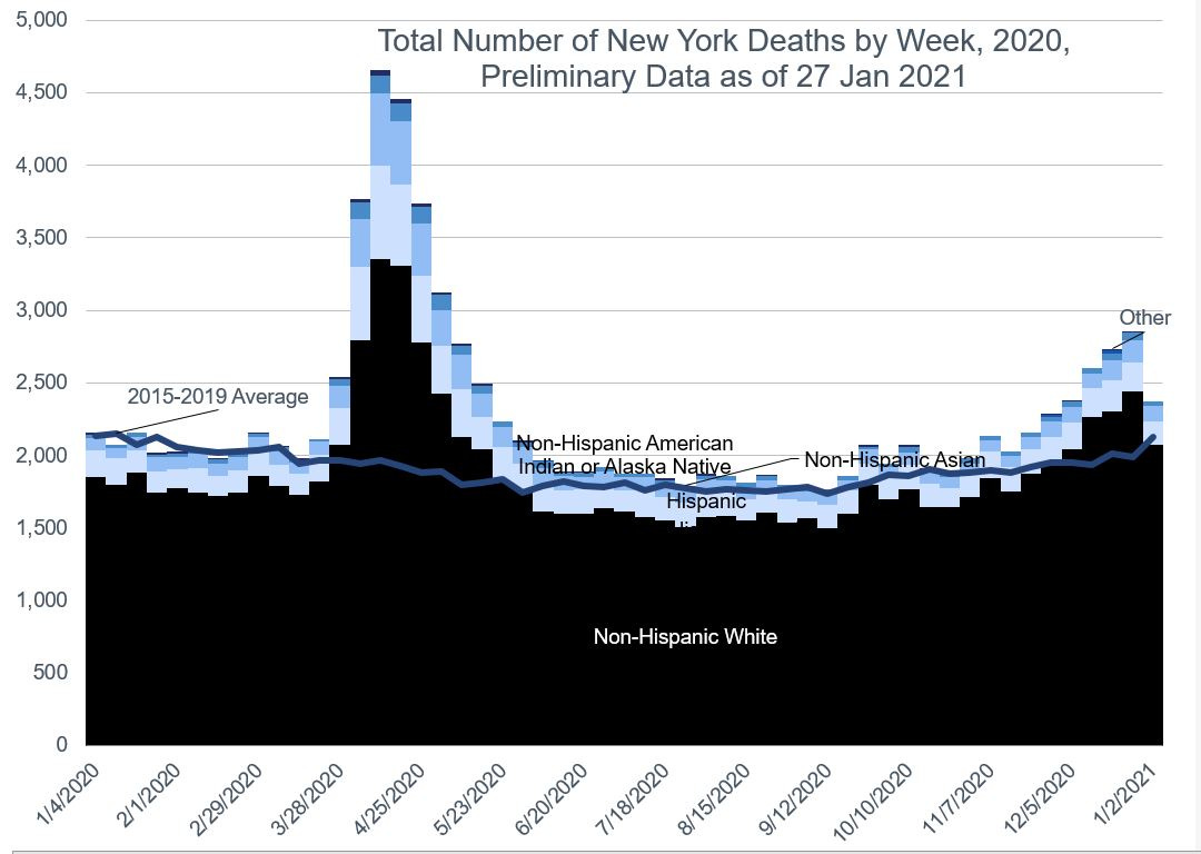
Total deaths:
Note that the “normal” death level is about 2,000 deaths per week — twice what we expect in NYC. But the April spike is not as extreme for the rest of the state compared to NYC.
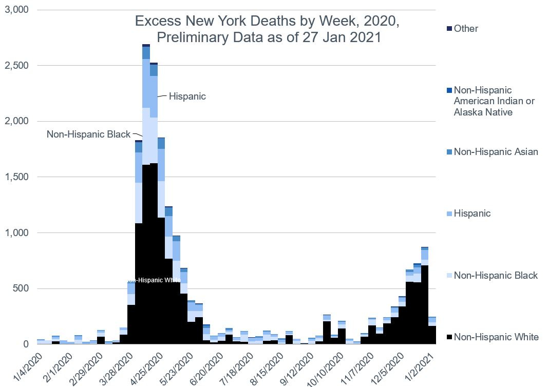
Excess deaths by race/ethnicity:
Note the balance of excess deaths in that second wave — non-Hispanic Whites are a larger percentage of the excess deaths in that second wave.
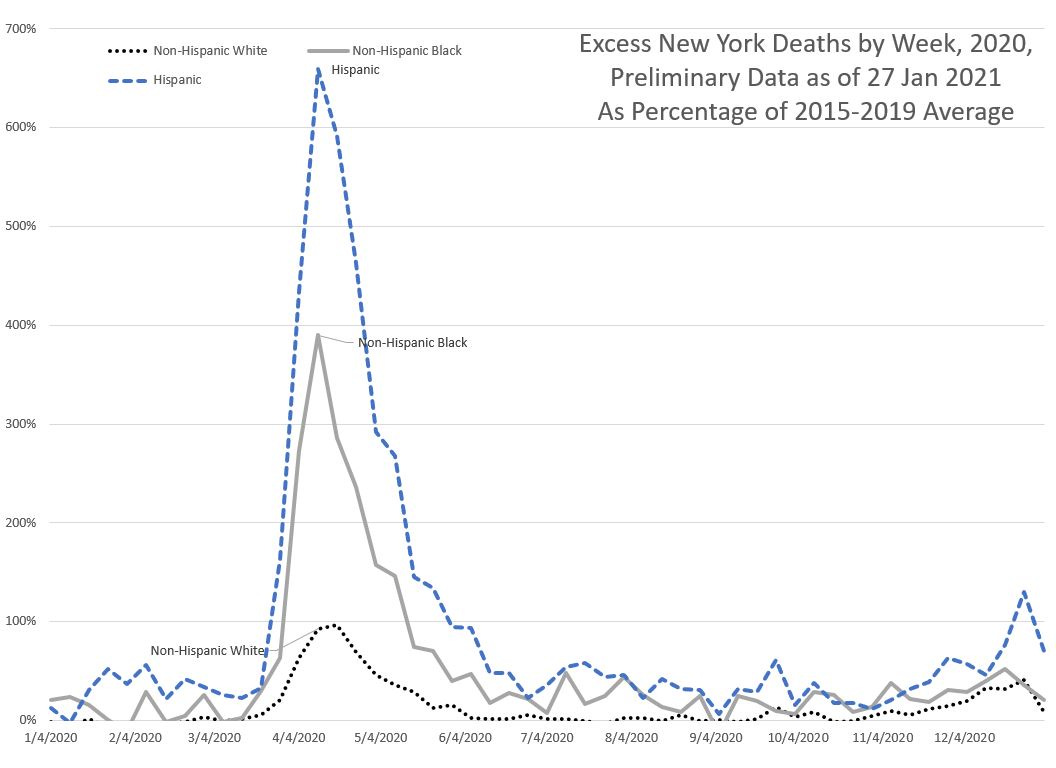
Percentage excess deaths:
And we can see in this one that we see the same structure as with NYC itself: much worse relative effects for Hispanics compared to non-Hispanic Whites and non-Hispanic Blacks are in the middle.
Note that I’m only looking at this here by race/ethnicity… there is a key dimension that could be driving some of these differences. Namely, age. The non-Hispanic White population tends to be older, and already has a pretty high death rate compared to the other groups. Their excess deaths can be very large from a number perspective, but be much smaller when looked at from a percentage perspective. I’m still thinking through the best way to show this, but there is an issue when I start doing slices like that — I start having smaller and smaller population slices to look at, and variability can really drive differences.
Video explainer: Excess mortality and population size
The reason I’m focusing on these largest states is that it is very difficult to do reliable analysis for the smaller states. To begin with, expected deaths are driven by the age distribution of the particular state, but also the overall population size. For large states, it takes a long time for the age distribution and population size to change in a noticeable way. For small states, a few thousand people high-tailing it to Florida (for example), will have a much larger effect on the small state than on Florida.
Another issue is the smaller the state, the more volatility (in a relative sense) in death counts, even during normal times.
New York City itself has a large enough population to do an analysis (8.4 million), but Alaska (730 thousand) is too small.
In any case, I will be doing Florida, Texas, and California in the next post.
Downloadable spreadsheet at my DropBox – note: you need to enable Macros in order for the graphs to be properly updated (the VBA forces calculation, and re-titles all graphs.)

