


Mortality with Meep: Digging into CDC report on mortality in the first half of 2020
Men were harder-hit than women

While we wait for North Carolina and Connecticut to get up-to-date on reporting deaths, the CDC has collected enough data from the first half of 2020 to release the following paper:
Provisional Life Expectancy Estimates for January through June, 2020
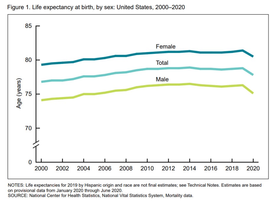
In the first half of 2020, life expectancy at birth for the total U.S. population was 77.8 years, declining by 1.0 year from 78.8 in 2019 (6). Life expectancy at birth for males was 75.1 years in the first half of 2020, representing a decline of 1.2 years from 76.3 years in 2019. For females, life expectancy declined to 80.5 years, decreasing 0.9 year from 81.4 years in 2019 (Figure 1).
Here is Figure 1:
Let me dive into the CDC report itself, and explain some of the results and make some comparisons that they did not make.
Video summary of the CDC results
If you prefer a video explainer, here you go:
Period life expectancy vs. cohort life expectancy
The issue here is that they’re trying to make comparisons of mortality levels year-to-year, collapsing the differing experiences different age groups had into a single number.
As I explain in the video above, there are two different ways to do this: period life expectancy or age-adjusted death rates. They’re inverses of each other — as mortality goes up, the age-adjusted death rate goes up, and the period life expectancy goes down. Similarly, if mortality improves, which means it goes down in general, then period life expectancy increases.
The concept of period life expectancy is that you take the death rates by age for a specific year, and then calculate a life expectancy from birth, assuming that’s the mortality experience the newly-born will see throughout their lives.
Obviously, that’s not what happens in real life, but it’s one way to capture the differences in mortality from year-to-year. It’s using period life tables – which are pertinent for entities such as pension plans. They have to deal with year-to-year mortality they’re seeing.
If you really want to think through your life expectancy for retirement planning as an individual, or something similar, what you want is a cohort mortality table and a cohort life expectancy or percentiles. A cohort table is a mortality table based on people all born the same year, and the mortality rates they see at various ages throughout their lives.
I did an extensive post on period vs. cohort life expectancy in 2018, and here is a graph:

See that spike? That’s 1918, and the period life expectancy dropped 10 years between 1917 and 1918 due to the Spanish flu pandemic (and then increased 10 years between 1918 and 1919).
As I mention in the video, I’m expecting a little spike in such a graph between 2019 and 2020, that period life expectancy will still be a little low for 2021, but that it may go back to “normal” in 2022.
So no, this number does not mean that the average number of years lost due to COVID was one year. It doesn’t mean you get to shave one year off your retirement planning. All this number is doing is capturing the mortality impact of COVID and other causes of excess mortality for the first half of 2020.
More comparisons: life expectancy changes by age
It starts getting interesting once we dig into the details of this report.
Here is the table from the study:
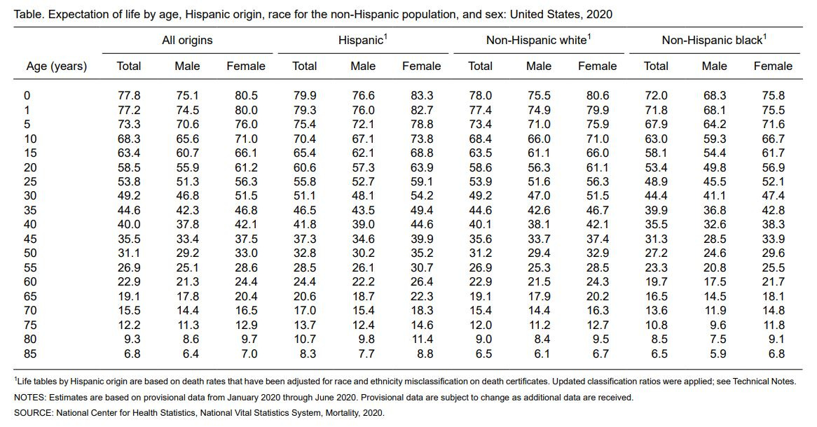
(Yes, life expectancy for Hispanics is higher than for non-Hispanic whites…. and non-Hispanic black women have higher life expectancies than non-Hispanic white men. Just a few things that have held for many years… and still holds, even with COVID.)
Note that they’re not giving the equivalent amounts for 2019, and alas, I can only find good tables for calendar year 2017, which you can get directly from the Social Security Administration. That said, from 2017-2019, it’s not like mortality has been that different over those years (except for that bad flu season 2017-2018….. which mainly had extra deaths in 2018.)
So let us compare male & female life expectancies between 2017 and first half of 2020 for the key ages in the table.
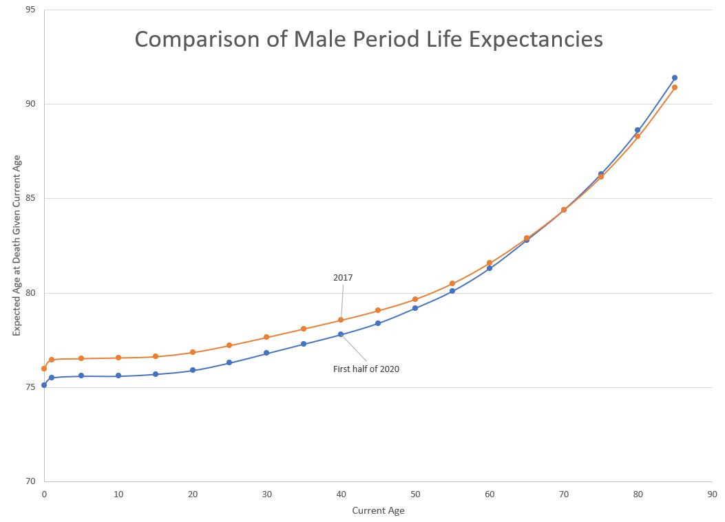
Male period life expectancy comparisons:
Female period life expectancy comparisons:
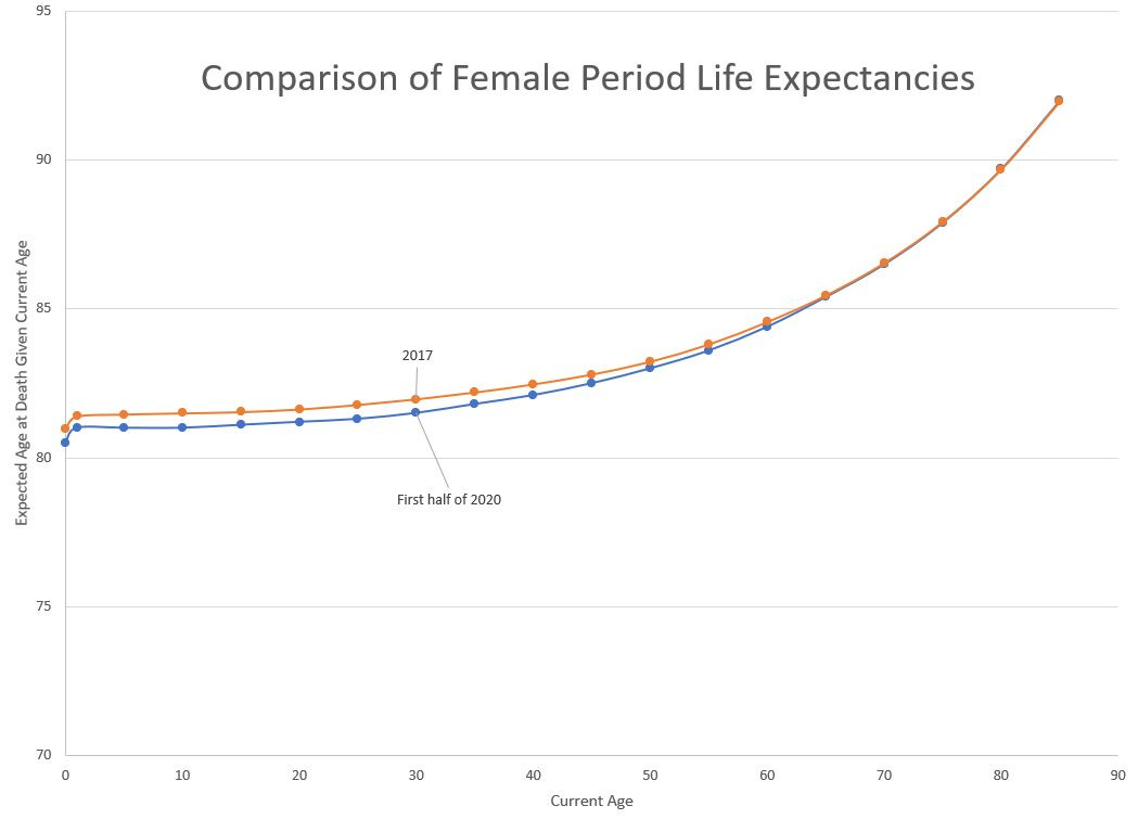
(To the nit-pickers: yes, I’m actually graphing expected age at death, not life expectancy, which is the expected number of years left… but that confuses people, so I’m graphing expected age at death given current age.)
Yes, the sex gap in life expectancy is huge at birth — about five years at birth.
But notice that these curves do overlap each other, crossing over at about age 70 — to be sure, 2017 was 3 years earlier, but if COVID supposedly had a huge effect on older people, why would life expectancy be higher for those age 70 and higher?
Let’s look at the percentage change in life expectancy (and this one is for number of years left, not expected age of death):
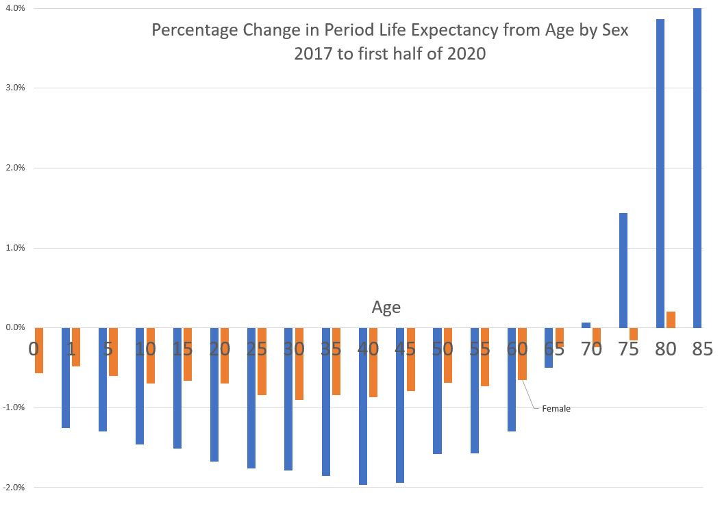
You can clearly see the crossover at age 70, and you can see that males were more adversely affected than females, even though male life expectancies are much lower than female life expectancies to begin with. Yes, men had a harsher mortality impact than women. When the full year 2020 data come in, that will still be the case.
Years are more familiar but death rates are more meaningful
It is better to provide death rates by age ranges for year-to-year comparisons.
When you calculate a period life expectancy, you’re incorporating the mortality rates for all the ages above the current age, and it doesn’t really capture how specific age ranges were affected. I can use these life expectancies to make estimates about the death rates, but I’m not going to – I’m trying to keep the calculations simple so that other people can follow my spreadsheets and check what I’m doing.
With age-adjusted death rates, you can capture overall mortality levels, but again, you don’t know which age ranges were affected the most.
I believe period life expectancy is used for these types of reports because people are more comfortable thinking about number of years to live, or age at death, than they are thinking about rates.
Sorry, but rates are the more meaningful metric.
The CDC caveats
I was about to write about some of the caveats from this report, but then I realized the CDC people themselves wrote up the caveats.
I am editing the text to make it easier to read and adding emphasis.
The provisional life expectancy estimates presented in this report are subject to important limitations.
First, they are based on deaths that occurred during the first 6 months of the year and do not reflect the entirety of the effects of the COVID-19 pandemic in 2020, or other changes in causes of death, such as the increases in provisional drug overdose deaths through early 2020 (11). There is seasonality in death patterns in any given year, with winter months typically seeing more deaths than summer months, and this is not accounted for in the data.
Second, the COVID-19 pandemic differentially affected certain geographic areas in the first half of 2020. The life table estimates may disproportionately represent mortality in those regions, which are more urban and have different
demographic characteristics than areas affected by the pandemic in the latter part of the year. As a result, life expectancy at birth for the first half of 2020 may be underestimated since the populations more severely affected, Hispanic and non-Hispanic black populations, are more likely to live in urban areas.
As I’ve noted in some of my prior video and blog posts, the first wave hit the northeast, and the second wave didn’t come until the summer, which is when places like Arizona, Florida, and Texas were hit.
The racial/ethnic disparity in the first wave was really driven by the results in New York City. Yes, there were waves in Detroit and New Orleans, too, which did differentially hit the black community in those cities, but the increases in those cities were nowhere near the impact seen in New York City.
When the full year 2020 data come in, whether it will be worse than this initial report somewhat depends on how bad the December wave actually was. It looks like the Covid death wave for winter, like with flu/pneumonia, will have peaked in January. There will continue to be excess mortality in 2021 but I hope with the vaccines this will fall off drastically.
Video review of most recent CDC data
I note that something is going on with increased deaths from Alzheimers/dementia and diabetes in particular.
I also note that there has been no excess cancer deaths. I find that very interesting.
Actuarial News posts with CDC tag.
Spreadsheet with CDC data for first half of 2020, with graphs.