Mortality Videos: State Rankings, Age-Adjusted Rates over the Decades, and Pulling Data for Cause of Death
What I did on my vacation week
Yes, it was my vacation this week. So I did what I usually do: record and edit some videos.
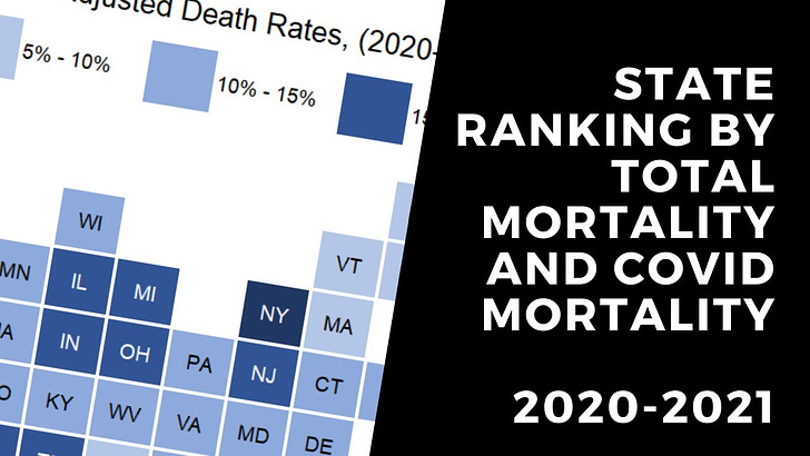
State Ranking by Increase in Total Mortality and COVID Mortality, 2020-2021, Provisional
A video version of my most recent mortality trend post:
Interlude: Tile Grid Maps
Someone was asking about how I do the tile grid maps I like to use in my geographically-related posts. I originally learned about these via the PolicyViz blog, and I downloaded the spreadsheet he had there and went to town.
This is by Jon Schwabish, who has a bunch of great materials for data visualization, especially in Excel. He has material in his A Guide to Advanced Data Visualization in Excel 2010, which will still work with current versions of Excel, that includes the tile grid map. I plan on doing a demo video later, but it is very involved.
Given I’ve just gotten my bonus, I think I’ll buy his combo A Guide to Advanced Data Visualization in Excel 2010 & 2016 Combo Pack, which again, works with the current version of Office 365. He’s got good stuff.
I’m still going to do my own video, because I have a specific adaptation I’ve made that others may wish to use.
Age-Adjusted Death Rates
I often use age-adjusted death rates in my posts. Here, I show how the current standard (using a 2000 U.S. population) compares against 1970 and 1940 standards.
Related post:
Working with WONDER: Pulling data for a single cause of death over multiple years
The example I use is motor vehicle accidents.


