Mortality Nuggets: Videos on Death Numbers, Ranking Table for States' Mortality for 2020
An amuse-bouche for the holiday weekend
Video Version of my Prior Post
For those who prefer videos:
I collect these videos in my Mortality with Meep playlist, which is up to 52 videos now, I see. I’ve been doing this since before the pandemic, so if you’re interested in some historical background for comparison, here is a similar video, where I discuss the 2017 version of that table:
This is the post I’m talking about with the 2020 death numbers, for your convenience:
Querying CDC WONDER for Leading 15 Causes of Death
This is to encourage you to do your own queries on the CDC WONDER database.
I have a playlist, Working with WONDER, which I am actively adding videos to as I pull data from WONDER. Check it out!
State Mortality Comparisons
Someone asked me about this, so here we go.
A reminder: there were two waves of COVID deaths in 2020, with the primary peak being spring 2020, centered around NYC (with a few blips around other cities like New Orleans, DC, Detroit, Chicago, etc.) There was a fall/winter wave, but it didn’t peak until January 2021.
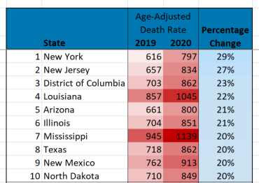
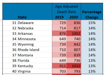
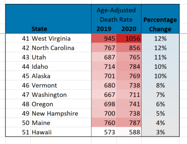
I grabbed the age-adjusted death rates for each state (plus DC) for both 2019 and 2020, and then ranked them by their percentage change.
Here is the entire 51 ranking table: (sorry it’s pictures - I’ll embed the spreadsheet below)
A few remarks on these lists.
You need to remember this is capturing the changes in mortality across all the ages, and with age-adjusted mortality rates, increased deaths of old people, while that will likely have large effects in total death counts, will not necessarily have large effects on age-adjusted death rates.
As a refresher — here’s my primer on age-adjusted death rates:
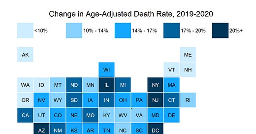
The ranking tables do reflect where COVID hit hard in 2020 — the spring 2020 wave in the northeast, and the summer 2020 wave along the south and southwest (Texas, in particular). No, Florida didn’t show its big COVID impact until January 2021, so it’s pretty far down on this ranking table.
I prefer looking at the information this way:
This way, we can see if there are any geographic patterns. We did know the hot spots of NY, NJ, IL (mainly around Chicago), DC, TX, Louisiana (around New Orleans), Arizona. I had not been aware of Mississippi being so bad, but maybe that was spillover from New Orleans.
Here is the spreadsheet, in case you want to play with it.
Though I didn’t use the information for this post, I grabbed the age-adjusted death rates and crude death rates for the states and DC going back to 1999. Interested people may wish to play with that.


