Mortality Nuggets: Car Crashes, COVID Deaths, and the WONDER of the CDC
Fatal car crashes are up both in total count and rate
Yes, I’m alive, I just haven’t been well lately.
So let’s cheer me up with some mortality!
Car crash fatalities increased in number and rate
About a month ago, we saw that accidental deaths were up, and this is a large category including things such as falls, drug overdoses, and car crashes.
We don’t have a detailed breakout of what pushed up the increase in accidental deaths, but it looks like that car crash fatalities were actually up, even though people drove less last year.
StreetsBlogUSA: REPORT: Increase in Death Rate in 2020 Highest One-Year Spike in Almost a Century
The death rate from car crashes in the U.S. spiked 24 percent in 2020 compared to the previous year— a historic rise linked to an equally historic reduction in congestion that allowed the remaining drivers to race around recklessly on roads designed to prioritize speed above all else.
According to preliminary data from the National Safety Council — a widely respected nonprofit that releases its estimates of annual roadway fatalities about two years earlier than the federal government — about 42,060 people lost their lives to the U.S. traffic violence pandemic in 2020, even as the coronavirus pandemic simultaneously ravaged the nation.
That’s about an 8.4-percent surge from the 38,800 deaths in the 2019 report — but because total annual mileage dropped about 13 percent during the nationwide quarantine, the one-year increase in the car crash fatality rate was the highest since 1924 — back when things like four-wheel brakes were still considered luxury safety features.
One of the reasons I’ve been just giving death counts for people is that just counting is easy enough for people to understand: more people died, therefore, mortality is up.
However, the way one really keeps track of mortality trends has to be by meaningful rates. For most causes of death, we look at age-adjusted death rates (I’ll explain that one another time) or actually give you death rate by age or a relatively small age group. That works for “natural” causes of death like cancer and heart attacks.
For car crashes, that’s not the meaningful measure (though we can and do measure it that way.)
Fatality rates for car crashes are measured by deaths per miles driven — and the number of miles driven last year fell by a lot. They usually fall in a recession, but last year was much more than a recession.
I grabbed Statistics and estimates from the National Safety Council:
Here are the total number of car crash deaths by year, with recessions marked out in grey:
In most recessions, the number of miles driven dropped, so even holding rates of deaths per miles driven constant, you get a lot fewer deaths. We do have data going back to 1913, and obviously in the run up from 1913 to about 1930, there is nothing but growth in deaths.
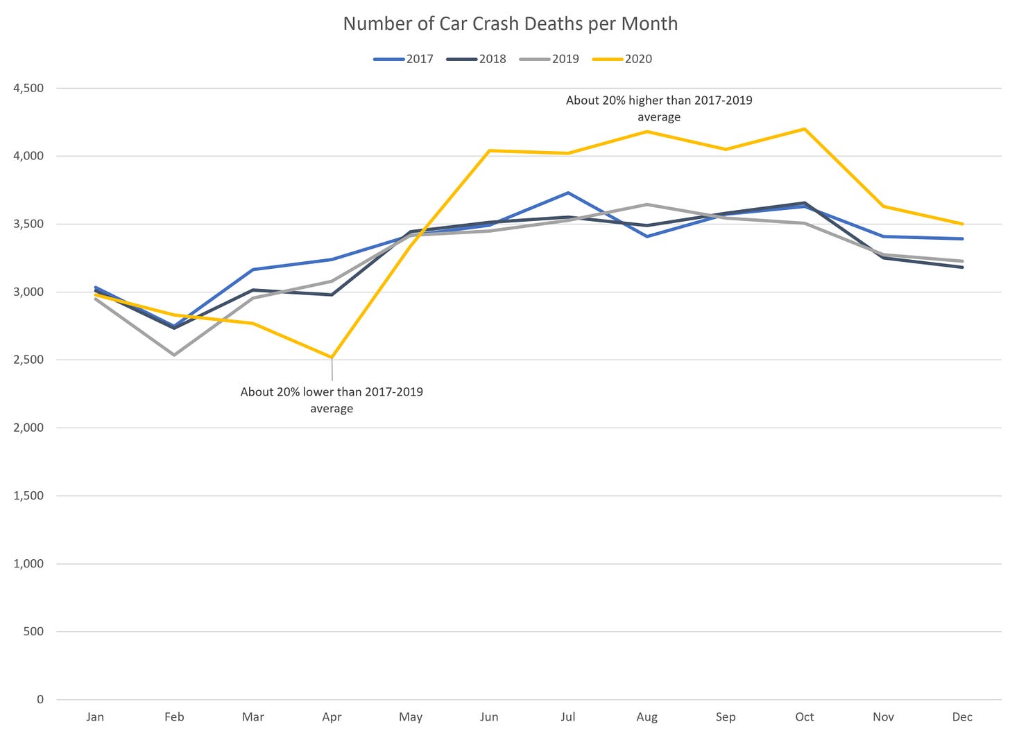
Here are the monthly estimates of car crash deaths:
You can see with the initial lockdowns, especially in April 2020, car crash deaths were way down… but more than rebounded starting in June. All of summer was pretty bad for car crash fatalities.
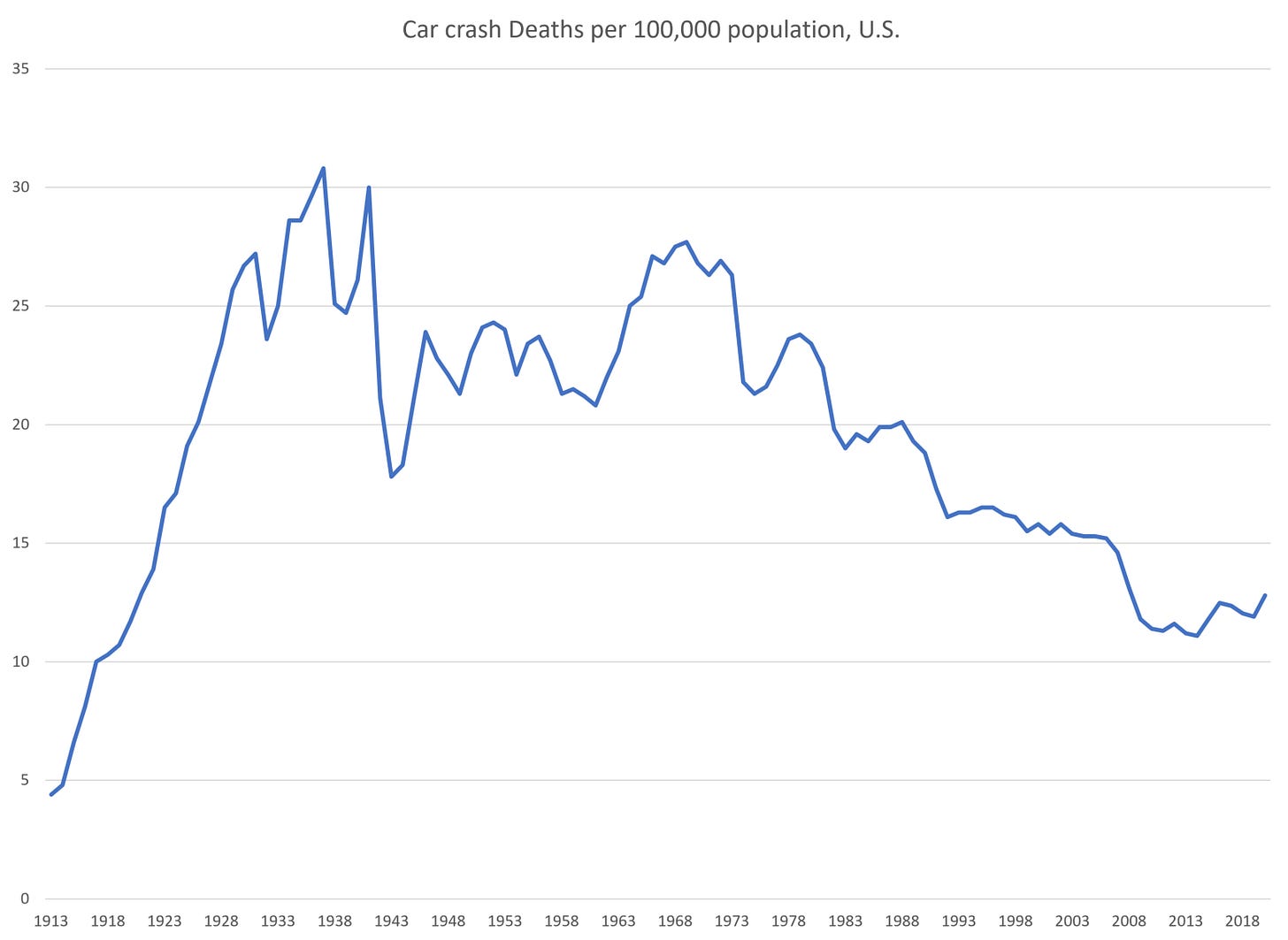
Here are deaths per 100,000 population (like the normal sorts of death rates for natural causes):
That looks like a very good trend — fatality rate for car crashes has been going down for many years. Note that as a percentage of population, the rate had been increasing a little in recent years, but that was due to economic growth — that is, more people were driving more miles.
Because the final graph has an excellent trend:
Look how smoooooth that is (until 2020).
So yes, the bad news is the meaningful rate, deaths per 100 million vehicle miles driven, increased 24% from 2019 to 2020. That’s very bad.
However, that merely pushes us back to the very dangerous year of 2006. Okay, not quite so bad, but it would be nice if people weren’t so reckless.
Mortality update – no news is good news
I spin through the CDC’s excess mortality dashboard in the following video:
Some notes:
We still don’t have good data for all of 2020 for North Carolina
I finally figured out how to make some nice thumbnails for my videos [no, I don’t use titles, etc., in my videos yet, but I’m figuring that all out]
It really looks like this third, nastiest wave is over. Yes, I know we can’t trust the estimate of deaths for the last 4-6 weeks (as per usual), but even pushing it back 6 weeks, it seems the excess mortality may be finally trickling away.
Before I get into the next video, just a reminder: I highly recommend you play with these dashboards yourself. If you’re on a phone, it probably won’t play nice (sorry).
I just tried the dashboard on my Kindle Fire, and it worked just fine. Just remember that when you pick one of the radio button options, you need to click the Update Dashboard button to get the new graphs. You don’t need to do that for the pull-down menu options.
WONDER database from the CDC: How to Use
While I do highly recommend you try out the CDC excess mortality dashboards for yourself, I don’t necessarily recommend you play with the following, unless you’re willing to download the data into Excel or some other software to do some analysis.
As I show in the video, the charting for the WONDER database really sucks. I hope they’re able to use Tableau in conjunction with WONDER in order to make for a better experience. It’s obviously not a priority for the CDC right now.
I use the WONDER database all the time to pull historical information on causes of death. I’m usually focusing on “underlying cause of death”, of which there can be only one.
Yes, one can get into multiple causes of death, which I discussed last year.
I have a few trends I want to dig into further, to the extent I can get 2020 death data, but alas, the level of detail is lacking for certain analyses I want to make.
But now that the excess mortality seems to be dying off [cough not sorry cough], I can stop digging into just total death counts, as get into items such as place of death and cause of death.
I look forward to it!


