Geography of Mortality: State Ranking by Increase in Total Mortality and COVID Mortality, 2020-2021, Provisional
Two years of experience brings a pattern
It’s been almost two months, and most states have reported enough data through the end of 2021 to make some reasonable comparisons.
I did a similar ranking for 2020, but rather than do a single-year ranking, I’m combining the results of both 2020 and 2021. This reduces the effect of any lack of data for the end of 2021 (so you will see that North Carolina, though it still shamefully lags in reporting its death data, does not benefit too much by this lag.)
Total mortality comparisons — the map
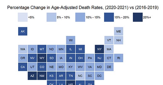
Let us start with a map showing how much mortality from all causes of death has increased across the U.S.:
With this tile grid map, we can see that the two-year mortality experience has been horrible, even on an age-adjusted basis. I will be using age-adjusted death rates [using the standard 2000-reference-age-adjustment] for all the comparisons. The methodology is at the end of the post.
I warn against taking any meaning from North Carolina, as it has a data-reporting problem. Hawaii, however, really does have a low increase in mortality, and I believe it is credible that the mortality increase of the northeast is also low. I am not sure how credibly to take the increase in mortality of Wyoming, given its relatively small population.
However, we can see some patterns. In general, one has a “hot spot”, and then the increase falls off as you retreat from that peak. The large pattern is the high increase along the southern border — Arizona, New Mexico, Texas, Mississippi — and then the next layer above is less bad, and so forth. There is the Wyoming peak, falls off around there. There is the midwest cluster – Illinois, Michigan, Indiana, Ohio. And then New York/New Jersey.
As well we know, the excess mortality is driven primarily by COVID, which I will get to in the next major section, but let me share some ranking tables.
Ranking the states by increase in mortality, 2016-2019 vs. 2020-2021
Let me break out the top ten, because we like round numbers:
The conditional formatting (the redness on the mortality rates) I’m using in the tables helps orient you to how bad the mortality levels are for that state relative to all the other states, while the ranking has to do with how much the mortality levels changed during the pandemic.
You can see why I went with the percentage increase, as the base mortality differs between the states, too. Some of the states with bad increases also had relatively bad mortality to begin with (Mississippi tends to be one of those poorly-ranked states), but some, like Arizona and New York, actually tend to have pretty good mortality.
New York’s rank is mainly from its 2020 experience. 2021 was pretty quiet for NY state, as it got walloped in spring 2020, the waves of COVID after that have been pretty tepid. It just took a spike of 600% excess mortality in NYC in April 2020 to make that happen, though.
The remainder of the ranking:
Again, you may wish to be a little skeptical of some of the states in the lower ranks of this table. Some are missing data from the end of 2021, such as North Carolina, which doesn’t have good data for the last two months of 2021.
COVID mortality map
Given most of the increase in mortality for 2020 and 2021 came from COVID, this map is similar to the one above:
This is not a shocker, and if I changed the color scale, and had this be a rate by month, instead of the average for the two years, the pattern would differ over time. This is not a surprise. I’m just trying to capture the overall impact here.
Now, what’s interesting is that certain areas are “hotter”, and certain areas are less hot. Part of this is that I like picking round numbers for cutting off my color scales, but part of this has to do with where the excess mortality that’s not COVID is coming from.
While most of the excess mortality has come from COVID these past two years, as I’ve been walking through non-COVID excess mortality, there are significant non-COVID causes of death, and some states may have seen more of these impacts than others. I have yet to touch on car crashes and drug overdoses and their geographic spread, but those may also have their particular footprint.
Ranking tables for COVID mortality, 2020-2021
These may not match up with ranking tables you’ve seen in the media, likely because those tables were based on either plain totals (which anybody can add up), or crude rates, which are just total number of deaths divided by population.
Age-adjusted rates are actually easy, too. I didn’t calculate these. I grabbed them straight from the CDC database.
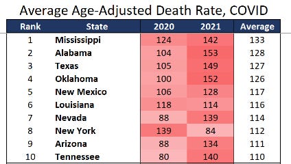
So here are the top ten, with the split out for 2020 and 2021, but ranked by the average:
There are a few states that had it bad both years, and obviously, they’re at the top of the ranking table. Again, it’s our southern border states.
But then we get down to the 7-10 ranking, and something interesting occurs. For three of them, 2020 wasn’t so bad, but 2021 was really bad (Nevada, Arizona, Tennessee). For the other, New York, 2021 wasn’t so bad, but 2020 was really bad.
As we get to the rest of the table, we will see that many states will have had a bad 2021 and a not-so-bad 2020, and a few had a bad 2020, and a not-so-bad 2021.
Unlike the total mortality numbers, I think the COVID mortality numbers are actually pretty good for most states. These data get priority in reporting, and for all that people try to make hay about over-/under-reporting, I’m not seeing much in the way of suspicious patterns in the aggregate. You can see that North Carolina is nestled in the middle here – their COVID numbers actually get in the system well before their total, reported-on-paper, deaths are.
The remainder of the ranking table:
Methodology
Data are from CDC WONDER. Data for 2016 – 2020 were from the Underlying Cause of Death database, using 2000 reference population age-adjusted death rates. Data for 2021 were using the state of residence, provisional death rates.
I also pulled data by month for 2018-2021, to check completeness of data, and detected some states (most particularly North Carolina) almost definitely are lagging in 2021 death data, and are ranked much lower than will ultimately shake out, though I felt for the largest states most of them were within spitting range (don’t ask how far I can spit) of their averages for 2020-2021.
To simplify the comparison I wanted to make, I compared against the average rate for each state for 2016-2019. For some states, the trend for the age-adjusted rate for all-cause deaths had been increasing, some had been noisy, some had been decreasing — I had thought to trend the rate, but took the average over 2016-2019 so as not to bias results. Trending rates like these can end up with wonky results, especially for small population states.
COVID death rates were also pulled via CDC WONDER, using the code U07.1 (COVID-19) for the Underlying Cause of Death. There can be only one underlying cause of death listed on a death certificate. Here is a video introduction to cause of death in CDC WONDER here.
Spreadsheets:


