Geeking Out: GDP By Country and Recent COVID Mortality Data
Improving graphs and chastising poor processes
It’s Valentine’s Day, so let me do something I love! Fixing graphs! And complaining about North Carolina!
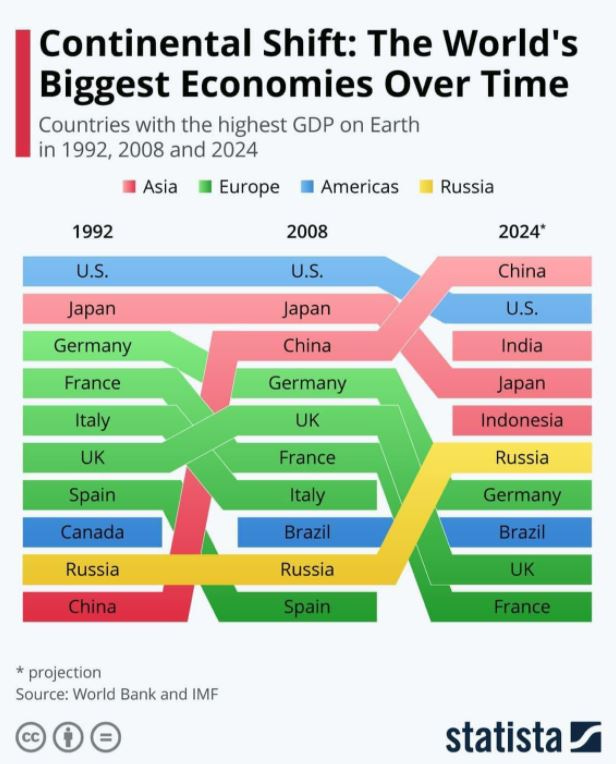
A friend shared the following on Facebook:
I saw that and I had some immediate questions:
1. Why is the most recent actual shown from 2008?
2. What are the different orders of magnitude here? The ranking doesn’t show us how close any of these are.
3. Could I have a link to the underlying data?
I did find a data source, though not the same from the graphic.
The GDP is measured in U.S. dollars (it doesn’t really matter the currency, but they all need to be in the same currency), and the following years are available: 1990, 2000, 2011-2019 (annual).
So I decided to pull 1990, 2000, 2011, and 2019. I don’t care about projections for now.
Ranking table comparisons
Let us first compare ranking tables:
For 1990 vs 1992, they’re very close, with Brazil being replaced by China in the top 10. It’s starting to become clear why specific years were chosen. I wouldn’t be surprised if 1992 was the first year China was in the top 10…. (and it also avoids the fall of the USSR)
For 2000 and 2011 vs 2008: we see the rise of China in my table, which obviously looks more drastic in the original graphic. The drop of Japan looks more gentle in mine, while picking 1992 and 2008 (16 years apart) shows a bigger movement. While the original makes it look like Russia is holding on, mine shows it drops out of the top ten in 2000 before it comes back (between 1990 and 2000, obviously “Russia” lost a lot of countries that came into being with the dissolution of the USSR.) India starts peeking in for mine in 2011, whereas it looks like it comes out of nowhere for the original graphic.
The narrative changes when you change the years you show, eh?
What’s the scale?
Let me redo the 2019 ranking list, including the total GDP amount, and the percentage of total world GDP that represents.
Do you think simply providing a ranking is helpful in showing where the countries land?
This is one of the issues I have with ranking in finance, because there can be large gaps between consecutive entries in a ranking list, and there can be very little difference as well.
Even without graphing, we can see that the U.S. and China are an order of magnitude higher than the other countries. The U.S. has been producing about a quarter of the world’s GDP for quite some time. The main story has been the high growth rate in China, and there are questions if it can keep that growth rate up, given how it’s aging.
Graphing the top GDP countries
So let me simplify what we’re looking at for a moment — let us look at the whole group of countries that ever showed up in the top five GDP countries for the four years we’re looking at: United States, Japan, Germany, France, Italy, UK, China, and India.
And now I will put back all the years for which we have data, and scale them appropriately.
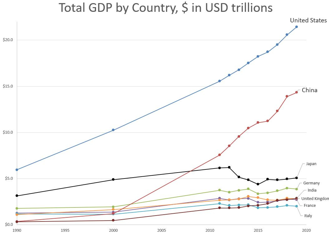
Here are all eight countries on the same scale:
The U.S. total GDP has been growing fairly steadily over the period, China’s GDP growth really took off in the last 20 years, and the Japanese GDP dropped in 2013, and hasn’t really recovered.
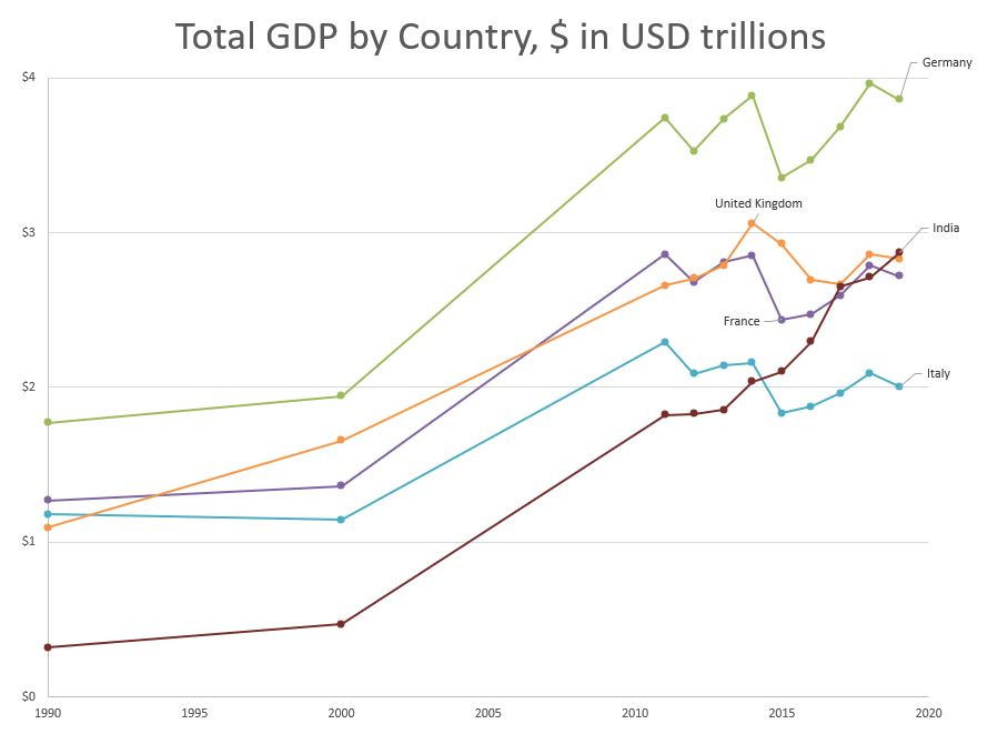
It’s too difficult to see what the next tier of countries is doing in that graph, so let’s zoom in on them.
The four European countries in this graph: United Kingdom, Germany, France, and Italy — all have had a volatile pattern since 2012.
The very interesting pattern is that of India – up there with China as the most populous country (reminder: the USA is number three in population currently – people keep forgetting that bit). While it started fairly low, it has managed to get grouped with the main European countries via its recent growth — and it seems likely to me that India will continue to grow.
How the ranking changes
I can understand how the projected GDP rankings for 2024 in the original graphic ends up the way it does. Japan and the European countries have sputtering growth. Many had negative GDP growth in the last decade.
The U.S. has had remarkably steady growth at about 4% per year. (This is nominal, I believe, not real — meaning this includes inflation effects.)
China has had some very high growth rates, over 13%/year annualized for 1990-2019 or 8% annualized for 2011-2019.
India has lower growth rates, with 7.8%/year annualized growth for 1990-2019, and 5.8%/year growth for 2011-2019.
I don’t want to project to 2024 to compare, because I know many countries took a GDP hit in 2020. Some had big recoveries, but many did not.
The reason China might surpass the United States is mainly its higher growth rate would get it past the U.S. — but again, there are reasons to question the maintainability of that growth. Also, I don’t know how much to trust the 2020 economic data. Some data are easier to measure than others.
COVID Mortality: a video
While I have your attention, here is a video I recorded yesterday while waiting on laundry.
I have been complaining about the lag in reporting for North Carolina and Connecticut, and yesterday I finally found out why they are so behind. They still use paper for death certificates.
Related links:
Why is NC delayed in reporting COVID-19 death data? It’s about death certificates.
The Fog of COVID-19 Data: Why is North Carolina so delinquent in reporting death data to the CDC?
Lesson: always question numbers
With both the GDP issue as well as the COVID numbers, there is the main lesson that you should ask questions of the numbers — are they the appropriate metric? What do they actually mean?
It would be great if those putting out these numbers in media stories would have done that work, but often they don’t.
Yes, it’s pretty easy to simply say “There are lies, damn lies, and statistics” but simply rejecting all numbers is as intellectually lazy as simply accepting whatever statistics are spoken at you.
The GDP ranking of countries does actually have interesting stories underlying it — some of the countries are sputtering in growth, and some switch rankings simply because one has a faster growth rate than another (why China is projected to surpass the U.S. in total GDP…. but that remains to be seen. I wouldn’t be surprised if it were India that surpassed both countries….eventually.)
I did finally take a little time to find out why both North Carolina and Connecticut suck so bad in getting their death totals to the CDC (and I guess that’s why it takes a year to get finalized death stats, too. Dammit, CT and NC.) At least I know NC is working to get on the electronic reporting system that EVEN SOUTH CAROLINA IS USING, DAMMIT NORTH CAROLINA.
I still have no idea re: Connecticut. Connecticut should be ashamed of so many things.
In any case, this past year bad data practices have come on stage in a particularly ugly way. I wasn’t particularly surprised, and in many ways, I’ve been pleasantly surprised to find some very good data sets.


