Geeking Out: Florence Nightingale, Data Visualization Pioneer - and Redoing Her Famous Graph
Don't worry, I'll be back to present day for the next post
I was going to pep myself up by doing some current mortality graphs, but let me improve my mood even more by looking at historical mortality graphs.
Five years ago, I was explaining to my grandma why she was seeing more obits for people 20 years younger than her compared to her own cohort. I was very ill at the time, but talking about these things really energizes me.
So here we go: Florence Nightingale, English army deaths in the Crimean war, and fixing graphs!
Enjoying a podcast with Helena Bonham Carter!
I keep a data visualization thread at GoActuary, a great actuarial discussion site.
One user on the site pointed to this podcast: Cautionary Tales – Florence Nightingale and her Geeks Declare War on Death by Tim Harford, enlisting the help of Helena Bonham-Carter(!!) , a distant cousin of Nightingale (note: Bonham-Carter is related to a lot of famous Brits.)
The podcast is primarily about how Nightingale used the power of data visualization (and really, scads of statistical tables) to be persuasive in her fight for better sanitary conditions in field hospitals. However, it’s also about some of the choices Nightingale made in producing the graph for her purposes.
Here is the graph, and I will be coming back to it:
It’s a very famous graph, and many people credit this specific graph for convincing the UK government and various UK health experts to improve hospital hygiene. (I do not want to delve into the pre-Nightingale hospital hygienic practices, much less what she saw in the army field hospitals. Listen to the podcast.)
I picked up a new motto from Florence Nightingale, courtesy the podcast:
“Whenever I am infuriated, I revenge myself with a new diagram.”
Though, obviously, when I’m infuriated, I love finding the apropos animated gif.
Okay, I like making graphs, too.
Questioning the impact of the graph and fixing it
Okay, I want you to look at the above graph, and I’m not explaining anything about it (an explanation is in the podcast, but I’m not transcribing the podcast explanation.)
I will transcribe the handwritten legend to the graph, because it is difficult to read:
The Areas of the blue, red, & black wedges are each measured from the centre as the common vertex.
The blue wedges measured from the centre of the circle represent area for area the deaths from Preventible or Mitigable Zymotic diseases; the red wedges measured from the centre the deaths from wounds; & the black wedges measured from the centre the deaths from all other causes.
The black line across the red triangle in November 1854 marks the boundary of the deaths from all other causes during the month.
In October 1854, & April 1855, the black area coincides with the red, in January & February 1855, the blue coincides with the black.
The entire areas may be compared by following the blue, the red & the black lines enclosing them.
Okay, with that information, and what you see in the graph…. do you see a trend? What do you take away from that graph?
I’ll give you some time to think.
Okay, now I will share my own thoughts: I really don’t “see” the pattern until somebody told me in words what I’m “supposed” to see. I do not like radial graphs AT ALL. It doesn’t even begin to make sense.
A statistician agreed with me, and re-did the graph as a stacked column graph:
There are problems with this graph, too. So let me fix it!
Rebuilding the Crimean War English army death graph
The full text of Nightingale’s book on mortality statistics is available online.
So I grabbed the table that informs her (and the statistician’s) graph.
Here’s the table:
There is a problem with the table, which a fellow actuary pointed out to me. I will explain that after I fix the graph.
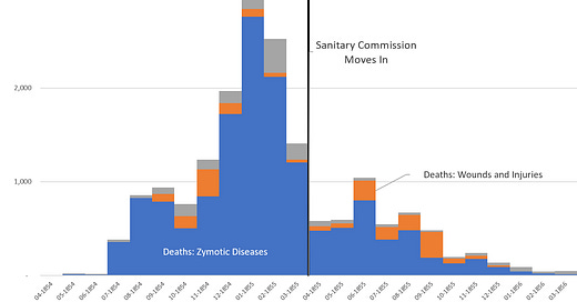
Let’s start with the simplest graph: total deaths by type (zymotic disease, wounds, and battle fatalities)
I switched up the order of items and changed my presentation for the stacked column graph version:
By marking when the Sanitary Commission set up work at the site, you can see that number of deaths was coming down before it moved in. But it still might be a little difficult to note that given the stacked column.
How about line graphs?
Hmmm, it really becomes questionable with respect to the effect of the Sanitary Commission.
Annualizing mortality rates
But here is something to really consider: the number of deaths should be normalized against the “exposure” – that is, the number of people in the army were around to die.
The statistician did this on a monthly basis… and Florence Nightingale (or her “team of geeks”) screwed this bit up.
If you simply divide the number of deaths in the month by the average number in the army for that month, you get a monthly death rate.
How to annualize?
Well Nightingale just multiplied by 12.
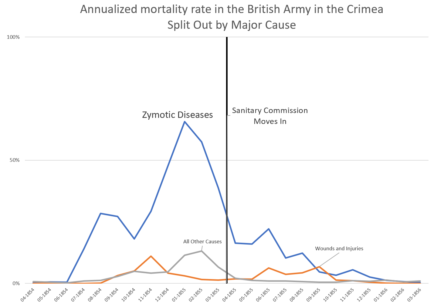
That was a problem for January 1855, during which 8.5% of the army died from zymotic disease. If you multiply that by 12, you get 102% annual mortality rate.
(Note: you can’t have a mortality rate higher than 100%…. unless you’ve got zombies. But I’d rather not deal with that right now.)
That’s not how to properly annualize a rate.
I am not going to explain it right now, but you annualize by looking at the survival rate, which is 1 – death rate. Then assume that holds for every month – so multiply this 12 times: (1 – death rate)^12. That’s the annual survival rate.
To get the annual death rate, subtract that from 1: 1 – (1-monthly death rate)^12
So no, it’s not a 102% annual mortality rate — it’s a 66% mortality rate. Big difference.
Here’s the graph:
So, again, it’s not clear that the Sanitary Commission moving in was the real change agent. But neither does it show that it wasn’t that change.
To be fair, the book itself has more graphs, and far more statistical tables. It didn’t merely hang on this one graph. There was plenty of evidence throughout the text that some of the practices Nightingale promoted would reduce mortality in hospitals (regular city hospitals or army field hospitals.)
Unfortunately, given they’re just taking a monthly death rate and multiplying by 12…. it’s not clear they knew what the hell they were doing with the statistics.
HOWEVER, to be charitable, much of the data visualization and statistical methods were in their infancy.
I do not hold it against Nightingale and her colleagues that they put a mortality result over 100%…. but you would have thought they’d notice they were killing off some of the people more than once……
….I didn’t think they had the concept of zombies back in the Victorian era.
Hey, I learn something new about history every day.


