Geeking Out: Census Numbers for Apportionment Released -- Let's Visualize!
NY lost by 89 people. That's quite the thin margin.
Today, the Census Bureau released the state population numbers for apportionment in the 2023-2032 Congresses.
If you haven’t seen it elsewhere, here’s the bottomline:
States that will GAIN a seat in Congress
Montana
Oregon
Colorado
Texas (+2)
North Carolina
Florida
States that will LOSE a seat (only one each)
West Virginia
Pennsylvania
New York
Ohio
Michigan
California
Illinois
The one factoid that came out of today’s data release that everybody will be parroting: New York missed not losing a seat by 89 people.
That is, if Cuomo had not killed off so many people in nursing homes in the initial COVID wave, maybe we would have kept our same number of reps. Maybe he will be more strategic next time.
I will probably look at population trends in a different post (the U.S. as a whole saw population growth of 0.7% per year… lowest decadal growth ever for the country.)
Today, let’s add this data point and talk about the long-term trend of various states’ representation!
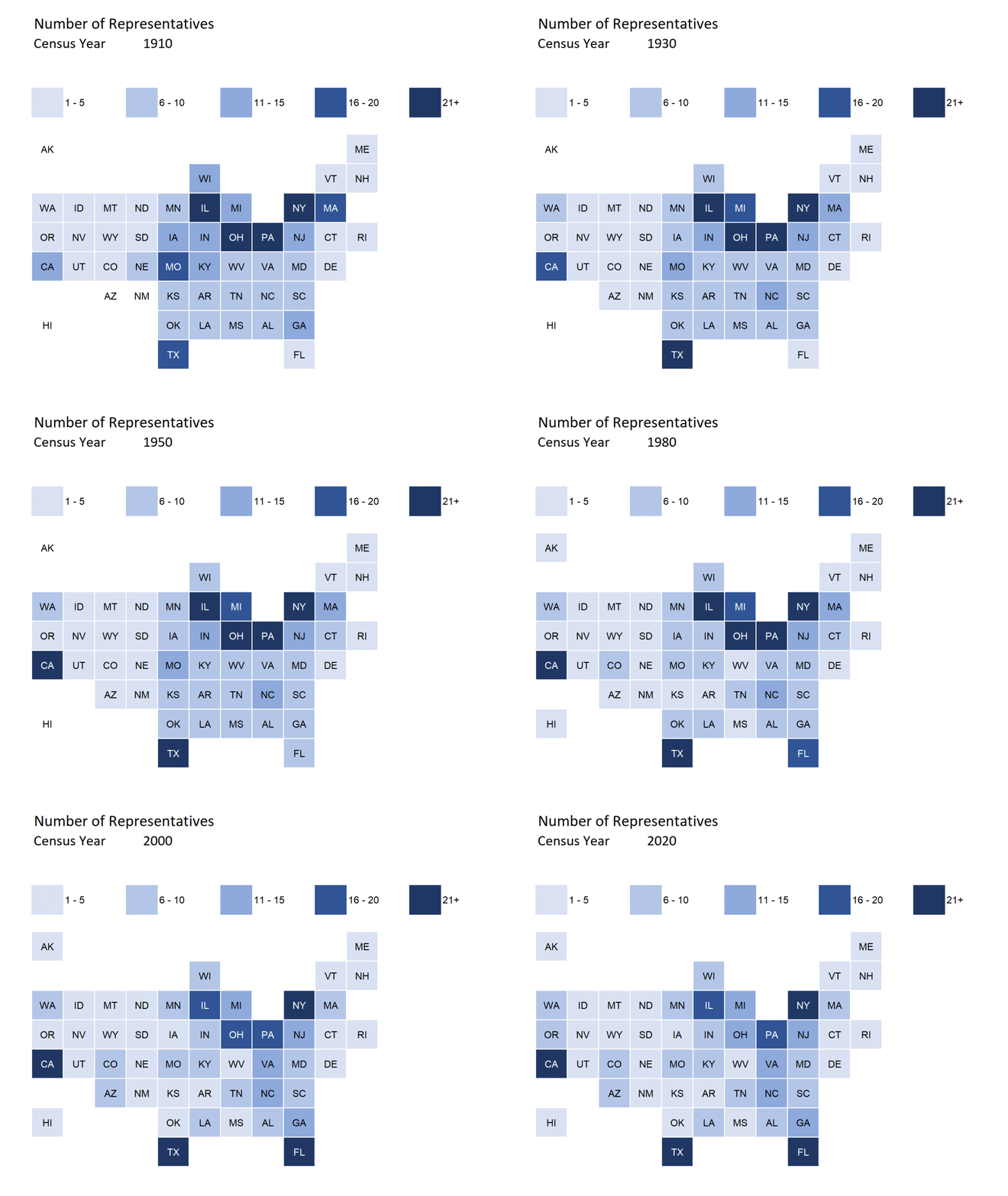
Visualizations of changes 1910-2020
A month ago, I did some visualizations for 1910-2010 apportionments. The reason I start the visualization with the 1910 Census is we’ve had 435 reps in the House since then.
I’ve updated my animated gif:
The other animated gif (population per representative) is boring, so let’s get away from that.
The boxplot for population per representative is more interesting:
As I mentioned last time, there really needs to be an increase in the number of representatives in Congress. Maybe double what we have now — the number of people purportedly being represented by one person are just too many, and approaches one million in at least one state.
The state with the bad luck, this time, is Delaware. In the 2010 apportionment, Montana had the ill luck to be that outlier, but with their addition of a representative, they’re now at the minimum…which is at about half that! This is nuts. Increase the number of reps! Uncap the House!
Specific trajectories
I want to graph what has happened with very specific states.
First, the 6 states with the top number of representations (and, obviously, the top population amount).
Of these top 6, the top three (California, Florida, Texas) have had an upward trend since 1910. Yes, California lost one seat from 2010 to 2020 (and it might bode ill for the future).
The next three: New York, Pennsylvania, and Illinois — used to be sitting on top. These three have had a general declining trend, especially post-WWII.
It’s nice to see that Florida, the state that all the Yankees like to flock to, has finally surpassed New York in number of reps.
I picked out three states I considered to have very interesting trajectories: Michigan, New Jersey, and Georgia:
Michigan and New Jersey peaked in 1970, and have been coming down since then.
Interestingly, Georgia lost reps in 1930 (maybe in the 20s, a lot of the black population – and maybe rural whites – left for the more alluring north with their nightlife (speakeasies) and industrial economies? Of course, it doesn’t even require Georgia losing population (it didn’t) – all it took was Georgia growing more slowly than the more industrial north… such as New Jersey and Michigan.
But since 1970, Georgia has grown — my dad was a part of that, working for IBM in Savannah and then Atlanta. I always thought of Atlanta as IBM HQ, because they had been growing their corporate operations there quite a bit. As the U.S. economy has shifted from industrial/manufacturing to more tech-related services, locations such as Atlanta and Raleigh, North Carolina have grown hugely. Yes, certain areas of California also grew.
But if you want diversity in the ways people like to define it now, Atlanta is a great place to go. I don’t really like the south, but it is literally due to the climate and specifically the foliage. I have really bad grass and pine tree pollen allergies. I have a bad allergic breakout right now here in NY, but here it lasts only a week or two. In the south, it’s the entirety of spring into summer.
The fall of NJ and Michigan is a warning to California, by the way. It has plateaued in number of reps, and it may continue to lose ground to places such as Texas and Florida.
A cartoon tribute to Illinois (and Seinfeld)
I had to share this – got this in an email from the Illinois Policy Institute, a cartoon by Eric Allie:
The serious bit is a piece from the IPI: ILLINOIS LOSES 1 SEAT IN CONGRESS AFTER 2020 CENSUS SHOWS POPULATION DROP OF 18,124
During the past decade, Illinois suffered the second-largest population decline in numeric terms, behind only West Virginia. As a percentage of the population, Illinois’ population decline was third worst behind West Virginia and Mississippi.
Here’s their graph:
Guys, even New York managed to grow in population. While NY often has negative net domestic migration, it does get a lot of immigrants, and maybe even births outnumber deaths (I haven’t checked).
But to be losing population?
That’s a really bad sign.
Not on IPI’s map is what happened with Puerto Rico’s population. While PR doesn’t have any reps, they did release the official 2020 Census number: 3,285,874
In 2010, the population was 3,725,789. They lost about 12% of their population in a decade.
In any case, Illinois needs to consider that its future may be like PR’s: a disappearing tax base. That will definitely not be able to plug up their pension holes.
Underlying spreadsheet: 1910-2020 Congressional Apportionment.xlsx


