Covid Mortality Update for November 2021: Before the Omicron Variant
Coming through in waves
As I said back in October, Winter is Coming. No, I didn’t know a new variant was coming, but given omicron is the 15th letter of the Greek alphabet (and yes, two letters were skipped over, let’s move on), let us assume more variants are on the way, just given recent history.
So, before the effects of omicron get here, let’s take a look at the mortality impact we’ve had since 2020, and so some simplification to make it a lot easier for us to look at the results through my most recent data draw.
As per usual, all my data are coming through the CDC’s own excess mortality dashboard, and if you’re coming through my substack, I will just dump my spreadsheet at the end of the post, and you can download it for yourself.
Four(ish) waves of COVID deaths
For my own simplification I identified 4 waves of COVID deaths:
Wave 1: Up to June 27, 2020 [aka Spring 2020]
Wave 2: June 28 – October 10, 2020 [aka Summer 2020]
Wave 3: Oct 11, 2020 – July 3, 2021 [Fall 2020 – Spring 2021]
Wave 4: July 4, 2021 and after [Summer 2021 -]
Here’s a graph of just the COVID deaths by themselves, with shading for the different waves:
Yes, wave 3 covers a lot of real estate, and it does seem there’s something of a wave and a half in there. I’m lumping it all together for my own convenience — wave 3 was the large wave that hit, essentially, the whole United States. If your state was mainly bypassed by the first two waves, you got hit in that third wave. The peak of deaths was in January 2021.
Given reporting lags, yadda yadda, I’m going to be doing the remainder of my analysis through 10/30/2021. I do have data past the end of October, but they’re far from complete. I’ll let them develop for a little longer.
Racial-ethnic excess mortality update
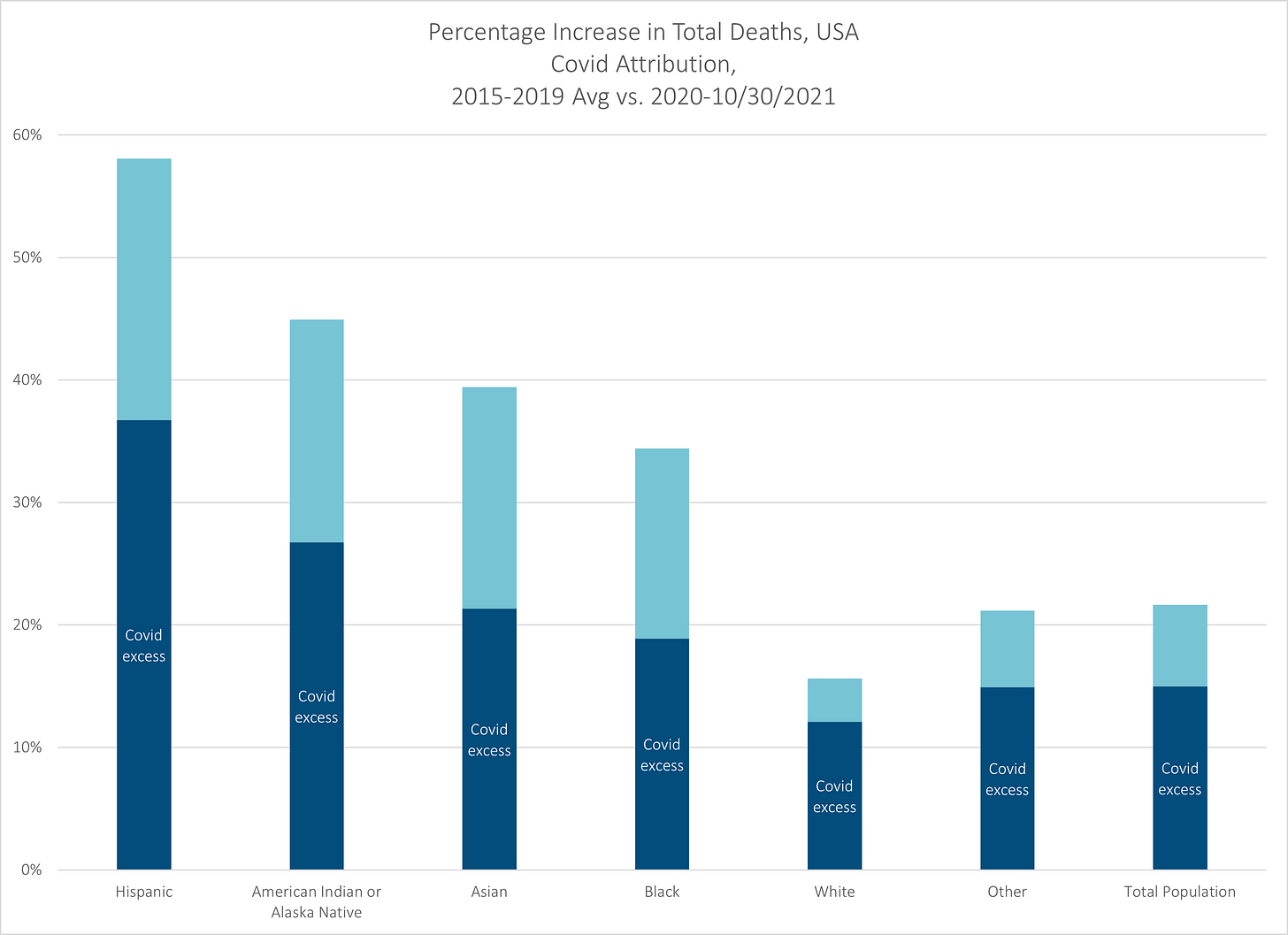
I had done some graphs through the end of September 2021, so here is an update of the graph, with a covid/non-covid breakout:
Reminder: to calculate the “excess” mortality, I’m taking as my baseline the average number of deaths for the identified group and MMWR week from 2015-2019 (2020 had a week 53, and I just averaged weeks 1 and 52 from the prior years. It happens.)
There are many other, more complicated choices to get at excess mortality, but it will take population estimates on top of mortality rates to get to that, and it will take a lot longer before we will see these trends. So I will go with this simple approach for now.
As we can see, not only do non-Hispanic Whites have the least excess mortality, in relative terms, but that almost all of their excess mortality can be explained by COVID deaths.
That is not true for other groups — for the remaining analysis, we will be looking solely at the largest racial/ethnic groups: Hispanic (can be any race), non-Hispanic Asian, non-Hispanic Black, and non-Hispanic White.
The wave structure of excess mortality
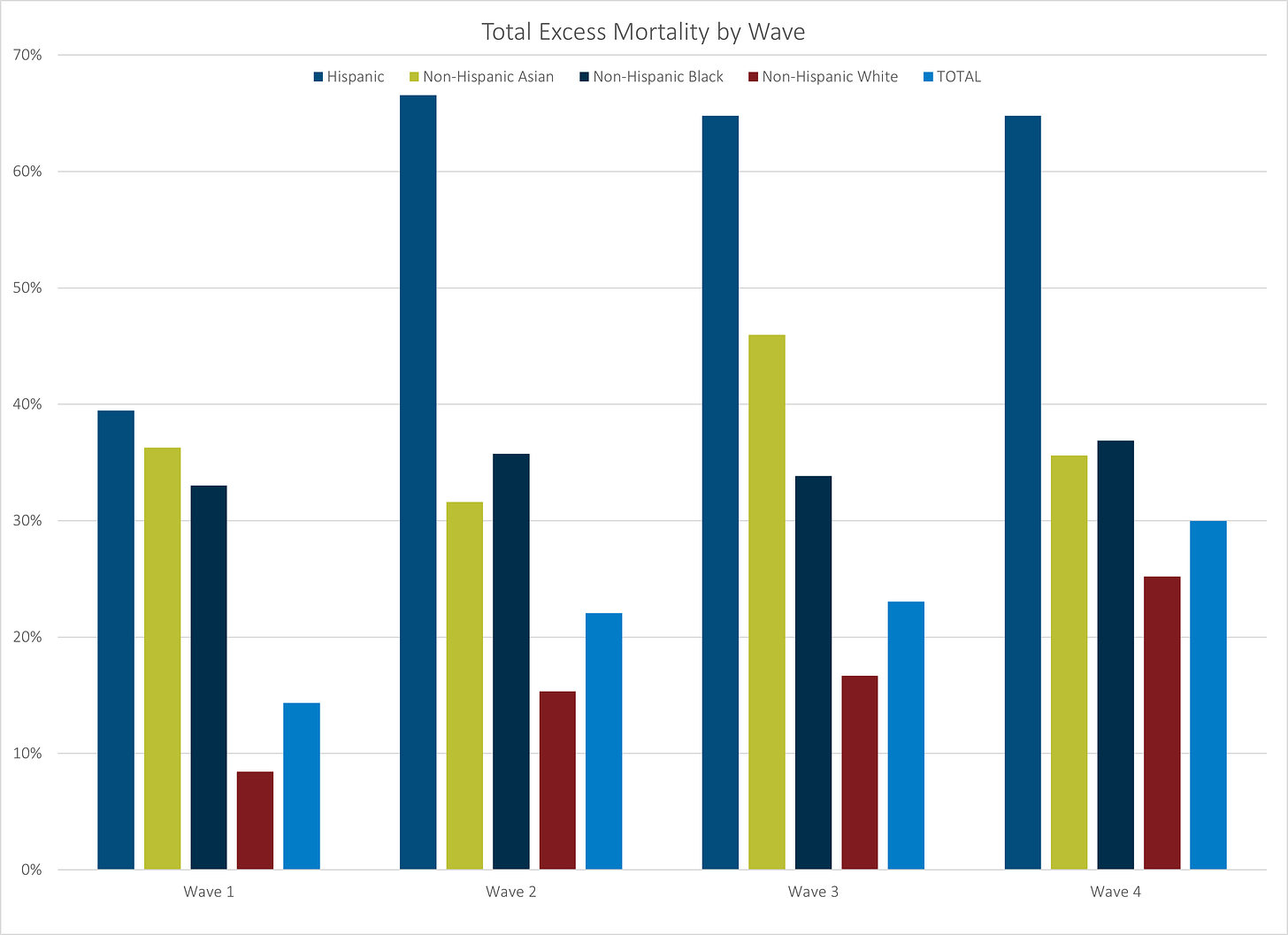
So let’s look at how the different racial/ethnic groups were hit in each of the waves of COVID:
Remember that the first wave in spring 2020 mainly hit the NYC area, and we can see that Hispanics, Asians, and Blacks had similar relative excess mortality, and excess mortality for Whites was pretty low…. but as I’ve mentioned before this may relate to geographic concentration. White people are everywhere in the U.S. That’s not true of the other groups.
In the second wave, we see the Hispanic excess mortality spike, as COVID hits the south in summer 2020. It stays elevated for the next two waves.
I will note the blue bar to the right, which stands for the overall population, shows increasing excess mortality. (Not all of that is COVID, to be sure.)
Let’s group this graph in a different way.
Now, that’s really interesting.
As noted earlier, the Hispanic excess mortality was about a level as the other non-White groups, but then spiked with Wave 2 and stayed very high.
The Asian group saw its excess mortality peak with Wave 3 — remember, that’s the large wave with the most COVID deaths. But they have been at about 30 – 35% excess mortality for the other waves.
The Black group looks like it’s slightly rising in excess mortality, but staying within a fairly narrow range of about 33% to 37% excess mortality.
The White group is definitely showing an increasing trend of excess mortality. Interesting.
Due to the White group’s increasing excess mortality, the overall population is showing an increasing trend — look, Whites have been the majority of deaths for a long time, as they’re the majority of old folks. That’s how that works.
Looking at what Covid contributes
However, for all this pattern, let’s see how much Covid is driving this pattern of excess mortality.
The answer: it depends which group you’re talking about.
Hispanics, Asians, and Blacks all have substantial portions of their excess mortality coming from non-COVID causes. That said, when Asians suffered a bump up in excess mortality in Wave 3, clearly COVID deaths drove that (I believe that was California).
For the White group, it looks like COVID deaths are the primary driver for the increasing excess mortality. There is some interesting summer-related non-COVID excess mortality as well, hmm.
What’s next?
So, the media has to have their hype. Perhaps we’ll see yet another large spike in COVID deaths due to the omicron variant, or perhaps pi, rho, sigma, tau…. we’ll see.
As for me, I will do an update later with these “waves”, but for the large states as I did in this post where I looked at the whole period. This time I will see if we can tease out some of these “waves”, and if I was right about the Asian excess mortality spike in Wave 3 coming from California.
Okay, I’m just going to grab a screenshot from the CDC.
It was California.
But more generally, let’s take a look at how these “waves” have differed, and think through why there might be the patterns we’re seeing. In addition to looking at the state-level breakout of these mortality waves, I want to look at the non-COVID causes for excess mortality, and in specific I want to look at drug overdoses and homicides.
So you have that to look forward to.
Enjoy!


