


A Tale of Know Your Data: The Mystery of the Excess Connecticut Summer Deaths
Spoiler: there were no excess deaths

Before I begin, I’m going to give the game away:
The “excess” Connecticut deaths in the below conversation are completely spurious. As far as I know, there has been no spike in extra deaths in the summer in Connecticut.
I’m going to take you on a journey, and let you “look over my shoulder” via a twitter conversation, and explain what happened.
Something catches my eye on Twitter
Let us start with the tweet, retweeted by someone I follow on Twitter:


I recognized that dashboard view, and I thought it looked really odd. First, I hadn’t heard of any spike of summer deaths in CT, where I work and shop a lot. Especially not a spike of deaths that didn’t involve COVID. That’s really weird!
The dashboard is here: Excess Deaths Associated with COVID-19.

I used to use this dashboard a lot in 2020 to do videos, especially as WONDER only got updated about once a year, and one had to wait a long time to get that info.
Then they started updating WONDER monthly, and I stopped using the CDC dashboard, and promptly forgot about it. I didn’t like that dashboard, because it didn’t slice the data the way I liked. It grouped the ages together in groups that were far too big, for instance. It didn’t give me causes of death I wanted to look at. That sort of thing.
But now this was really odd.
Causes of death contributing to the spike?
I will link the tweets, so you can see what I wrote at the time, but not embed them, because it just gets ugly rather rapidly.
I started by looking at the major causes of death, trying to figure out if there were specific causes of death driving the spike. All of these views are coming from different views from the same dashboard.

The 2022 curve is the lavender-ish line, and I noticed the cancer line was trending upward. Ah-hah!

Then there’s Alzheimers and other dementia:

Heart disease:

That last one may be difficult to see, due to the noisiness, but heart failure, stroke, and other heart diseases are showing elevated results for 2022, just eyeballing it.
Age groups contributing
If we slice it by age group, all this excess is coming from the oldest age groups (I’m not going to show you all the groups, just the oldest):

Most from age 85+.
Seems very clear, right? Mostly from the oldest ages, and it does seem that cancer is a large contributor.
Why not check out what kind of cancer? We don’t get that sort of detail in this CDC dashboard, but we can get that detail in CDC WONDER, and it would also give me a chance to cross-check the numbers, which I would do first.
Cross-checking against WONDER
And here is where I realized something was wrong.


Here’s the graph:

My first thought was that maybe there was a disconnect in cause of death categorization between WONDER and the CDC Dashboard.
Note that there is no spike in cancer deaths, which is no surprise to me at all — there has been almost no change in cancer deaths anywhere throughout the pandemic. They’ve barely been affected.
But then I pulled the total deaths, all causes.
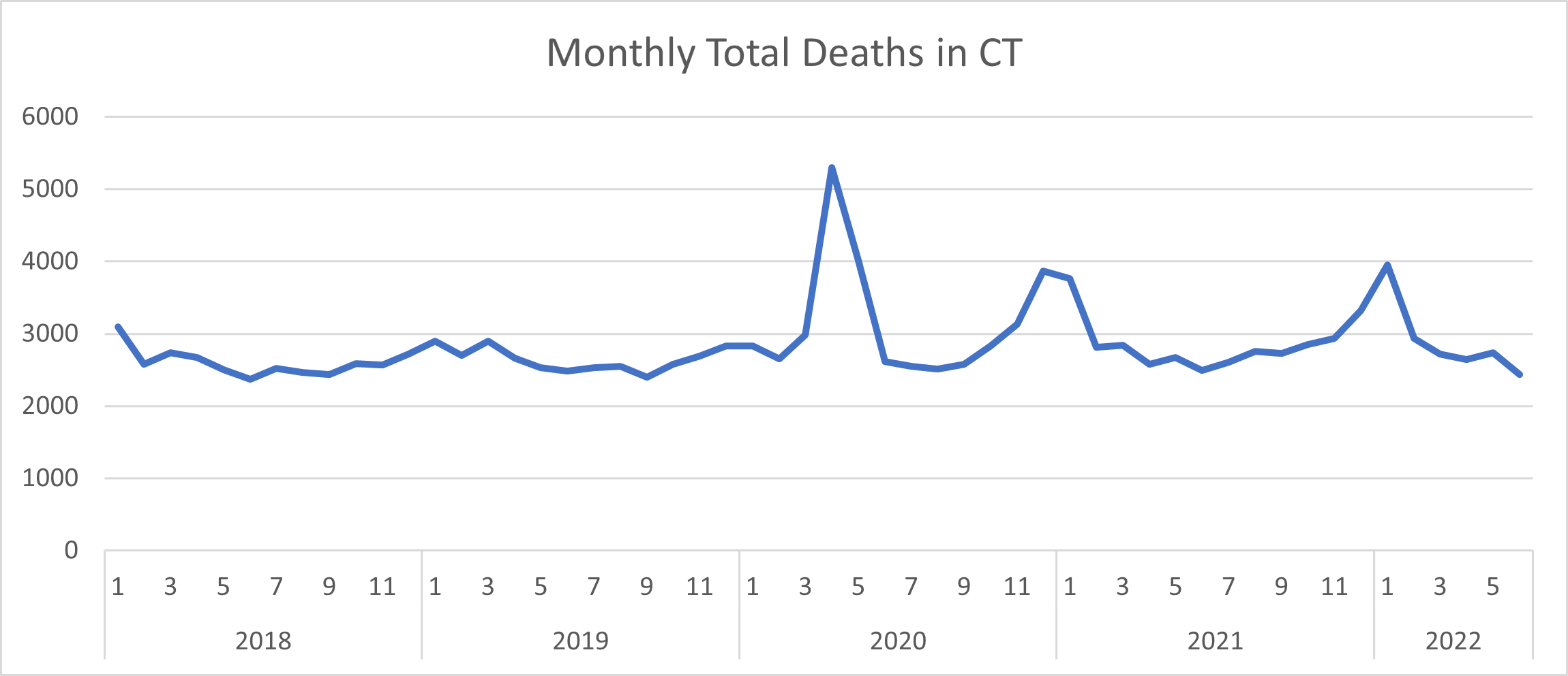
The last spike in CT deaths was over the winter of 2021-2022, which I do recall. But no summer 2022 death spike as they were seeing above. That is definitely different from what they were seeing in the CDC Dashboard.
What was going on?
Meep has a revelation

And yes, it’s like this working with me. I do get very annoyed quite often when I forget basic assumptions.
When you go to the dashboard page you’ll notice there’s a wall of text. There’s a lot of detail.
Yes, I know most of us don’t read it, and I don’t read it now, but I’ve read it before.
But it’s kind of important.
In particular, you’ll notice this dashboard choice:

Most people skip over that choice, because they don’t even think about it…. and they really don’t understand how much of the recent 3 months of “data” are influenced by those weighted results. And it’s over all the dashboards except for that one.
So here’s what the Connecticut weighted/unweighted breakout looks like:

The spike is completely generated by the model that does the weighted deaths.
They don’t weight the COVID deaths. But it does get distributed to the various ages (and as most deaths are of old people, yes, the spike shows up among old people). It gets distributed to the various causes of death — and as most deaths are cancer and heart disease, guess what? I assume the Alzheimers spike comes from most of the deaths being of old people and those deaths getting amplified by the model.
This model of “weighted deaths” has existed in the dashboard since they set it up in 2020. I have written and talked about it before.
In this video, at the 8:50 mark, I talk about it briefly:
I hadn’t been using this dashboard in months, so I had forgotten about the weighted/unweighted issue.
Model risk and know your data


Amusingly, the meme I had created there was because of a discussion over how actuaries had defined the term “data” in actuarial standards, starting in 1991. The twitter thread is here, if you care to follow it. I didn’t realize I’d use it in a different context only a few hours later.
A bunch of us thought we were looking at actual deaths. We didn’t realize we were looking at model output for that spike.
Luckily, I knew of an alternative data source I could cross-check against that were actuals (WONDER), and when the numbers were very different, I started to ask questions of the original numbers…. and then realized where it had fallen apart.
The reason that CT may have gotten this spurious spike of deaths is not only because it is a small state, relatively, but how the death reporting occurs in the first place, and how that informs the “weighted deaths” model.
If CT has only a few employees who update the reporting to the CDC, and the model assumes a steady state of reporting (that is, a certain percentage of deaths get reporting within 4 weeks, a certain percentage within 6 weeks, etc.), and then in the summer those employees go on vacation and those percentages actually change….. or maybe, in this case, they don’t go on vacation and actually report a higher percentage of the deaths faster, and thus the factors are off….. then the weights get all screwed up and therefore the CDC assumes CT is under-reporting the deaths, when, in fact, they are actually on-the-ball.
It may have been valuable (I’m skeptical) for the CDC to have made death estimates back in 2020 when the death reporting wasn’t so rapid, but in 2022, when WONDER is getting updated more frequently with actuals, maybe they should just stop the modeling. I will note a lot of us stopped using the epidemiologists’ models back in 2021 (mainly because their reliability sucked).
I recommend the CDC just drop the weighted deaths estimate, and show actual reported deaths and let people know that yes, there is a lag in death reporting and our models just haven’t been all that robust and have generated some spurious death spikes that maybe we shouldn’t have allowed to go through our dashboards.
(Excuse me, I have an email to write.)
In any case, as far as I know, there has been no spike in deaths in Connecticut in summer 2022.
What you’re seeing on the CDC dashboard was generated by a crappy model.
Great news about Stu!!!
Have they learned nothing about models over the past two plus years?